Blog
Conversion Rate Optimization
A Foolproof Form Optimization Process That Reduces Abandonment
Follow our form optimization process to reduce abandonment, simplify user experience, and significantly increase submission and conversion rates.
Lucky Orange

Following the steps laid out below will help you reduce form abandonment—increasing your conversion rate and revenue with simple changes to the form experience.
Let's get into it.
(If you're looking for a quick-start guide, our web form optimization checklist covers the essentials in three steps.)
Step 1: Run a Form Analytics report
Form Analytics is a Lucky Orange tool that provides key data points about form performance, showing you how easy (or hard) it is for people to complete. This tool makes it easy to understand what’s happening on your forms at a glance:
How to use analytics to reduce form abandonment
Since Form Analytics lives inside our Dynamic Heatmaps tool, it’s really easy to find what you need.
Simply go to Analytics, then Heatmaps and select the URL you’d like to view. We’ll show you a list of top pages, but you can also search and filter to find exactly what you need.
Select Launch Heatmap for your chosen page, then select Forms at the top of the page. This will open the Form Analytics feature. If you’re a current Lucky Orange customer looking for guidance with this tool, here’s our Introduction to Form Analytics help document.
At this point you can also choose Reports and go through all the different metrics we’ll highlight later in this article. All of these reports can be used as benchmark data when you work to increase the percentage of people completing your online form.
Which metrics to track on your forms
Over the years, we’ve seen people take all sorts of approaches to optimizing their forms. When it comes down to it, these are the five metrics our customers need most to create a better web form experience.
In the next section, we’ll discuss what defines success with each metric, and what you can do to impact each report—but first, definitions.
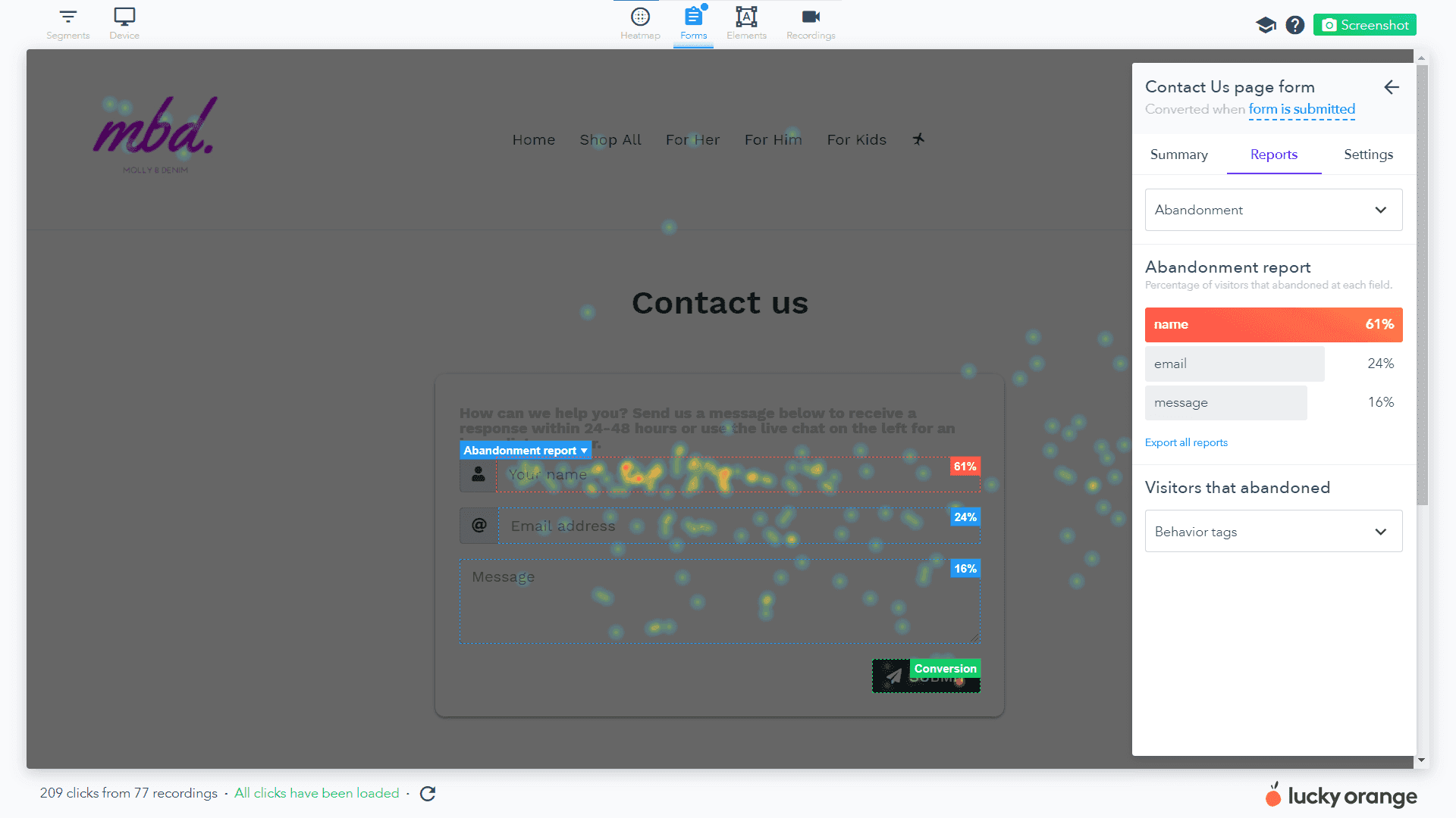
Abandonment: Spot the field website visitors are working on before abandoning the form (and possibly your site).
Time to start: Track how long a visitor is on the page before starting to fill out your form.
Field time: See how long a visitor takes to complete each field to judge which are easiest and which are most difficult for people.
Average order: Understand the order in which people complete your form to see their preferred fields to complete first and last.
Repeat fields: Identify fields people complete more than once to spot signs of struggle.
Step 2: Analyze and understand what you’re seeing
For most teams using Form Analytics tools, this is the most vital step to practice. It’s great that you have access to all this information, but what does it mean and how can you use it to increase online sales?
Abandonment
People who start your form are the closest to completing your desired action of a form conversion.
They’re giving every buying signal in the world and just need to break through that conversion wall. This is why form abandonment (and similarly, cart abandonment) is such a real, painful problem for many online retail businesses.
Why might people be abandoning your form from one field more than another?
The field is asking for information they deem too personal or unnecessary for the transaction
The field happens to be last and they felt like your form was too long
The field is unclear in what it’s asking for and they get frustrated
The field is a UX nightmare and is difficult to complete (a date picker on mobile phones is a great example of this)
They're navigating more than one e-commerce store at once and decide to leave your store for a better deal.
What can I do with a field causing a high amount of form abandonment?
Remove the field if it's not necessary
Change your placeholder text to make it more intuitive
Test field order (or break into more than one step) to put this field first (they still have the energy to complete it) or last (they already feel committed to the form)
Time to start
Depending on your situation, you may benefit from people spending more time on a landing page before starting your form (reading more content to understand the offer) or you may want people to commit quickly. Time to start shows you how long it takes for people to even begin your form.
So, a “good” time to start is completely dependent on your website.
When you start using Lucky Orange, set benchmark data for each of your forms and consider how this relates to overall time on page. Are people starting your form towards the beginning or end of their session?
If you feel like your time to start is problematic, consider where your form is placed on the page and what surrounds it. Is anything distracting and preventing people from starting faster? Is the form below a ton of content on the page? If so, is that content necessary and increasing conversions?
Field time
If you’re seeing a trend at this point, it’s that Form Analytics surfaces the most difficult pieces of your form experience. In the case of field time, it’s all about spotting fields that take longer to complete than others.
Some fields that take longer to complete may not be problematic. If something requires a longer response or asks for a piece of information people are likely to need to look up, it’ll naturally require more time.
However, if a seemingly simple field is taking longer than others to complete it may be a problem. We recommend marrying this with an Abandonment report to see if your high field time leads to people leaving the form. In many cases, this will be true and you’ll be able to start testing adjustments to that field.
If you run into a field time issue, consider similar adjustments as recommended above for abandonment.
Remove the field if it's not necessary
Change your placeholder text to make it more intuitive
Break the field into two separate fields to simplify response requirements
Break your form into more than one step with your more difficult field on its own step
Average order
You likely built your form in the order you think would make sense to complete for that customer journey phase. With simple fields like first and last name or zip code at the top, you believe people will start from there and work their way down.
An average order report will show you if this is true or if people are taking a different path through the form submission. Your average order report is best used in tandem with abandonment and field time information. This might look something like this:
Spot the field with the highest abandonment rate
See if it’s taking longer than other fields to complete
Determine where it falls in the completion order
If something is causing abandonment and taking longer to complete, people may also be leaving it to the end to finish. How can you make this easier? Just like with field time, we recommend trying to move the field to a separate form step, break it into two fields or adjust your placeholder text to simplify.
Repeat fields
Nobody wants to repeat something when they don’t have to—and certainly not when it comes to your forms. A repeat fields report will show any fields that people tend to complete more than once.
But why might someone complete a field twice or more?
They’re trying to enter fake information to avoid being contacted and your form won’t let them submit because of validation technology
The field is truly difficult and they’re messing up formatting or clicking something in error
You have a technical issue preventing them from completing it correctly the first time
To know which of these is true, we recommend using Session Recordings to see what’s happening during the field submission process. You’ll be able to see why people are repeating the field and what they do after they do this.
NOTE: Session Recordings won’t show you the personal information they’re entering into the form, but will show you if there’s a technical issue or submission error occurring.
Simplifying what you’re asking for and how you’re asking for it can go a long way in avoiding repeat fields. For fields like email address, zip code or date of birth, use preset styling cues like slashes or length limits to guide people to an acceptable response.
Step 3: Study what happens on-page around your form
Keeping your eyes on Form Analytics is a great entrance to studying visitor interactions on the entire page.
Taking things a step further and analyzing what people do directly around your form will help you understand what’s driving certain behaviors on the form itself.
We recommend starting with a Dynamic Heatmap. Dynamic Heatmaps are a visual representation of visitor behavior on your page and include key insights like the effective fold.
This shows how far down the page an average visitor scrolls and can help you see if your form is high enough on the page. Since the form is likely your primary call to action, getting as many eyes on it as possible will be key—and moving it above the effective fold will help.
You’ll also want to view a Dynamic Heatmap filtered for clicks to see if anything near your form is drawing a lot of clicks. This may indicate something is distracting and drawing visitor attention away from the true goal of the page—a form submission.
If you see something interesting on a heatmap, the next step is watching Session Recordings to find and watch specific visitor examples.
For example, if you see a lot of clicks on a link below your form about shipping times while people are completing the form, watching recordings will help you see what happens before, during and after they interact with the form.
And when you combine the information found in heatmaps, recordings and form analytics, you’ll be ready to create a testing hypothesis.
And if you're getting ready to launch a new website, check out this pre-launch website checklist.
Step 4: Come up with a hypothesis and start testing
A great testing hypothesis isn’t necessarily one that leads to a positive testing result. It is one that’s well-informed and built to leverage your increased understanding of visitor behavior.
While we hope every A/B test you run or change you make increases conversions, be prepared to learn from those tests that lead to a negative or nearly no change in conversion rate. This is sometimes where the most valuable insights can come from.
Here’s a template to use when creating a well-informed A/B testing hypothesis:
We saw [visitor behavior] on [URL or section of site]. We believe that changing [thing you’re testing] will increase/decrease [what you’re measuring].
Put simply:
We saw X and believe that changing Y will impact Z.
Further detail might include audience information like traffic source (search engine, social media, ppc, etc.), device type, geographic location or any other information that will help your team understand who will experience the test variation.
This is, of course, a great starting point for an A/B testing strategy. As you get more complex in your approach, expanding pre-test documentation to include testing QA, expected revenue impact and other steps/metrics will be important.
Other tools to use alongside Form Analytics
Throughout this article, we recommended using a combination of tools as you research your site visitors and take on conversion rate optimization (CRO).
This is the best path to getting immense value out of Lucky Orange.
Taking what you learn in one tool and investigating further in another takes you deeper and deeper into the minds of your customers.
What causes them to take action? What causes them to get annoyed and leave? How can you maximize conversions while also tending to an amazing customer experience?
No matter if you run an e-commerce site, small business or are just interested in buying and selling products online, this website testing prioritization log can help you prioritize your ideas and insights.
Lucky Orange


