Blog
News & Updates
Discovery Quick Actions: The Website Analytics Fast Lane
Use Discovery AI's Quick Actions to run a 1-minute deep dive into your data. Spot and solve issues with AI Referrals, overall performance, Frustration signals and more.

Sean McCarthy
Director of Marketing
Most website tools still expect you to stare at dashboards, hunt through reports, then guess what to do next.
Lucky Orange Discovery flips that. It’s a website analytics assistant that sits inside your Lucky Orange account, reads your live visitor data, and answers questions in plain language—with links straight into the heatmaps, funnels, forms, and segments you should open next.
Discovery AI, our new chat-based analytics interface, is the foundation. Type a question, get a narrative answer, plus data and recommended next steps—not another pile of charts.
The Discovery quick action buttons are the fastest way to see that in action:
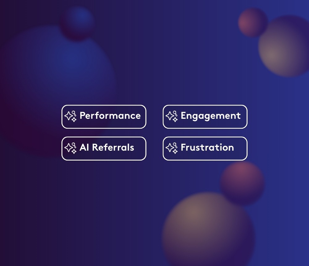
Frustration Summary
AI Traffic Summary
Engagement Summary
Performance Summary
Think of them as preset prompts that help you understand visitor behavior faster and get real conversion rate optimization insights without knowing exactly what to ask yet.
And they all ladder up to the same idea:
It’s time to ask more of your website tools.
How Lucky Orange Discovery works in the background
Before we get into each quick action, a 30-second primer.
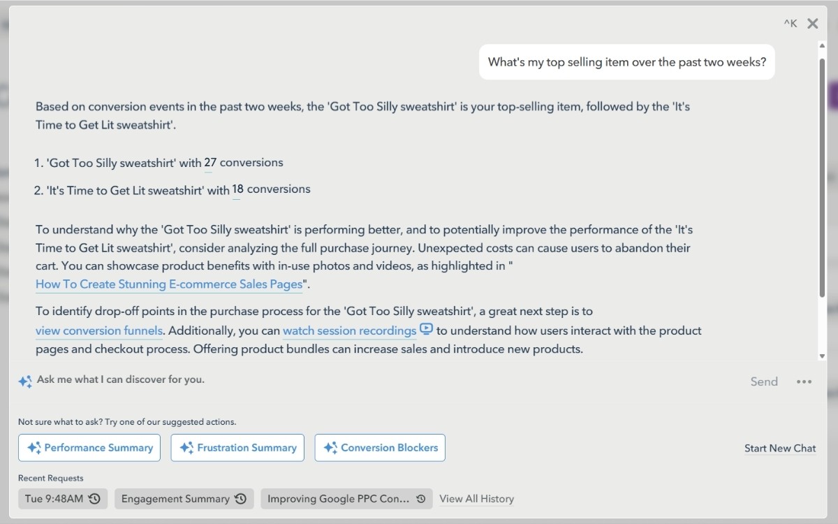
Inside Lucky Orange, you open Discovery from the top navigation (or with Ctrl+K). A chat window slides over your current view so you can keep working wherever you are. You type a question; Discovery responds with:
A written explanation of what’s happening
Key numbers (you can hover to see how they were calculated)
Direct links into Lucky Orange—usually already filtered to the exact visitors, funnels, or pages you should inspect next
Under the hood, Discovery is acting as an AI website optimization tool: it pulls your live visitor data, looks at behavior trends, and translates them into plain-language analytics you can act on.
The quick actions just give you a head start.
Frustration Summary: find friction before it kills conversions
If you only click one quick action this week, make it Frustration Summary.
This view is built to surface where visitors are clearly struggling—so you can:
Find conversion funnel drop-offs tied to UX issues
Analyze form abandonment without reading a full Form Analytics report
Spot pages where rage-clicks, repeated attempts, or dead-ends are piling up
A typical Frustration Summary answer might highlight:
Pages with the highest rage-click rate or repeated taps on mobile
Forms where visitors start but fail to submit, broken down by device
Segments (like first-time visitors or paid campaigns) that hit trouble spots more often than others
Then Discovery links you to:
Session Recordings filtered to stuck visitors
Form Analytics views for the problem form
Heatmaps that show exactly what people tried to click before giving up
Good prompts to stack on top of Frustration Summary
“Show me where mobile visitors rage-click the most in the last 7 days."
“Which form field causes the biggest drop-off on my page /signup and how does that differ by device?”
This quick action hits the Form Optimization and Funnel Analysis pillars hard: it gets you from “something’s wrong” to “this exact field, on this page, for this segment” fast.
AI Traffic Summary: make sense of AI referrals
AI-driven traffic is real now—visitors dropping in from AI search experiences, recommendations and tools that don’t look like classic SEO or paid clicks.
The AI Traffic Summary quick action is how Lucky Orange Discovery keeps that chaos readable.
When you click it, Discovery looks at traffic identified as AI-influenced (for example, AI-powered search experiences or referral patterns you’ve tagged) and compares it to your other traffic:
Landing pages AI visitors hit versus everyone else
How often those visitors reach your key Conversion Events
On-site behavior: scroll depth, CTA clicks, and how fast they move
This helps you:
Compare website visitor behavior between AI cohorts and traditional sources
Decide whether to build dedicated experiences for AI-referred visitors
Monitor your overall level of visibility and resulting traffic from various LLM tools
Follow-up prompts that work well
“Compare AI-driven visitors vs PPC visitors who land on my home page—how do they differ?”
“For AI traffic, what are my top landing pages?"
“Show me recordings of AI-referred visitors—what should I look for in their recordings?”
This sits squarely in the Traffic Quality and Visitor Segmentation pillars: you’re no longer guessing whether AI traffic is good; Discovery shows you.
Engagement Summary: content engagement analytics that tie to revenue
The Engagement Summary quick action uses Lucky Orange’s behavioral data to answer the ultimate question: "What's driving high engagement and where do I have opportunities to improve?"
When you trigger Engagement Summary, Discovery looks across key content and landing pages to show:
Which URLs keep visitors engaged and lead to a Conversion Event
Where people read but rarely click anything meaningful
How engagement differs between segments (for example, new vs returning, or organic vs paid)
You’ll typically see:
A ranked list of high-impact pages and their assisted conversion rates
Notes on content blocks or CTAs that get strong interaction vs those that are ignored
Suggestions on what to test next
Prompts to extend Engagement Summary
“On /pricing and /landing, which content blocks are getting the most engagement?"
“Compare engagement for new vs returning visitors on my blog."
Here you’re deep in the Content Performance pillar—with a side of Visitor Segmentation—without spending an afternoon exporting data.
Performance Summary: your daily CRO pulse check
The Performance Summary quick action is Discovery’s “what changed over the last week?” button.
From the Lucky Orange Overview page, clicking Performance Summary and asking something as simple as “Can you give me a quick summary of today’s data?” gives you a read on:
Overall conversion vs the previous 7-day average
Funnel steps that moved more than usual (good or bad) if you have a Lucky Orange Funnel set up
Key campaigns, devices or entry pages that spiked or dipped
Where Discovery thinks you should look first—funnel vs heatmap, and which exact URL to open
In other words: a daily conversion rate optimization insights briefing without building a dashboard.
Smart prompts after Performance Summary
“Zoom in on /checkout and show me any new friction compared to last week.”
“What changed most for mobile visitors in Europe today vs the last 14 days?”
“If I only have 30 minutes, what should I watch or fix first to protect revenue?”
Performance Summary is your Funnel Analysis and “keep an eye on things” pillar in one click.
From quick actions to deeper Discovery projects
Quick actions are the on-ramp. Once you see a pattern, Discovery helps you go deeper.
The Discovery Projectbook lays out full workflows like Paid Traffic Quality Sprint, Form Friction Hunt, Funnel Leak Mapping, Segment Side-by-Side and Prospect Content Engagement Study. Each project takes a focused goal—like validating PPC quality or mapping leaks from /home → /pricing → demo—and walks you through prompts that chain together heatmaps, funnels, Form Analytics, and recordings.
The move is simple:
Start with a quick action to see where today’s problems or opportunities are.
Drop into a project-style workflow when you need to fix something specific or prove it’s working.
Use Discovery’s answers—and the links it gives you—to make changes, not just screenshots.
That’s the difference between a tool that reports and a tool that actually helps you decide.
Why this approach matters now
AI is reshaping how people discover products, compare options, and decide what to do next online. Your website is still the place those decisions get made—or lost.
Lucky Orange Discovery is built for that reality:
A chat-based analytics layer that understands your data and your questions
Quick actions that highlight traffic quality, friction, engagement, and performance in one click
Plain-language analytics that teach CRO as you go, instead of hiding behind jargon
As Discovery AI evolves through 2026 and beyond, those same principles hold: less dashboard dumping, more direct answers and better paths to action.
If your current stack only gives you charts, it isn’t doing enough.
It’s time to ask more of your website tools.
Sean McCarthy
Director of Marketing


