Blog
Conversion Rate Optimization
3 examples of brands with brilliant landing page design
Create high-converting landing pages with psychology-backed design principles, compelling CTAs, and visual hierarchy that guides visitors toward action.
Lucky Orange
You pushed your website live and started driving traffic to key landing pages.
That’s a great accomplishment. Now it's time to start optimizing and converting visitors.
The truth is that website optimization doesn't have to be complicated, anld it's definitely not out of reach for your business.
In this article, we'll walk through great landing page designs from Shopify, Tuft & Needle and Upwork to highlight their layout, messaging and CTAs. You'll learn strategies these brands use to keep their pages interesting and, in the end, drive a massive amount of revenue. Let’s get started.
What is landing page design?
Landing pages are typically a single page seen by visitors after taking an action like clicking an advertisement, email, social post or any other marketing activation.
Landing pages act as welcome pages on websites, which informs landing page designs and other elements driving traffic into the rest of the site.
Most dynamic landing web pages include similar elements like a clear call-to-action, product value messaging and an easy-to-complete form.
The phrase "landing page" is also used in tools like Google Analytics to describe the first-page traffic lands on when arriving at your site. For example, Lucky Orange receives traffic from marketing efforts that lands on the Dynamic Heatmaps page of our main website. This is a successful landing page for us, even though it's not separated from the navigation of the site.
In this article, we'll focus primarily on pages built for a specific effort as opposed to those baked into a website that happens to be the first page of a conversion funnel.
Here's how we'll evaluate our three examples:
Visual: How the landing pages are organized, where the forms live and how color scheme and layout impact the experience. Are bright colors always the best? Can you drive an emotional connection with your forms? Are they setup properly to drive conversions on mobile devices?
Messaging: Which words live in which spots on the page and how do they describe the offer at hand? What eye-catching phrases and other elements are used to stop visitors from bouncing?
Forms: The key conversion points of each page, what surrounds them and what language and design cues are used to designate them as forms
Software as a Service: Shopify
Brand & Landing Pages
Shopify is a top e-commerce platform for over 1,000,000 online stores worldwide. It's equal parts website builder, logistics provider and CRM.
We reached this high-converting landing page after clicking on a Google ads link and it links to additional information about their subscription levels and focuses heavily on getting the visitor to start a free trial by providing their email address.
Let’s take a look at how they quickly convert visitors into trial merchants.
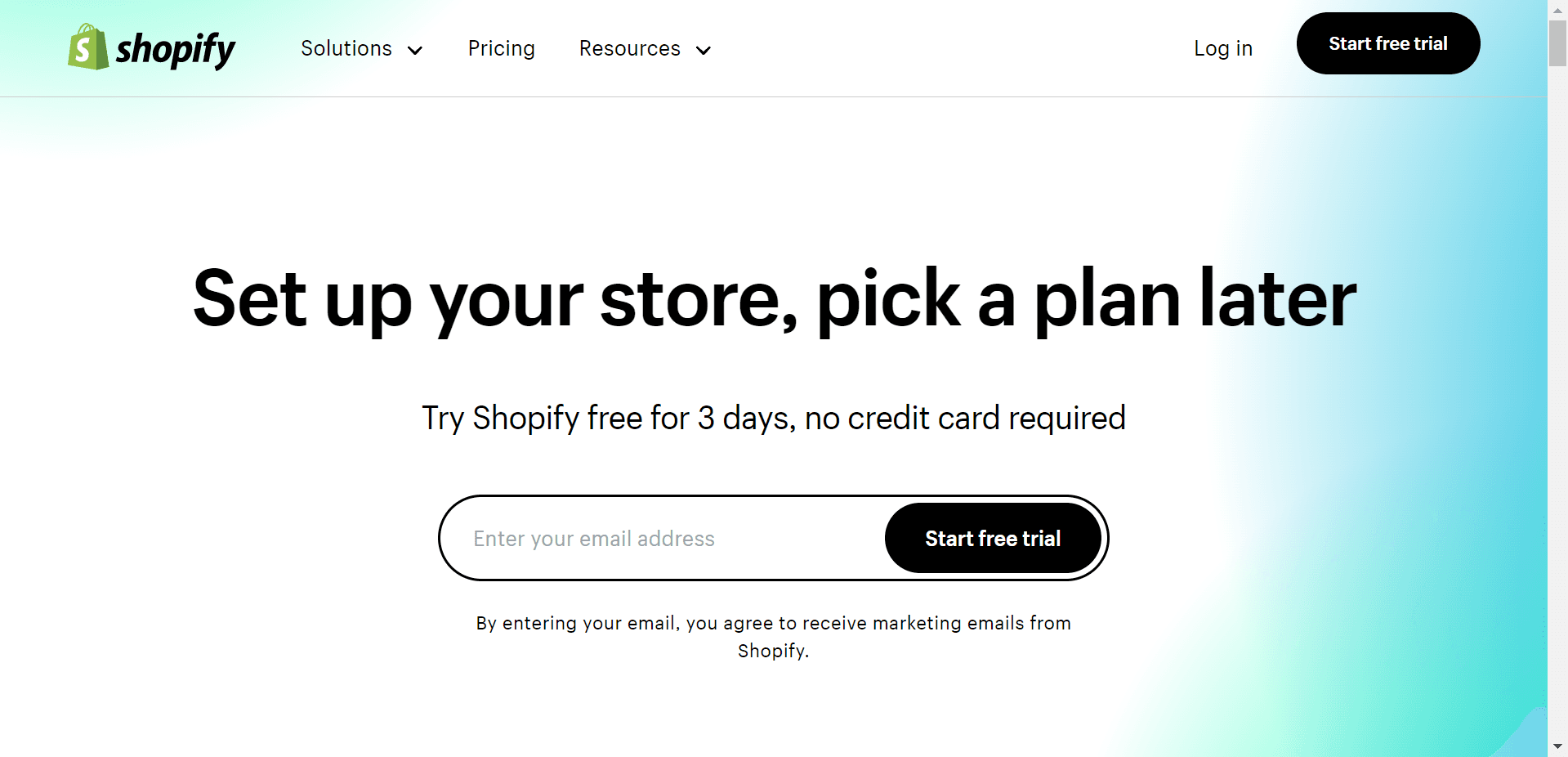
This effective landing page allows just the right amount of open space between content blocks. There is a use of a green color that can be seen throughout Shopify's website variations, allowing the white font to be clearly legible on all screen sizes.
Shopify clearly believes traffic that lands on this page is interested in signing up but may want to see pricing first as the pricing blocks are a prominent feature.
A common theme throughout this page is simplicity, and it is prominent in the pricing descriptions. The best part about this section is just how easy it is to understand the offer. And with the large list of features offered by Shopify even beyond the website builder, it's quite a feat of simplification.
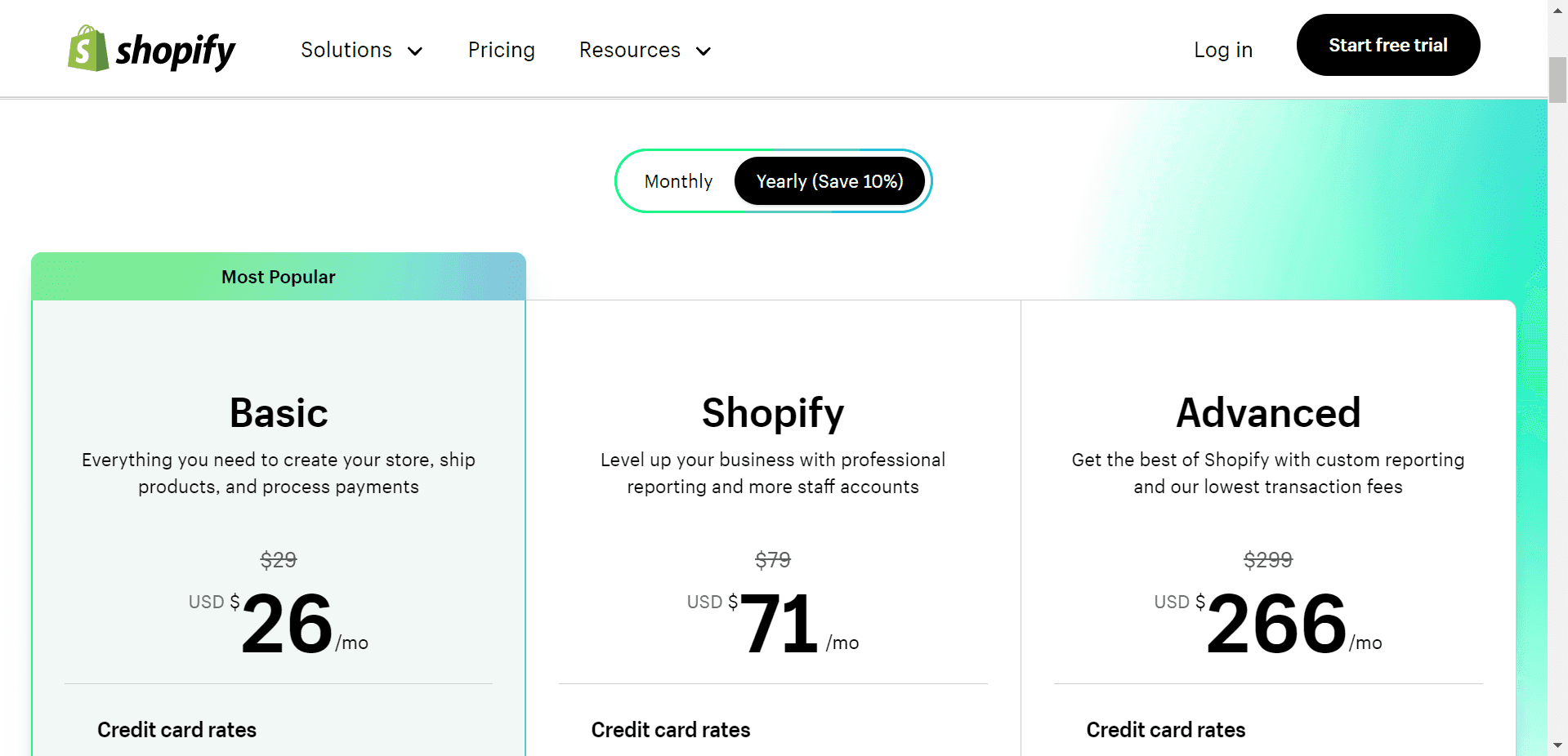
There are three basic levels with simple names and short descriptions. Shopify has likely A/B tested their way into this level of information as they could clearly include more feature descriptions within each plan level.
Below the pricing level section, you'll see a three-column layout of support points. This is a common feature of effective landing pages and is something to consider adopting on your own website.
Visitors who read down to this part of the page are likely looking for more information on the product, and Shopify offers these points to help convince them the platform is right for their needs.
Use a space like this to clarify a complex feature or highlight a competitive differentiator.
For visitors who are still unsure, Shopify then provides social proof by sharing some existing customer logos. Simplicity appears again as Shopify doesn't use a description for this section but rather assumes the visitor understands these logos as examples of current customers.
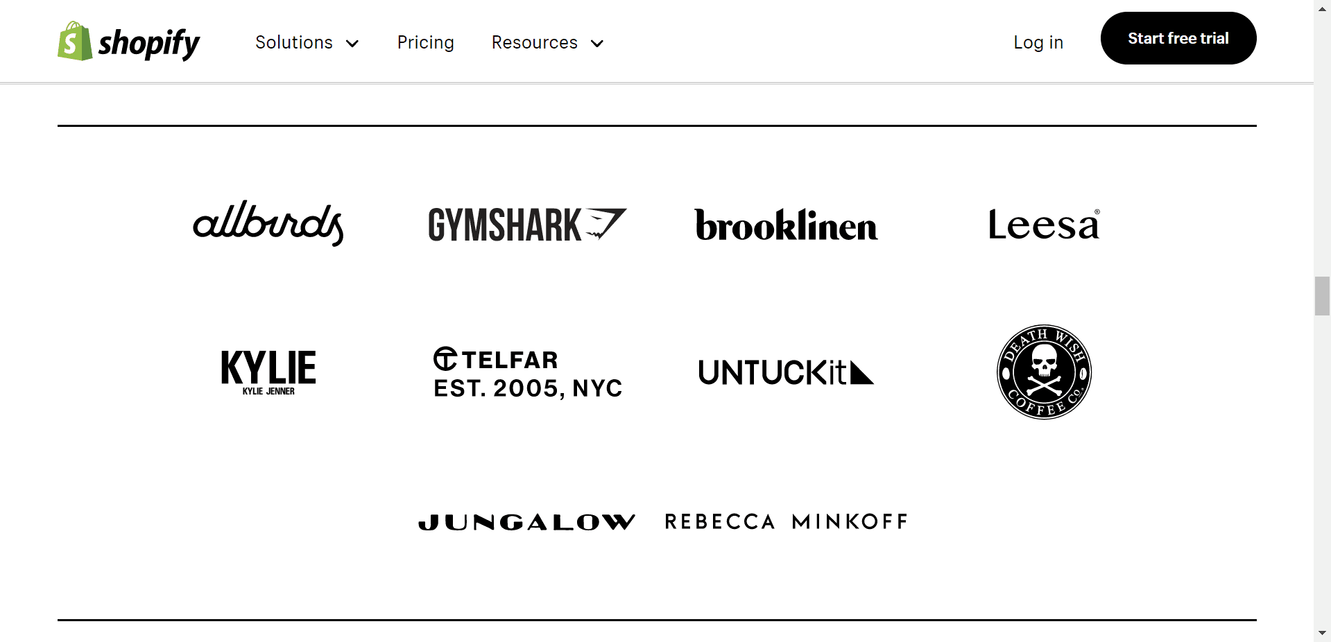
These logos, like everything else on the page, are static, unlinked images. This keeps customers focused on one thing—the trial signup form. Ultimately, that's the reason this page exists.
Finally, Shopify provides a simple quote from an executive at a powerful, potentially recognizable brand followed by a secondary CTA offer for the free trial using the green contrast color used in the top section of the page.
Messaging
Primary value propositions don't get much clearer than, "Sell online with Shopify." There's much more to the product, but at its core, Shopify enables you (read: anyone in the world with a product to offer) to create an online business.
The simplicity of this statement makes e-commerce, a potentially intimidating industry, more approachable and encourages visitors into conversions.
It's worth noting that Shopify has enough brand recognition as a place to grow your business, that it doesn't necessarily need to provide further clarity around product capabilities to still convert visitors.
If your business is complicated or lesser known, your primary statement should clarify why your specific offering is the best for the visitor. This is the "one thing" you want them to remember above all else after they've left your site.
The proof here provides social proof to show the visitor that Shopify is the best place to take their e-commerce store.
If your business doesn't have large numbers like 1,000,000 to throw around, it's okay. Key points can come in many formats and simply needs to lend credibility to the primary statement.
So, whether this is highlighting a product feature or how you can help make the visitor's life easier, injecting proof points into the top of a landing page is a great idea.
Forms
This landing page design features a great example of a multi-step form—landing page designers, take note.
At first glance, the user interface appears that you'll sign up for an account using just your email address. Providing this piece of information and clicking the button labeled "Start free trial" will actually take you to a secondary form to confirm you'd like to sign up. After this, you're led to two more forms to help refine your store information and set up a payment address.
Of course, an email-only form looks really simple and has a simple design aligning with the rest of the page. However, there's something else here to pay attention to.
By breaking the two additional fields out (even things as simple as "Password" and "Your store name") Shopify hooks the visitor with that initial click or email address submission. The visitor is already invested in the process since they engaged with the first step, increasing the likelihood of conversions.
It's likely Shopify has a large list of email addresses for people who complete this step but never get their store up and running. Keep this in mind should you take a similar approach and be prepared to activate email marketing to help convert those records into fully-active customers.
Keeping a full panel of options open is a great way to start building an omnichannel marketing strategy.
So, what's the takeaway here? Be intentional with the amount and type of information you request from visitors upfront.
Consider different ways to get to the end result, whether that's a signup, download, purchase, demo call or anything else you want to call a conversion.
BONUS:
Take a look at Shopify's full website home page. Notice how some important elements from the landing page we analyzed carry over.
It's likely Shopify sees many visitors find the landing page and navigate away to find this full website to do further research. Strong retargeting and tracking capabilities will help you control your customer journey more effectively.
E-commerce: Tuft & Needle
Brand & Landing Pages
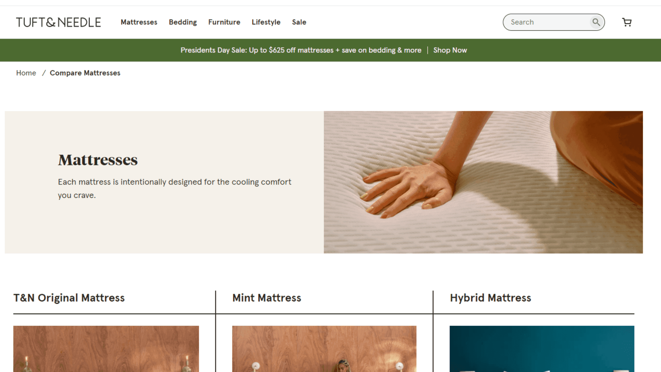
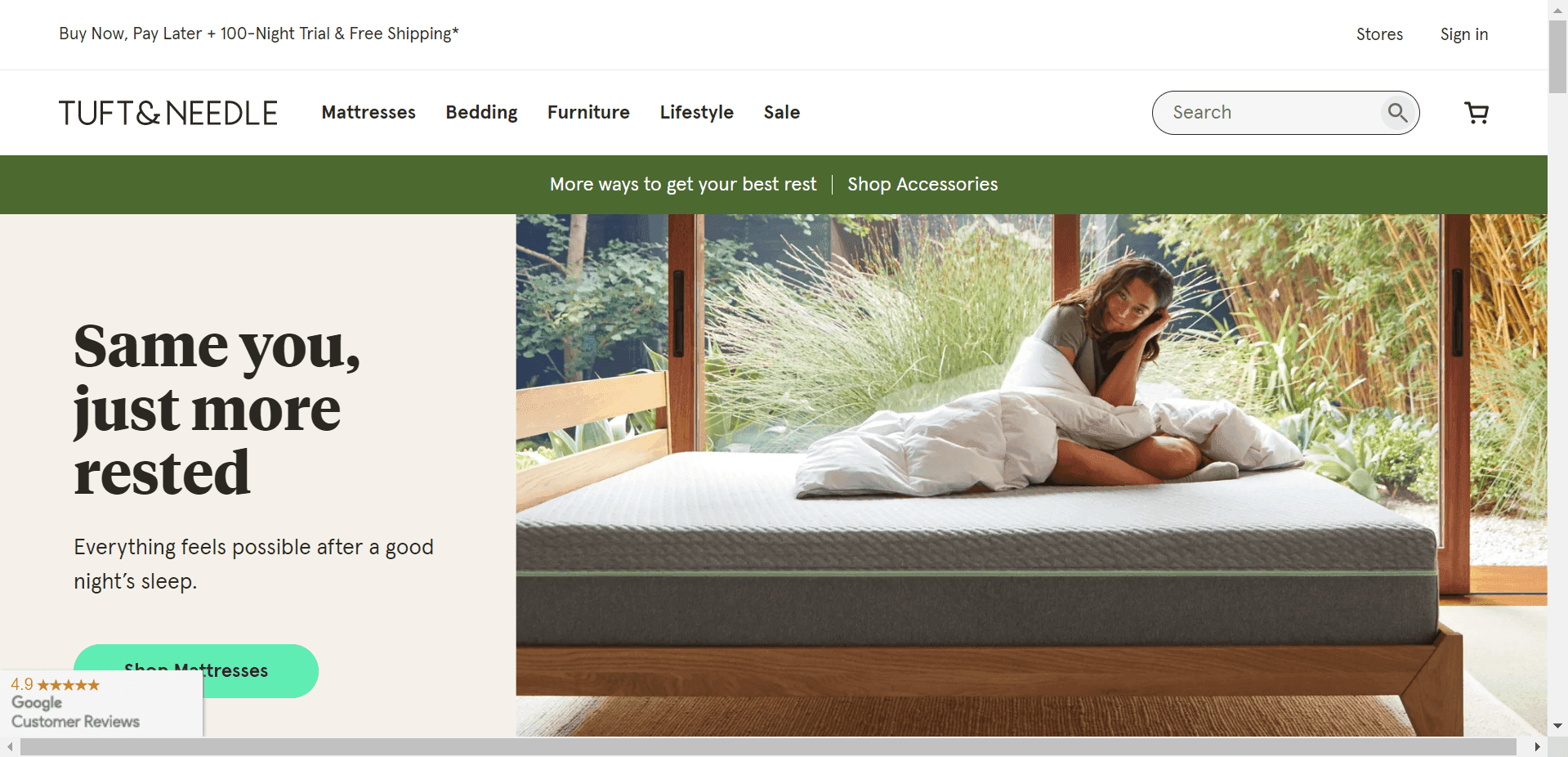
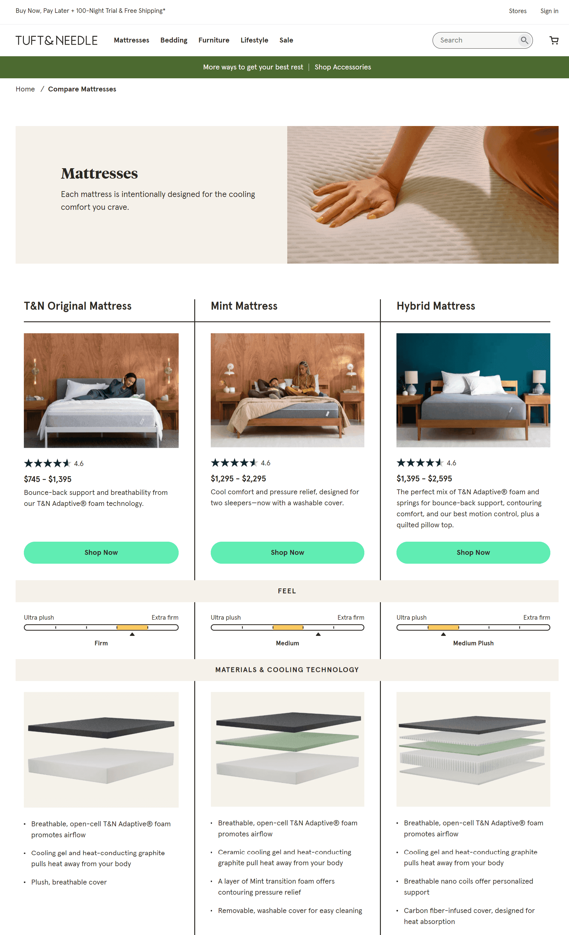
First arriving in 2012, Tuft & Needle is part of a group of direct-to-consumer mattress companies offering a quality product and an alternative to the traditional mattress product and purchase process. This particular page was reached following a Google search for "Tuft & Needle mattresses", is a product category page within the broader T&N website and is focused on educating visitors about the three different mattresses offered.
Let’s take a look at how this e-commerce product comparison is structured and lessons we can take from their work.
First, get a feel for their conversational and innovative brand with a quick explainer video.
Visual
Some products lend themselves to online photos. Others do not.
Mattresses traditionally were something you’d lay on at a store (gross) and try to guess if it’s actually comfortable or not. So, how do you sell mattresses online?
Tuft & Needle attacks this product interaction issue with a mix of contextual product photos and close-up shots of specific features.
The focus here becomes more on the comparison between models as opposed to if any of them would actually fit your needs -- really smart.
Tuft & Needle includes a LOT of product details on this page, but because they’ve allowed the page to be about five scrolls long, there is plenty of space to fit things without feeling overwhelming at any point.
Landing pages work differently depending on the brand. In this case Tuft & Needle knows common FAQs that need to be addressed.
They’ve even deployed collapsing copy blocks to include a frequently asked questions section. This is a great way to fit a large amount of information (specifically paragraphs on a page that’s designed to encourage efficient conversion) in a small space.
Messaging
What kind of sleeper are you?
Tuft & Needle’s research seems to have resulted in qualitative data saying there are several categories of features that matter to people when it comes to their mattress experience. And while you may not know what “Adaptive foam with graphite and cooling gel” is, they’re willing to help you understand.
Using tooltips to explain complex (or proprietary) product features is a great way to get conversational and, again, not overwhelm all visitors with information if they don’t need it.
Tuft & Needle offers succinct copy points to answer questions about things like firmness, edge support and cooling features. Notice how everything feels approachable (like a nice mattress).
Finally, Tuft & Needle recognizes that they’re asking people to change their typical mattress purchasing process.
To quell concerns, they present an easy-to-follow set of on-brand icons highlighting their answers to a few common customer service needs.
Forms
Visitors who decide Tuft & Needle has a solution for their sleep setup start an easy checkout page by selecting a simple, on-brand button for a mattress option.
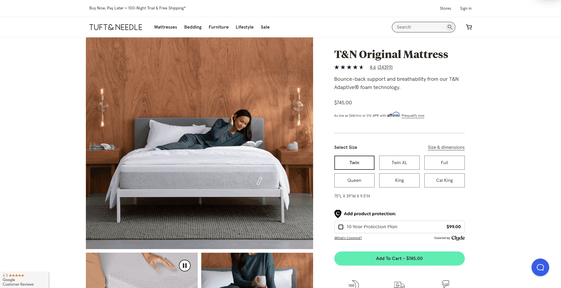
A few things to note here on this form setup.
The visitor can either select their mattress size upfront or do this later in the process. Similar to Shopify’s signup process, this encourages the initial action and gets the visitor engaged in the process.
Notice the CTA language used. “Shop now” makes the visitor feel like this is a process where you’ll select your specific mattress. It also separates the experience away from “Buy now” which would potentially discourage some new customers from clicking through.
Tuft & Needle chose to highlight their alternative payment method (and approximate cost per month) upfront. This is a great way to share your payment capabilities and open up to a much broader audience.
Tuft & Needle also does a great job of providing ample upsell options during the checkout process.
Things that you may not otherwise consider, like antimicrobial protection, are offered for a relatively low cost with clear value proposition language provided.
Bonus
What about landing page design for holidays?
If you're considering creating specific holiday season campaigns and don't want to work with a landing page designer, simply treat it like any other effort—create a compelling combo of great copy and imagery.
If I were in digital marketing for Tuft & Needle, I'd focus on the benefits of getting great sleep during the holiday season. And then I'd use a landing page designer or a powerful tool to pull together a concise page with all the normal benefits.
Professional Services: Upwork
Brand & Landing Pages
When first going to find a freelancer, many businesses have a specific need they’re looking to fill.
Upwork’s landing pages provide quick potential solutions to these needs to pull customers into their vast network’s talent options.
Because Upwork’s freelance network includes everything from copywriting and web development to customer service and accounting, their landing pages must balance specificity with overall value proposition enough to convert a broad visitor demographic.
Visual
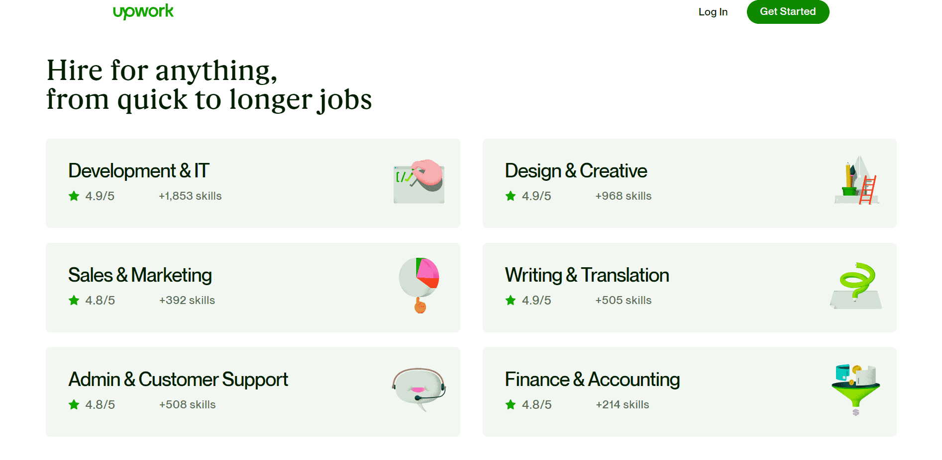
One of the first sections of the page is dedicated to quickly explaining that Upwork has talent available to fit your needs, no matter your company or project size.
How does their website landing page design play a role? The answer is twofold.
First, Upwork shows they’ve worked to help some of the biggest companies in the world by using a logo bar.
If you have the opportunity to include examples of your customers on a landing page, do it. Even if they’re a small business, it helps build a real-world connection to the brand promises you’re making.
Second, Upwork confirms that they can help you with everything from a one-off project to a long-term relationship with a full-time contract. This is a vital point for them to make and prevents visitors from abandoning simply because they assume Upwork is only for one or the other.
As we’ve seen across all three brands, notice how the contrast of on-brand color draws attention to certain elements. These elements are generally either key messaging points or a call-to-action button.
If you were using an eye-tracking program, you’d likely see visitors jump from one point to the next that uses this color.
Here, Upwork offers a powerful section of example freelance talent and leverages their contrast color to allow visitors an actual step forward in signing up with, “View Profile.”
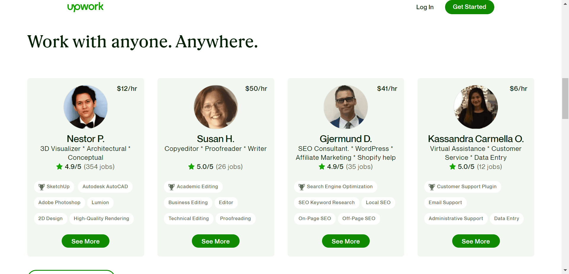
The other element worth noting in this freelance example section are the high-quality photos used. This is another way Upwork can build trufst with its potential customers. Highlighting real people with real talents who can actually be booked via Upwork proves that this is an actual solution to your business needs.
Messaging
As we saw with Shopify, there is a clear flow of information provided as you navigate down the page. Good copy attacks any concerns customers may have in an increasingly specific format—starting with the most common question of all.
If we were to break down the page sections by the questions they answer for the visitor, it would look something like this:
What does Upwork do?
Does Upwork offer solutions for my need type?
What are some examples of the type of services available?
What is required of me to find a freelancer on your network?
In a more generic format that you can apply when creating landing pages, this might be:
What value does our brand offer?
Who is our product or service best for?
What are some specific product features that help this audience meet their needs?
How do people gain access to our product or service and at what cost?
If you can answer these questions for your customers in an efficient manner, you’re off to a pretty good start.
Forms
Upwork’s website forms are a great example of being flexible and providing more than one option depending on how you'll generate leads. A great landing page is flexible in how it speaks to a potential customer, offering relevant content while explaining how your product or service works.
Depending on your form builder’s limitations, having more than one type of form is a great way to connect visitor needs with the desired action. Using the quantitative data gained from two form options will allow Upwork to optimize even more strategically.
Option 1: Inside the profile
If a visitor engages with the “View Profile” section, they’ll see the selected freelancer’s profile alongside a signup form. Upwork is simply asking for an email address or to sign in with Google to see the profile.
From a marketing perspective, Upwork is granting access to their network with one piece of information knowing they can come back around later with an email drip series or on-site notifications to encourage signing up for a more premium level plan.
This form captures those visitors who are ready to rock with a specific project or at least want to see what it’s like to move into contacting a specific freelancer.
Option 2: General signup
The other signup option is located in two places on the page. At the top of the page we see a button labeled “Get Started” which links down to the form at bottom of the page, seen in the second image.
This is a great way to keep the visitor on the page and still encourage the conversion. This form looks much like the one provided inside the freelancer profile aside from the language used. This time, we get a broader CTA encouraging the visitor to “Sign up for free project quotes.” Using keywords like "Free" or phrases like "No credit card required" are good ways to increase conversion rates when creating landing pages.
What does this message do? It removes the stressful idea of searching a freelance database, providing a bunch of project information or any risk in signing up for a subscription. We’re just getting free quotes.
Conclusion
We hope you have some strategies to take into your conversion rate optimization. Though each of these three top brands goes about things in a different way, much remains the same. They offer clean design inspiration with plenty of space for copy to breathe, clear CTAs, and forms with a compelling offer.
As you head into optimizing your own pages, don’t get overwhelmed by the potential changes you could make.
Do one thing at a time and before you know it, you’ll have a high-converting, revenue-generating machine.
Looking for free landing page design inspiration? Check out Dribbble's great collection of examples. And for more channel-specific options like Instagram landing page examples, check out Sprout Social's list.
[Editor's note: None of the aforementioned brands participated in this analysis. All screenshots were taken during the time period Dec. 11-15, 2020]
Lucky Orange