Blog
Conversion Rate Optimization
Landing Page Heatmap Analysis For High-Growth Websites
Optimize landing pages with heatmap data using our comprehensive guide to identify user patterns, fix issues, and create higher-converting experiences.
Lucky Orange

Landing pages are one of the most effective tools for digital marketers. Whether you’re driving clicks from ads, capturing leads, or highlighting an e-commerce product, the ultimate goal is always the same—conversion.
But how do you know if your landing page is truly connecting with your audience? Traditional analytics like Google Analytics only tell part of the story. That’s where heatmaps come in.
Heatmaps turn complex data into simple, visual insights, showing exactly how visitors interact with your site. They help answer key questions like:
Which buttons or images grab attention?
How far are users scrolling, and what content are they skipping?
What keeps them engaged—and what makes them leave?
Are interactive elements like pop-ups or menus working as intended?
With a website heatmap, you can uncover hidden visitor behavior, pinpoint areas for improvement, and implement changes that boost conversions and ROI. Stop guessing—start improving your landing pages today.
What Are Landing Pages and Why Do They Matter?
The Many Types of Landing Pages
Landing pages are a great way to boost conversions and meet different business needs. That’s why so many websites use them. But to get the best results, they need to be well-designed. Here's how landing page contribute to a variety of business goals:
PPC Pages: Built to turn ad clicks into conversions fast.
Lead Generation Forms: Collect emails or other information in exchange for something valuable like an eBook, free trial or website audit.
Log-In Pages: Seamlessly guide existing users into your platform or community.
Sign-Up Pages: Perfect for capturing newsletter subscriptions, demo bookings or service sign-ups.
Sales Pages: Showcase a single product with a compelling pitch to engage and convert website visitors. This typically leads to a checkout page.
Product Launch Pages: Create excitement for new releases by highlighting key features and benefits.
Referral Pages: Encourage users to spread the word with irresistible incentives.
Content Hub Pages: Organize resources—like articles, videos or guides—in one user-friendly place.
Coming Soon Pages: Generate buzz for upcoming launches while collecting leads.
Event Registration Pages: Simplify the process for attendees to sign up for events like webinars or trade shows. Clear ticketing information on these pages also helps potential participants understand pricing, seating options, or access levels, reducing confusion and improving overall conversion rates.
Your landing page is often your one chance to make a great impression. A poor design or unclear messaging can derail your marketing efforts and waste valuable ad spend.
Even if your landing page looks polished—with user-friendly design, strong calls-to-action (CTAs) and compelling copy—it might still struggle to convert. The reason why isn’t always obvious.
Optimize Your Landing Pages with Heatmap Insights
Optimizing your landing page becomes much easier with website heatmaps. These tools reveal precisely where visitors are clicking, stopping, or experiencing difficulties, providing you with clear insights into what’s effective and what needs improvement. By leveraging this data, you can make informed adjustments to enhance user experience and convert more visitors into customers.
Understanding Heatmap Tools
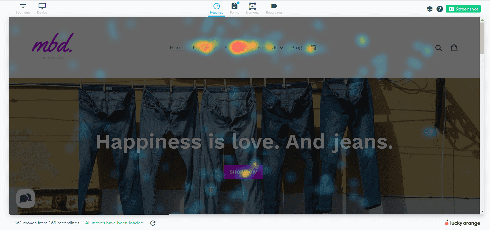
A website heatmap offers a visual representation of visitor engagement on your web page. It compiles all user interactions on a single page, revealing behavior patterns and trends.
Unlike session recordings, which track individual user journeys and show how a specific visitor navigates your site, heatmap tools offer a broader, high-level view of all visitor interactions across your website. By visually representing where users click, scroll, or spend the most time, heatmaps simplify the process of spotting trends and identifying opportunities for enhancement. This can help you optimize layouts, refine calls-to-action, and ensure your site effectively meets user expectations.
You can gain deeper insights by segmenting data from specific groups—whether by referral source, UTM parameters, geographic region, device type, or visit frequency. This level of analysis provides the insights needed to efficiently tailor your site for maximum user interactions, engagement, and conversions.
Types of Website Heatmaps
Website heatmaps are essential tools that provide a visual representation of user behavior, and they come in four primary types: Click, Scroll, Move, and Precise Interaction heatmaps.
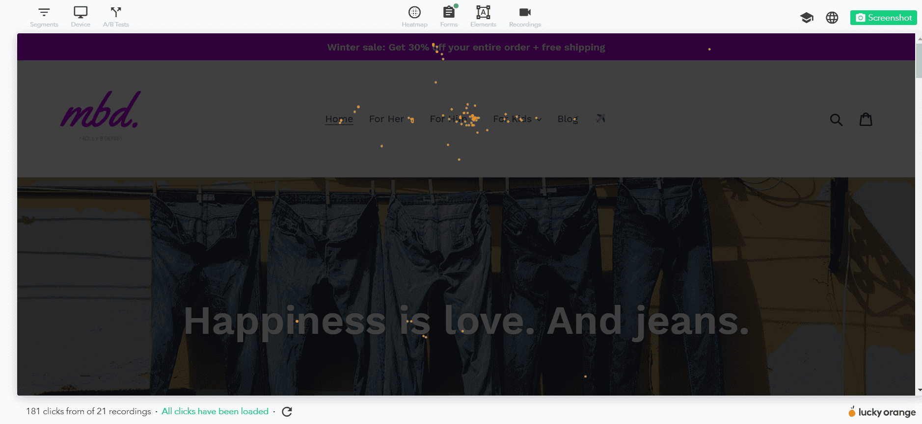
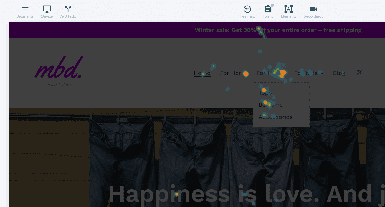
Click heatmaps show where users are clicking on a web page, highlighting popular clickable elements and identifying areas of interest or distraction. This type of heatmap is invaluable for understanding which buttons or links are attracting attention and which areas might need redesigning to improve user engagement.
Scroll heatmaps reveal how far visitors scroll down a page, helping you understand whether key content is being viewed or if it's buried too low. This type of heatmap is crucial for assessing the placement of important information and calls-to-action.
By analyzing scroll heatmaps, you can ensure that visitors are reaching the content that matters most for conversion optimization.
Move heatmaps track mouse movements, offering insights into user engagement by showing where visitors linger or hesitate. This can help identify usability issues or areas that capture attention. Understanding these movements can lead to improvements in user interface design, making the site more intuitive and engaging.
Finally, Precise Interaction heatmaps provide a more detailed analysis of user interactions, including clicks, hovers, and form field engagement. These heatmaps offer a comprehensive view of how users interact with specific elements, allowing for targeted improvements and a deeper understanding of user behavior on your landing pages.
Why Dynamic Heatmaps Are Better For Studying User Behavior
Static heatmaps only capture a single snapshot of user behavior, limiting your view to interactions with static elements and leaving pop-ups, drop-downs or hover-over menus out of the picture.
This one-dimensional approach fails to provide a complete understanding of how users engage with your site.
Dynamic heatmaps from Lucky Orange, however, go beyond the basics. They track and visualize every interaction on every element of your landing page—whether it’s static or dynamic.
For example, a static heatmap only shows how users interact with the top level of your main navigation. A Lucky Orange Dynamic Heatmap allows your analyze all interactions on the navigation drop-down as well.
Or if you use a hero carousel, a static heatmap will only show how people interacted with the first image whereas a dynamic heatmap allows you to analyze engagement across all images and CTAs within your carousel.
This deeper level of analysis offers actionable insights, especially for websites with advanced functionalities or responsive designs.
By delivering a more accurate picture of what visitors experience, dynamic heatmaps ensure you can make smarter data-driven decisions to optimize your website. Static heatmaps simply can’t compete with the clarity and value dynamic heatmaps provide.
Why Lucky Orange Is the Ultimate Heatmapping Tool for Landing Pages
Your landing page’s success often hinges on having the right heatmapping tool—and Lucky Orange delivers in every way.
It provides a clear, visual breakdown of how visitors interact with your site, without unnecessary complexity. With dynamic heatmaps, it tracks every action—clicks, scrolls, hovers, and more—even on interactive elements like pop-ups and dropdown menus.
No need to juggle multiple tools or guess what went wrong—Lucky Orange simplifies the process. Its filtering options let you analyze data by device type, traffic source, or visitor frequency, ensuring you get actionable insights tailored to your needs.
Beyond Dynamic Heatmaps and Session Recordings, Lucky Orange goes a step further with Live Chat, Surveys, Form Analytics and more. You can engage visitors in real-time, ask targeted questions, or offer immediate assistance.
This pairing of real-time feedback with heatmap data gives you a full picture of not only what users are doing on your site but why they’re doing it.
For marketers, this level of insight is invaluable—it empowers you to resolve issues quickly and confidently.
Lucky Orange also shines with its intuitive dashboard and budget-friendly plans.
It’s easy to set up and designed to provide actionable data without overwhelming you.
If you want a tool that captures real visitor behavior, includes session recordings, and helps boost conversions, Lucky Orange is an unbeatable choice.
It’s built for marketers who need results, not guesswork.
How to Use Website Heatmap Data to Transform Your Landing Pages
Step 1: Understand Your Web Page Audience
Unlock powerful insights by analyzing demographics with tools like Google Analytics, your dashboard or advertising platforms. Focus on key data points such as:
UTM parameters and referring sources
Top regions, languages, browsers, device types and operating systems
Time on site and average pages per session
This data helps you refine your heatmap analysis to identify areas for improvement. For instance, low time on site paired with minimal engagement could signal a mismatch between your audience and the content or CTA on your landing page.
With this understanding, you can make data-driven adjustments to boost conversions and create a better experience for every visitor.
Step 2: Choose Your Landing Page
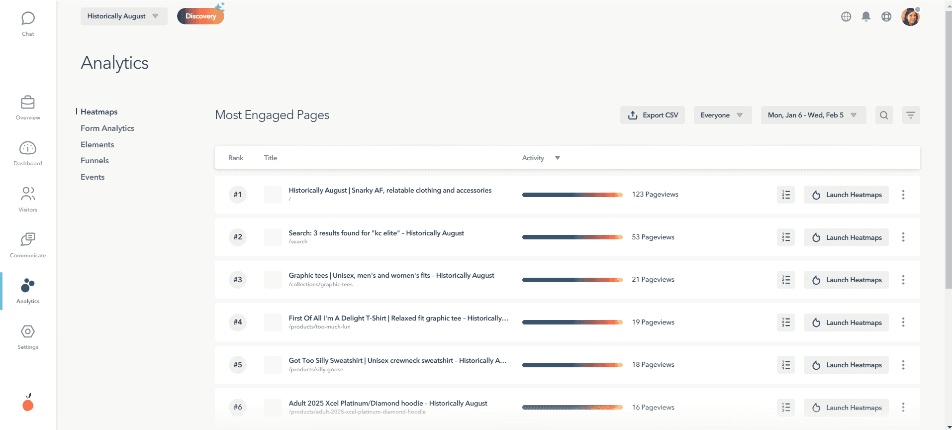
In Lucky Orange, open Analytics and locate your landing page of choice.
When ready, launch your website heatmap to dive deeper into what people are doing on a particular web page—by default, it starts as a click heatmap.
Step 3: Choose Filters To See A Specific Audience Segment
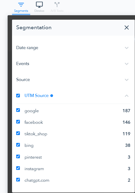
Now it gets exciting. Within Lucky Orange Dynamic Heatmaps, you can refine your view to unlock the most valuable insights. Adjust the heatmap type, apply filters and see exactly how user behavior changes based on device type or traffic source.
Using the audience insights you gathered in Step 1, focus on the data that matters most to your goals:
Ad traffic performance in your top region: Use filters for UTM Source and Region to zero in on high-priority traffic.
Returning visitors engaging with your CTA: Apply a Visit Number filter and exclude "1" to analyze only returning visitors who are ready to convert.
Mobile users’ experience: Switch the Device Type filter to mobile. Watch how your landing page looks and performs on smaller screens so you can make targeted improvements.
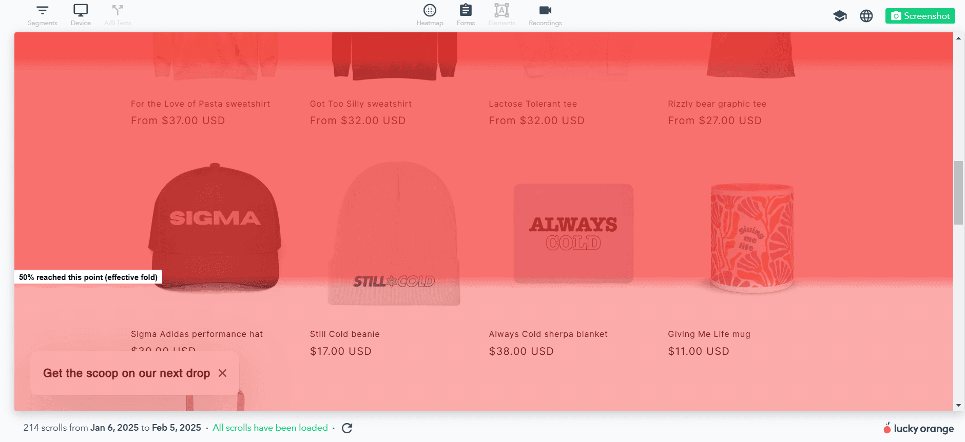
Step 4: Analyze Heatmap Data
With heatmaps in hand, you can quickly identify patterns and outliers. Here’s how they can help:
Click Analysis: Are visitors engaging with your CTAs or wasting clicks on non-interactive page elements? See exactly how they navigate and uncover opportunities to guide them where you want them to go.
Scroll Depth: Are visitors reaching critical information below the fold or is your CTA buried too low? Understand how far they scroll and make adjustments to keep them engaged.
Hover Tracking: Find out where visitors linger and what grabs their attention. Are they engaged or is something missing?
Use the Screenshot button to download a screenshot of the heatmap tool for your records or to share with your team.
Step 5: Follow The Visitor Journey
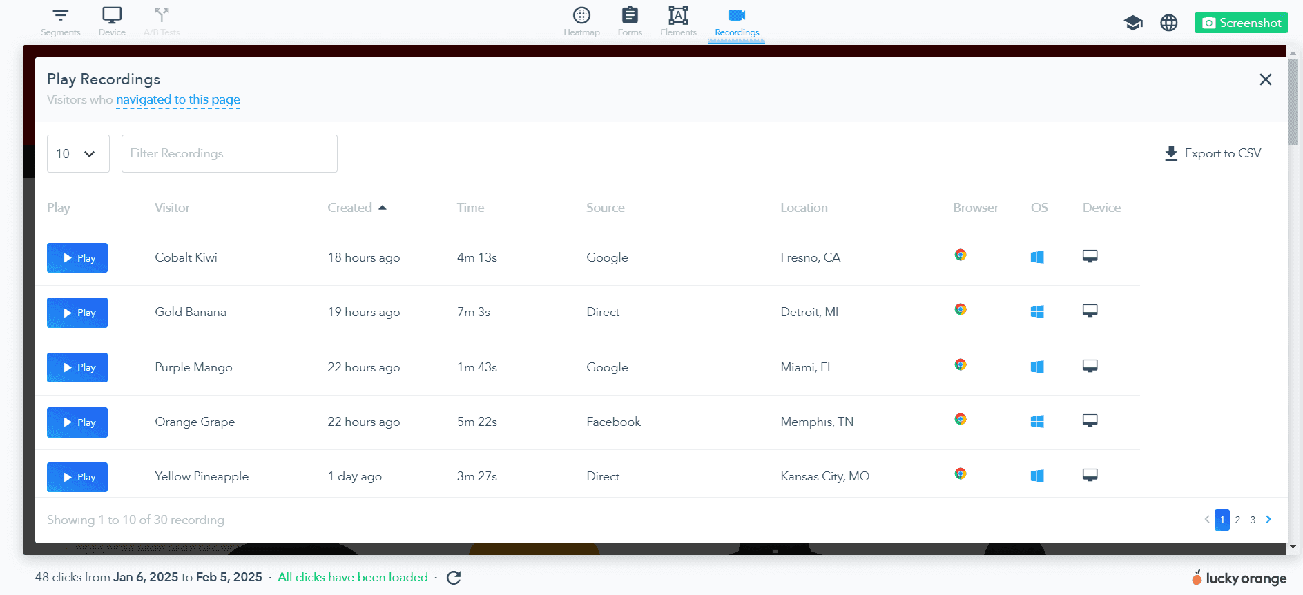
Start with website heatmaps as your foundation and seamlessly transition to session recordings to understand what visitors did before and after a click or interaction.
Here are two ways to see session recordings directly from your heatmap tool:
Use the Recordings tab. At the top of your Lucky Orange heatmap, click on the Recordings tab. Instantly access a list of visitor recordings filtered by your selected criteria, showing how people interacted with your page.
Click on an element. Once clicked, you’ll access detailed analytics for that specific element. From there, watch recordings of visitors engaging with that specific element to uncover behavioral patterns.
Step 6: Test & Refine
Identify problem areas and turn them into opportunities for improvement.
Relocate an underperforming CTA button to a more visible spot and track how visitors interact with it.
Revise your content to highlight key information at the top of the page, ensuring visitors see what matters most.
Simplify your landing page navigation for a more personalized experience tailored to your audience.
Put your hypotheses to the test by running A/B tests. Use website heatmaps to monitor how changes impact visitor behavior in real-time, refining your strategy as you go.
Don’t have the traffic for A/B testing? Implement updates on the page and refine the heatmap by date range to compare behavior data changes over time.
Step 7: Monitor Results
Heatmaps are a powerful tool in your website optimization arsenal, especially when used as part of a regular improvement process.
Re-deploy heatmaps to track pre- and post-optimization performance to give you clear insights into the impact of your changes. See how behavior evolves over time and use this data to scale your optimization efforts effectively.
Heatmaps in Action: Real-World Success Stories
Website heatmaps have revolutionized the way businesses optimize landing pages, turning them into high-performing conversion tools.
Across industries, companies are leveraging Lucky Orange dynamic heatmaps to drive measurable results. Here are two of their stories of success:
Runway Health: Elevating User Experience
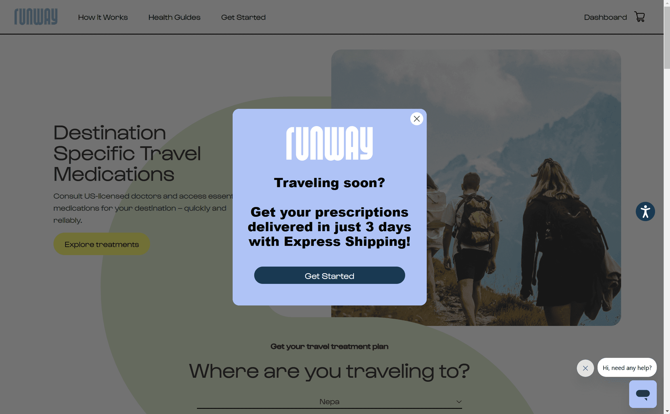
Runway Health, an e-commerce brand specializing in beauty and personal care products for diverse skin types, aimed to enhance the user experience on its landing page. By utilizing Lucky Orange heatmaps, they gained detailed insights into visitor behavior—identifying areas where users hovered, clicked and scrolled the most.
This data fueled their optimization strategy. Runway Health revamped their page design to focus on key engagement points like form submissions and CTA interactions.
By comparing heatmap data throughout the process, the team was able to track the impact of changes and measure improvement in conversion rates.
The outcome?
Heatmaps enabled them to streamline the customer journey, resulting in a more intuitive user experience and increased conversions. Lucky Orange helped this B2C brand thrive in a competitive market.
Celerity India Marketing Services: A/B Testing Meets Landing Page Optimization

Celerity India Marketing Services, a digital marketing and content generation agency, leveraged Lucky Orange’s powerful heatmaps alongside A/B testing to drive results for a B2B ad campaign.
By running an A/B test, the team identified which landing page variant delivered higher conversions. Heatmaps provided detailed insights into user engagement across that particular page, allowing them to pinpoint exactly how behavior improved with each iteration.
Together, these tools created a data-driven approach to optimizing landing pages and enhancing user experience.
The outcome?
The client’s ROI skyrocketed, quadrupling over a two-month campaign that was fine-tuned for success using Lucky Orange. Check out the full breakdown of the test results.
Best Practices for Using Heatmaps to Boost Conversions
Heatmaps can significantly improve your website's performance, but teams that get the most value out of them follow a structured process.
Instead of randomly searching for insights, these teams analyze specific audience segments to identify meaningful patterns.
They focus on key areas like click trends, scrolling behavior, and points of user friction, documenting their findings step by step. Most importantly, they have a clear plan for sharing insights and taking action. With this approach, heatmaps become more than just a tool—they become a driver of smarter decisions.
Focus on High-Value Areas: The call to action (CTA) is the most important element of landing page design. It’s what gets visitors to complete your desired action. As such, your CTA button needs to be placed on the right spot on the page and stand out from the rest of the page content. Your landing page conversion rates may be low because your CTA is either hidden in plain sight or unconvincing.
Contrasting the button color of your CTA button makes it visually pop out from the background color of the landing page. Additionally, enlarging or moving it higher up on the page will make it stand out from the rest of the page.
The text of the CTA is crucial. Don’t be coy or clever. Be obvious and upfront.The CTA copy “Join for Free Download”, for example, clearly states what the visitor is expected to do and what they can expect in return. On the other hand, using “Free Download” and then asking for the user’s contact information will make the user think twice about pushing through.
In addition, the number of CTAs also affects conversion rates. A study by Unbounce found that focusing visitors’ attention on one direct CTA led to higher landing page conversion rates than landing pages with multiple CTAs.Spot Low Engagement Zones: Identifying low-performing areas is just as important as highlighting hotspots. These zones reveal gaps and opportunities for improvement that can transform your page.
Use Segmentation for Deeper Insights: Break down heatmap data by audience type (like new vs. returning website visitors) or traffic source (organic vs. paid) for actionable takeaways. For example, Runway Health uncovered referral trends that helped them optimize ad spend for maximum ROI.
Start with Click Heatmaps: Begin by analyzing where users are clicking most—on CTAs and other key elements. Then, dig deeper with scroll and movement heatmaps to see where users linger and lose interest.
Turn Data into Action: Heatmaps are only valuable if you act on them. Reduce clutter, reposition content or tweak your layout to capitalize on what’s working and fix what’s not. Quick wins are just a few adjustments away.
Combine with Form Analytics for a Full Picture: The goal of your landing page is to get the users to share their contact information. The lead capture form is what is used to collect customers’ information.
People are increasingly sensitive about the information they share online. They are easily turned off by forms that ask for unnecessary information or submission forms that take too long to fill. To improve your chances of sealing the deal, reduce the fields in your lead capture form.
Optimizing your forms in this way will undoubtedly increase conversion rates. But you also want to increase the quality of leads. Using a multi-step lead form will help you achieve this.
Breaking up the lead capture form is less overwhelming for visitors and leads to 87% higher conversion rates. Multi-Step forms are effective because people are more likely to complete the form once they’ve committed to the first step.
After the lead capture form is submitted, send a follow-up email. Effective follow-up emails are powerful customer retention tools that encourage repeat business. If they are not part of your email marketing campaign efforts, you’re losing sales every day.Commit to Continuous Improvement: Optimization isn’t one-and-done. Regularly revisit your heatmap tool to stay ahead of changing user behavior and keep improving your site.
Add in Qualitative Data: Quantitative data coupled with heatmaps are powerful in and of themselves, but qualitative data can add an extra layer of insight. Qualitative data often include surveys that ask open-ended questions to people as they are on a web page.
By following these steps and leveraging the right tools like heatmaps, you can drive meaningful improvements and achieve higher conversion rates.
Drive Conversions with Data-Driven Decisions
Heatmaps have transitioned from being a luxury for tech-savvy marketers to an essential tool for optimizing landing pages. They provide a clear visualization of user behavior, enabling you to prioritize impactful changes and move beyond guesswork.
The actionable insights gained from heatmaps can directly boost conversions.
For digital marketers focused on achieving exceptional campaign results, tools like Lucky Orange take the uncertainty out of optimization. Companies such as Runway Health and Celerity India have already demonstrated how heatmaps can uncover hidden opportunities to drive higher conversions.
Lucky Orange


