Blog
Conversion Rate Optimization
How Kindo Toys Increased Facebook Ad Conversions
Discover how Kindo Toys optimized their Facebook ad campaigns to reach their target audience, lower acquisition costs, and dramatically increase ROAS.
Lucky Orange

If you're seeing people click on your Facebook ads but not make a purchase, Lucky Orange tools can help.
We're going to take a deep dive into the UK-based Shopify store Kindo Toys. We’ll discuss three ways to use visitor behavior tools to analyze and optimize your Shopify store and Facebook ads while spotting issues that impact both your visitors and SEO.
Check out our complete website analysis of Kindo Toys on Youtube.
Follow your traffic to the right landing page
When you're optimizing Facebook ads a lot of people start with creating amazing graphics or targeting just the right audience. Both of these are very important but you can't forget about evaluating your Facebook links themselves.
Here are the ads Kindo Toys is running on Facebook:
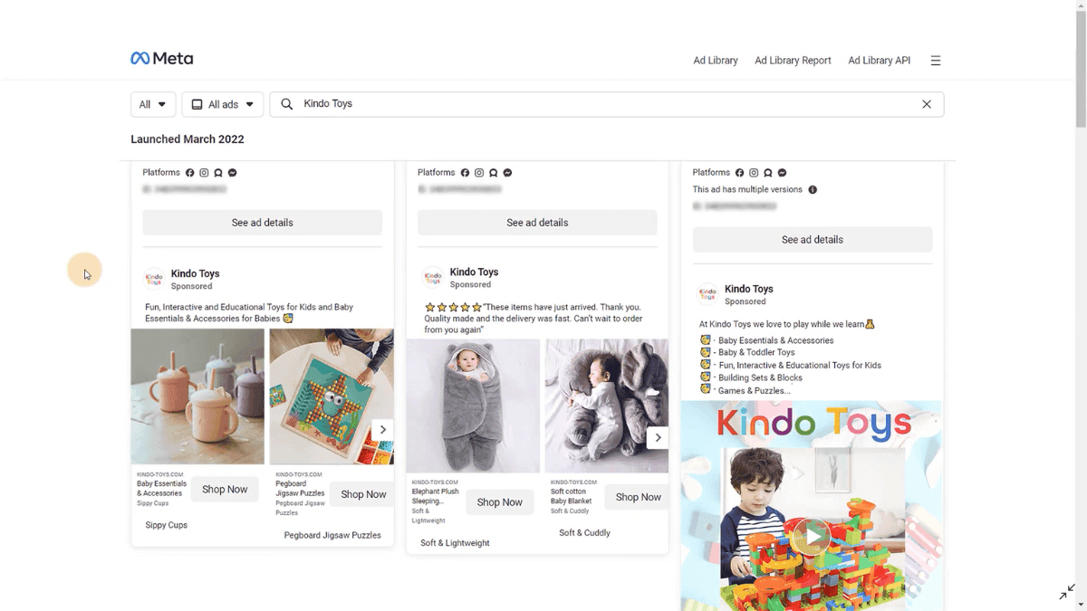
The first thing we notice is that there are no UTM parameters on any of the links. UTM parameters are snippets of code placed at the end of a link that help you accurately track and analyze traffic engagement.
Adding UTM parameters to all campaign links consistently helps with ongoing and back-looking analysis. You’ll be able to compare things like campaigns and entire traffic source performance over time.
In this instance we see that one of these great Facebook ads takes us to a product page—which is perfect. Ideally, we avoid sending paid traffic to something more generic like a home page or even a product category page. By sending people to a specific product page, we get them as close as possible to converting. You also can better align your ad copy and images with what they see on this specific page.
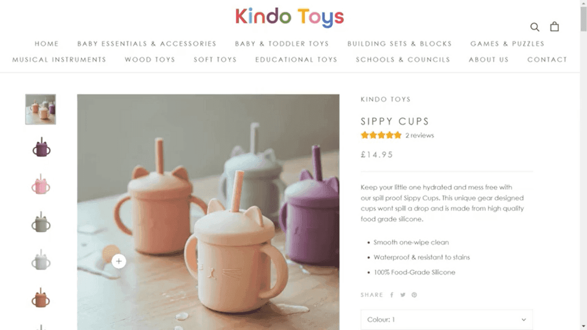
The problem, though, is that this particular product is currently sold out. And when this happens, you’re basically wasting your marketing budget sending people to a place where they can’t make a purchase—even if they’re ready and willing.
The takeaway here is to always monitor which products you’re currently promoting to avoid putting people in a dead end. If a product gets a lot of attention when out of stock, consider adding a secondary CTA to join a waitlist or a related products section to keep people interested and on-site.
But how do you know what your traffic is doing at a high level? The best place to start is a Lucky Orange Dashboard.
Monitor entire campaigns in one spot with a dashboard
In this dashboard for Kindo Toys, Facebook represents more than half of total traffic with most of that traffic coming from mobile devices. This is great information to have—allowing you to reasonably focus on mobile optimization.
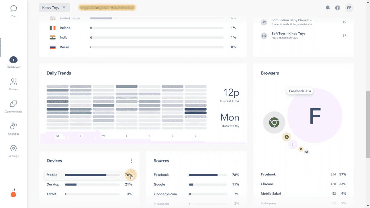
Next, we can look at top pages to see what’s getting the most attention on the store.
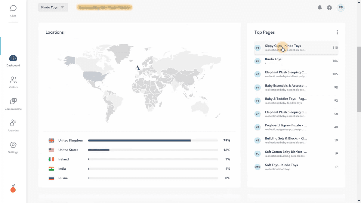
In this case, the top page is the out-of-stock sippy cup product page we saw featured in the Facebook ad. From here you may look to see what other traffic sources are driving people to this product, or if they’re finding it organically from elsewhere in the store. This will help you understand the full picture of how this product is performing.
Want to see what your Shopify store traffic looks like inside a Lucky Orange dashboard? Download our app for a free trial in the Shopify app marketplace.
What is your Facebook ads traffic doing after the landing page?
In the case of Kind Toys, this out of stock product might not be the end of the road for visitors. Because they have a great line of related products, people may very easily find similar options that fit their need.
This is where following your visitors throughout their entire journey comes in. You need to make sure the entire site is set up in a way that promotes exploration and removes barriers to conversion.
To perform this analysis, we’ll take a look at the Dynamic Heatmap for this sippy cup product page. This will show us where people are clicking, moving and scrolling. The brighter the color the more engagement each area of the page is getting.
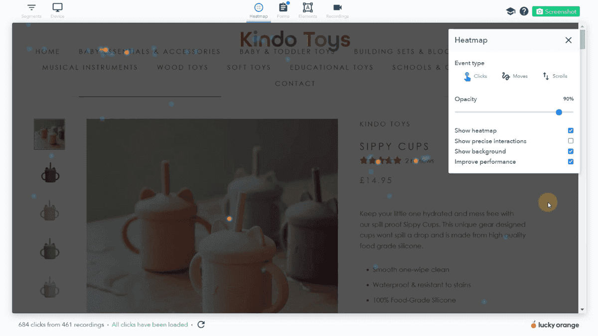
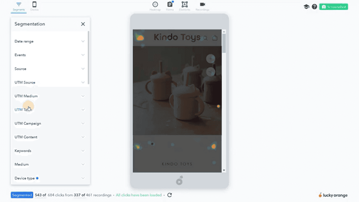
Since we know from the dashboard that most of the traffic is from mobile we’ll adjust the Dynamic Heatmap to display the mobile version. Here’s what mobile visitors see when they land on Kindo Toys:
Once they realize the product is out of stock, visitors are left with two options:
Search for a different product
In this instance we see a good amount of activity happening on the hamburger menu. Let’s dive in there to see what might be happening.
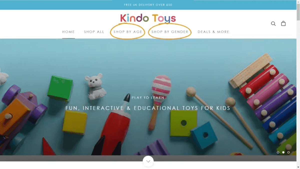
Make your menu simpler and more intuitive
Since we're using a Lucky Orand Dynamic Heatmap we can interact with the elements inside the menu itself.
Here we can see there are a lot of options in the main navigation and unfortunately there's very little engagement on other collections. So, visitors are clicking on the hamburger menu but they're not going much deeper into the store.
This tells us people are willing to browse the store even if the product they initially wanted is sold out but they aren't going to other collections or other products.
A lot of times people think the more options you give your customers the higher the chance they will convert. But it's not always the case there's due to the paradox of choice.
We know now that more choices will actually paralyze your visitors because you're giving them too much to look at and it can become really overwhelming—especially in this mobile navigation.
Do shoppers know the difference between products in baby/toddler toys and products in building sets and blocks? There’s clear crossover between these categories, so choosing from one over the other may cause confusion (and frustration) with visitors.
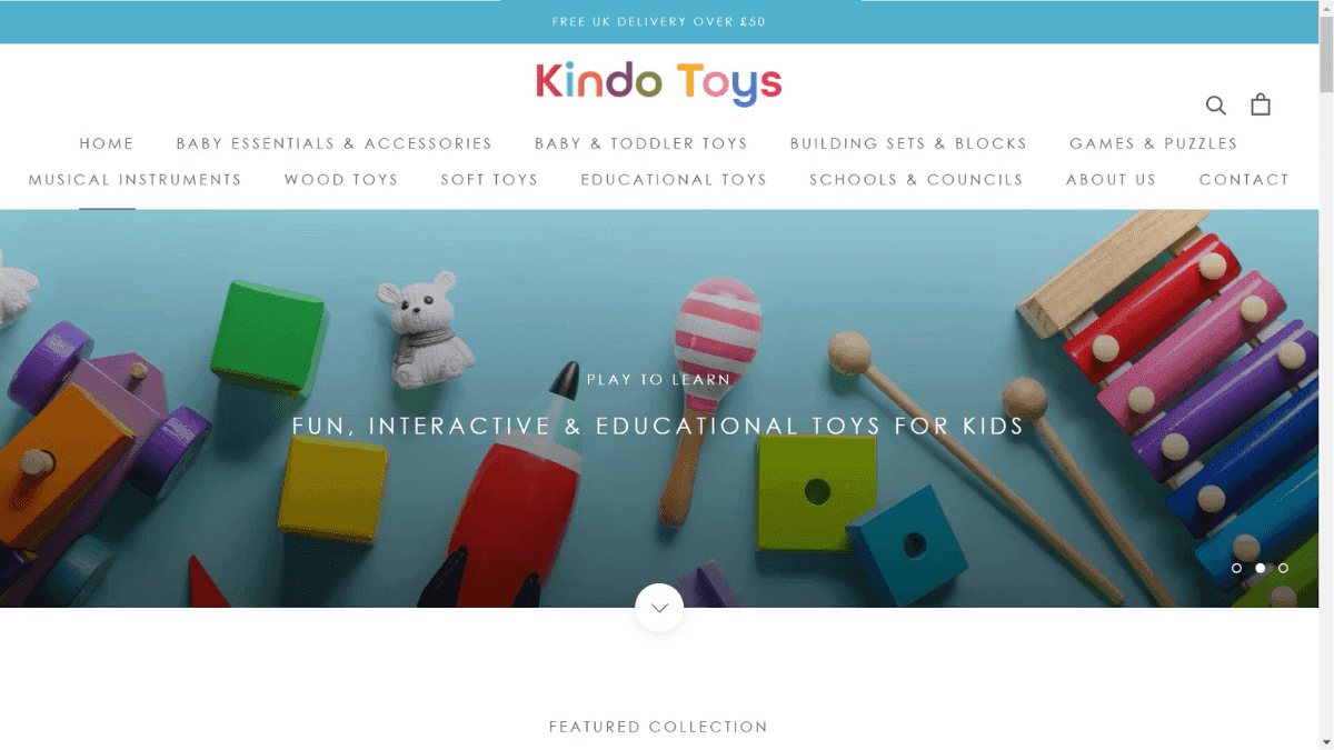
Simpler categories for this store type might be shopping by age or price range. You can even combine products under categories like sale items or seasonal or holiday-specific items.
Link what should be linked
Looking at a Session Recording on Kindo Toys, we can see someone interacting with the home page. They’re clicking on these trust statements located around the 75% scroll mark on the page.
While these trust icons look like text these are actually formatted as images instead and they aren't linked to anything.
From a user experience standpoint if you're on this website and are looking for maybe a shipping policy or you're trying to click on a trust mark maybe you're trying to just get more information on something—you would expect these to be linked to something. This could be to a blog post, help doc, or even a tooltip with additional information.
And since these just three images you can't highlight the text this leads to some accessibility issues. If you have a visual impairment and you're using a screen reader on this site you're actually you're not going be able to really understand or know what it says which is a problem.
The W3C publishes a list of guidelines called the Web Content Accessibility Guidelines or the WCAG. These guidelines a useful tool, especially for designers. They give you a really good look into things that you could do to improve your site and make it better for people with impairments. Using actual text is really crucial because screen readers will be able to pick up on that and provide that content to people with impairments.
How to apply this to your own website
So how can you use this advice for your own Facebook ads and on your website?
Analyze your Facebook ad links. Learn how paid ad traffic engages with your website and use a dashboard to keep a closer eye on things like top pages, top sources and device types.
Evaluate your product pages and main navigation on a regular basis using Dynamic Heatmaps. See where people are clicking and how far down the page they’re scrolling. This will help you find answers to your questions like what information are they missing on the page and what collections in your main navigation could you remove or condense.
Focus on user experience changes like using alt tags and text instead of images where possible.
Want to see what your Shopify store traffic looks like inside Lucky Orange? Download our app for a free trial in the Shopify app marketplace.
Lucky Orange