Blog
User Strategies
Low Conversion Rates: Causes and Solutions
Diagnose and fix the root causes of low conversion rates with practical solutions for improving UX, messaging, trust signals, and checkout processes.
Lucky Orange

Are you hoping to turn more prospects into customers? You're not alone. Many website teams face the challenge of a low conversion rate. The good news is that with careful planning and optimization, you can fix it.
Every missed website conversion is a missed chance for growth. Whether you run an ecommerce store, nonprofit, B2B business, or educational platform, a poor conversion rate can slow progress, drain your budget, and hurt your ROI.
But your conversion rate can improve.
What’s stopping your conversion rate from rising? Why do you have a low conversion rate instead of a high one?
It could be an unclear call-to-action, a slow website, or even targeting the wrong audience with your ad campaigns.
These aren't roadblocks—they're opportunities to optimize. By identifying and addressing these issues, you can unlock the potential for meaningful results and make low conversions a thing of the past.
What is Your Conversion Rate and Why Does It Matter?
Your conversion rate measures how effectively your website turns visitors into customers or leads. It’s a common metric for understanding how well your site meets its goals.
Whether you get 100 visitors a month or in an hour, understanding how many of them take meaningful actions helps you refine strategies and achieve measurable results.
Defining a Website "Conversion"
To understand conversion rates, start by defining what a conversion means for your website. A conversion is the key action you want visitors to take, and it varies depending on your goals.
The definition of a conversion depends on your industry.
For an ecommerce store, a conversion is a completed purchase. However, this isn't the case for all websites or landing pages. Here’s how different organizations may define conversions:
Nonprofits focus on financial donations as their main goal, while secondary conversions might include volunteer sign-ups or material donations like food or clothing.
Education organizations aim to generate leads through forms for prospective students and parents. They also use specific landing pages for alumni fundraising or selling apparel to fans.
B2B companies often prioritize free trial sign-ups as their main conversion goal. Secondary actions include scheduling demo calls, downloading content, or registering for webinars.
Ultimately, a conversion rate for your website depends on your business's specific goals and objectives. Identifying these goals is crucial to setting up effective conversion tracking and measuring success.
Average Conversion Rates and Benchmarks
You might feel confident in your website's conversion rate, but how does it actually stack up? Is it higher or lower than the industry average conversion rate?
Different sectors have different average conversion rates, and knowing where you stand can provide valuable insights.
The average ecommerce conversion rate will likely be vastly different than the average nonprofit conversion rate:
The average e-commerce conversion rate is around 2%, similar to education organizations.
B2B SaaS companies typically see rates closer to 1%.
Nonprofits achieve an impressive 16% average donation page conversion rate on desktop alone. Mobile devices generally resulted in a lower conversion rate.
Be Careful With Intermediate Conversion Rate Increases
Experiencing a low conversion rate can be frustrating, and it's tempting to celebrate any increase. However, not all conversions are valuable to your bottom line, and not every visitor is a potential customer.
In e-commerce, for example, a customer might add items to their cart (a key conversion point) but not complete the purchase. This issue can also affect other sectors:
B2B: A conversion might be someone signing up for a free trial or demo. But if they don't use the trial or respond to emails, the conversion rate doesn’t reflect true engagement.
Nonprofit: Conversions like donations or volunteer sign-ups are important. Yet, if volunteers don't respond to follow-ups, the conversion doesn't lead to real benefits.
Education: Student inquiry forms may count as conversions, but if they don’t lead to further interaction, the conversion lacks substance.
To ensure you're improving the conversion points that matter most, track not just initial conversions but also what happens afterward.
Set Clear Goals: Make sure your conversion definition aligns with your ultimate goals. For B2B, track not just signups but also active users. For nonprofits, track actual volunteer hours or donation commitments.
Monitor Engagement Post-Conversion: Use tools like automated emails or CRM systems to measure actions after conversion. Are free trial users logging in? Are volunteers attending training sessions?
Segment Your Conversions: Not all conversions hold the same value. Separate engaged leads from passive ones for better insights.
By analyzing your conversion metrics, you might discover a hidden low website conversion rate when you eliminate false conversions.
The next step is to understand what your visitors need and how to support them better.
Understanding Your Audience
Whether you're struggling with low conversion rates or optimizing a healthy one, understanding your audience and learning your user expectations is crucial. Knowing who they are, what they're looking for and their behavior on your site can help you craft an effective conversion strategy.
Using Behavioral Analytics Tools To Improve Conversions
Understanding how users, especially potential customers, interact with your website on their customer journey is critical to identifying friction points or where your website visitors drop-off in the process.
Use Lucky Orange Dynamic Heatmaps, Session Recordings and Conversion Funnels to optimize your website experience and better align it with your audience needs.
Dynamic Heatmaps
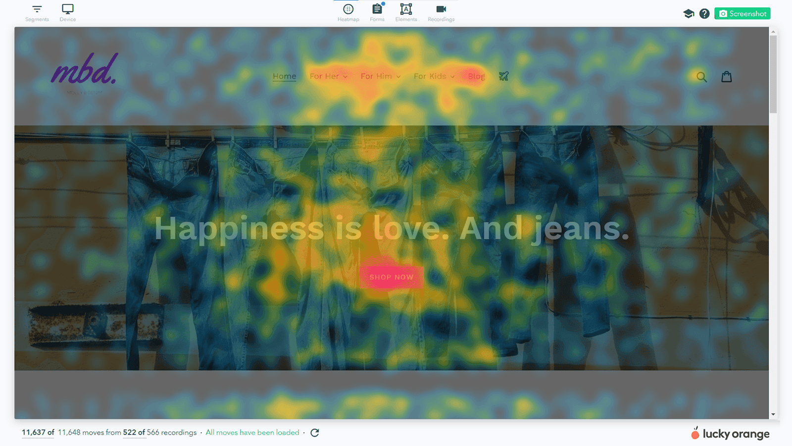
Get a clear, aggregated view of where users interact on your most important pages. Identify high-engagement areas to optimize for more conversions and low-engagement spots to refine your design or content placement.
Session Recordings
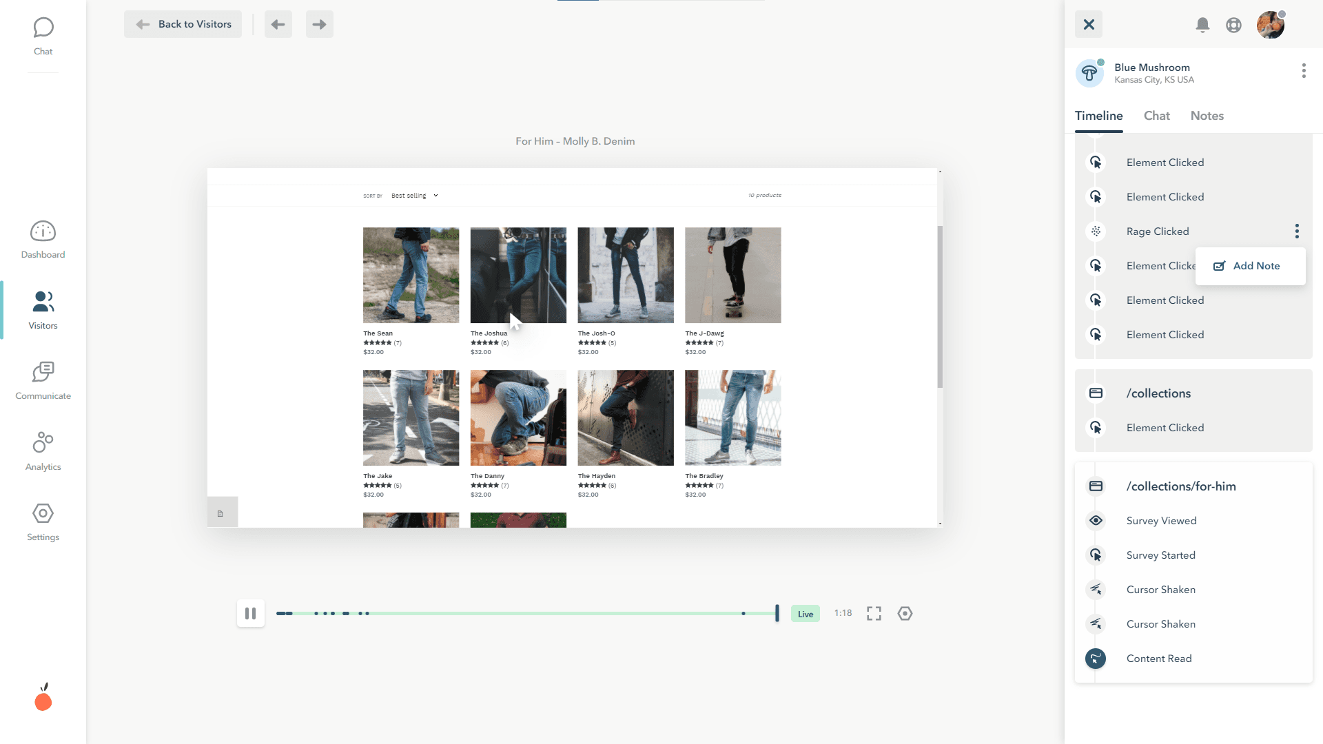
Watch recorded or live visitor sessions to see how users navigate and spot signs of confusion, hesitation or repeated actions that may signal usability issues. Filter your visitors using segments for a more efficient method of sorting and prioritizing session recordings.
Conversion Funnels
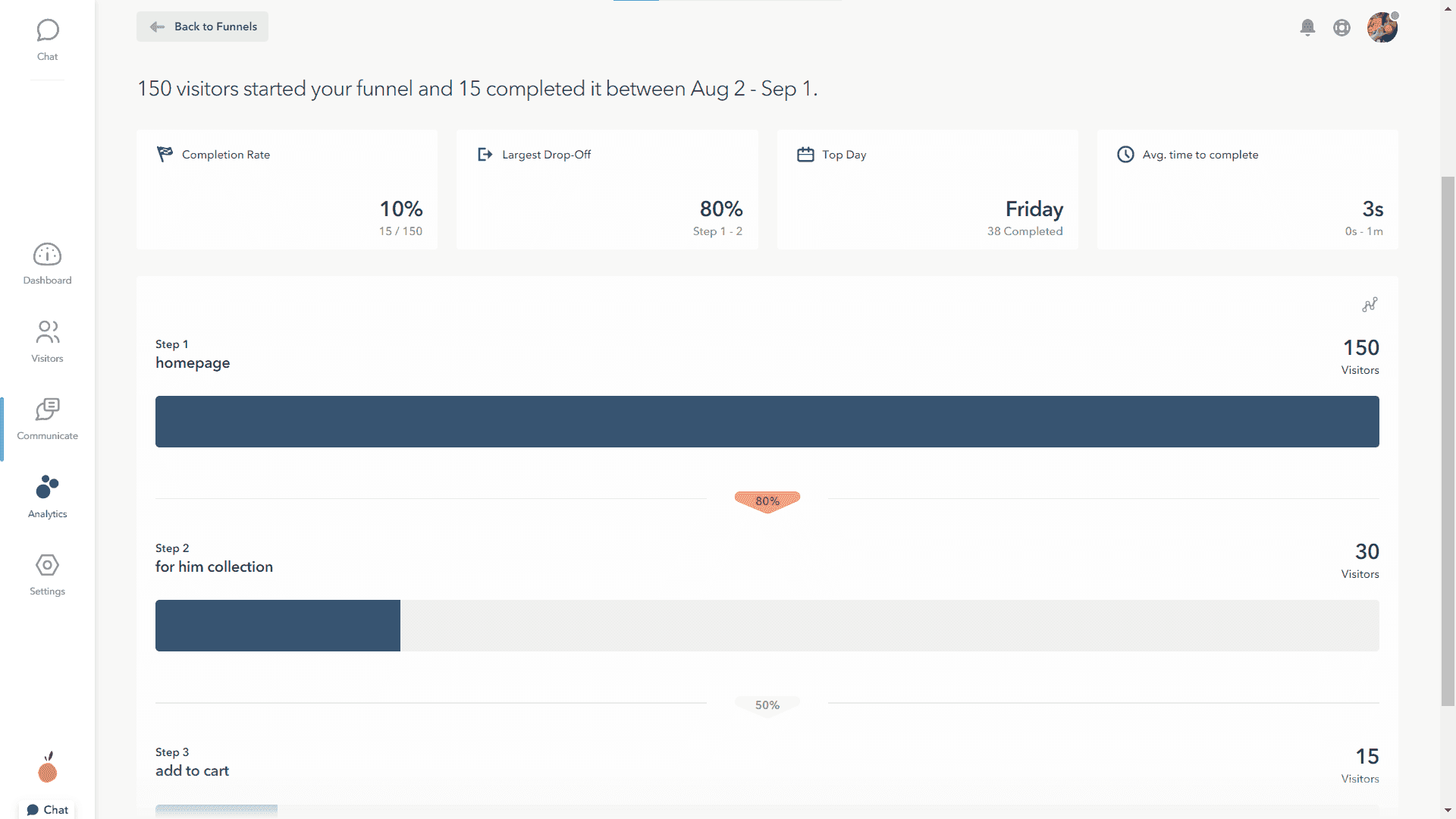
Set up a simple funnel for the navigation pattern you spotted using session recordings. Combine web pages and event triggers to identify key touchpoints and behavior trends that impact conversions.
Real-World Example from a B2B SaaS
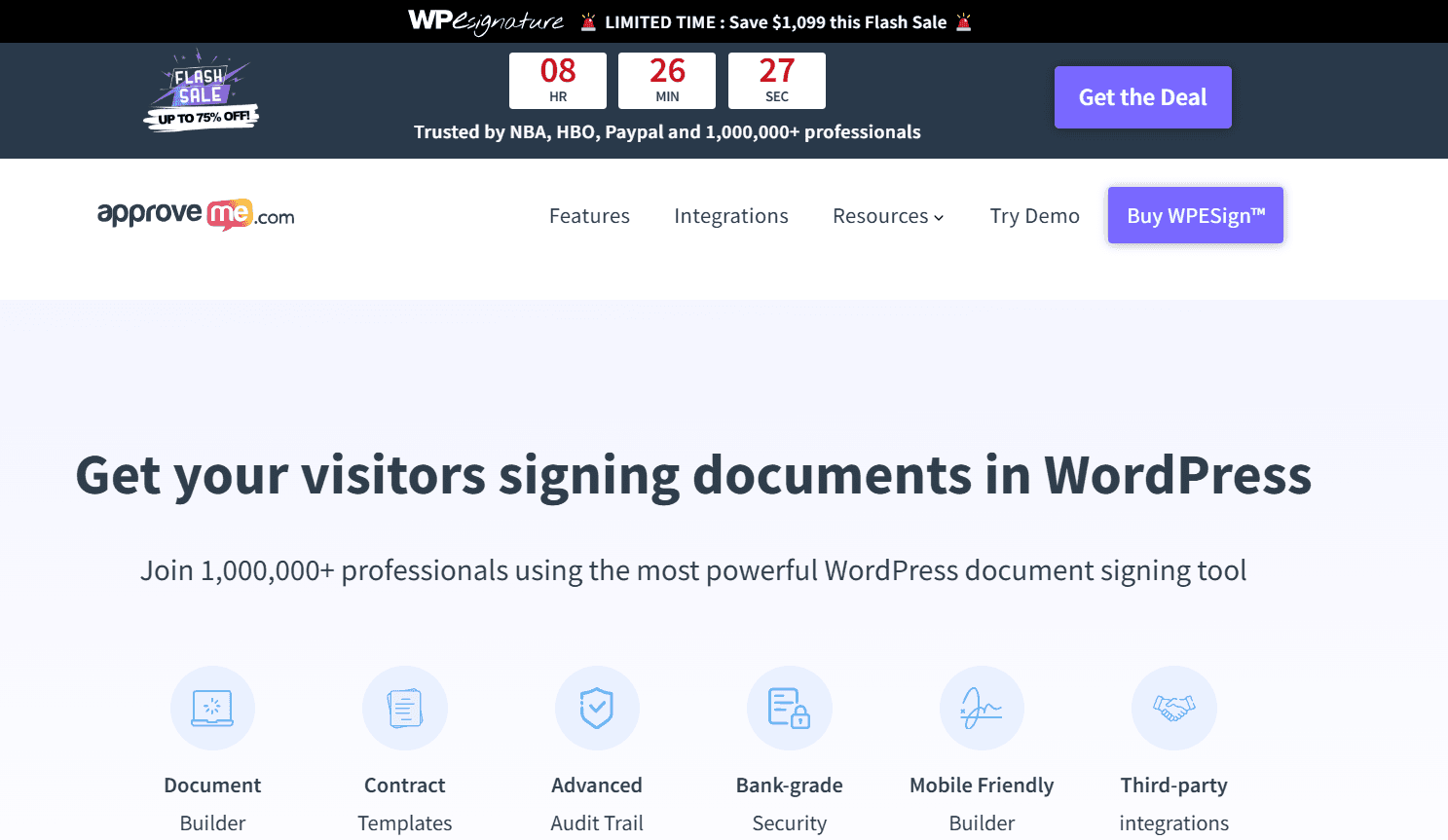
ApproveMe.com, a B2B SaaS company, used Lucky Orange to uncover and fix bugs on their checkout page that were stopping customers from completing purchases. By watching real visitor sessions, the team quickly identified issues and resolved them to improve the customer experience.
The result? A 211% revenue increase in just a few weeks.
ApproveMe.com turned visitor behavior insights into actionable improvements that transformed their customer journey. Read the full case study here.
Segmenting Your Target Audience by Source
Another key step to improving conversions is identifying which audience segments are driving the most value and which ones are doing little to move the conversion rate needle.
Analyze your website traffic by source—organic, paid, social media or referrals—and evaluate which channels bring in the most engaged website visitors.
For paid campaigns, dig deeper into your ad performance to see which segments have the highest click-through and conversion rates.
By pinpointing your top-performing sources and campaigns, you can focus your efforts on attracting more of the right audience.
Conversion Rate Optimization Challenges and Solutions
Improving your conversion rate involves more than just minor adjustments—it's about addressing common obstacles that prevent your audience from taking the desired action.
Frequent Website Challenges and How to Overcome Them
Your website often serves as the first point of contact between your audience and your brand. To boost website conversion rates, whether you're operating as a B2B company, a nonprofit, an educational platform, or an e-commerce business, it's essential to ensure a seamless experience.
Here's how various industries can tackle common website challenges:
For B2B Companies
Challenge: Complex forms.
Reason: B2B buyers have busy schedules, and lengthy forms can deter them from providing their details. Asking for too much information may result in losing potential leads and negatively impact your conversion rate.
Solution: Simplify the lead capture process. Begin with requesting just a name and email address, and collect more information as the relationship develops.
For Nonprofits
Challenge: Unclear Calls to Action (CTAs).
Reason: Nonprofits often have varied goals and audiences, leading to multiple calls to action. If these CTAs aren't clear or aligned with campaign goals, it can confuse potential donors or volunteers, resulting in a lower conversion rate. Ensuring your CTAs are straightforward and compelling is crucial for guiding visitors toward the desired action.
Next Step: Optimize Your Ad Spend Effectively
While enhancing your website, a logical step to boost your conversion rate is to drive more traffic by increasing your investment in paid campaigns.
Before increasing your ad spend, take a strategic approach by evaluating how you measure ad success and refining your ad budget allocation.
Measuring Ad Success More Effectively
To truly understand your ad campaigns' performance, delve deeper than surface-level metrics.
Key Campaign Metrics
While conversion rates are important, they are just one part of the equation. Focus on metrics that reveal the quality of your traffic and the long-term value of both current and potential customers. Consider these insights:
Time on site and session duration
Bounce rate
Customer Acquisition Cost (CAC)
Customer Lifetime Value (CLV)
Return on Ad Spend (ROAS)
Relying solely on conversion rates as your primary KPI can be misleading.
Analyze Specific Visitor Behavior
Visitor behavior insights can help you understand the reasons behind your low conversion rate.
These insights aren't just for analyzing website traffic but can also be used to evaluate your ad campaigns by isolating ad traffic by source or landing page. Here are some suggestions to get started:
Landing pages and exit pages: If visitors leave your site from the page they landed on, it’s a red flag. This could indicate a mismatch between your campaign messaging and their expectations, issues with the creative, or targeting the wrong audience.
Engagement immediately after landing or prior to exiting: The beginning and end of the customer journey are as crucial as the middle. Did visitors immediately search for specific information? Did they hover over particular images or content? Observing their first page experience can highlight possible information missing from your campaign or landing page.
Signals of confusion or frustration: Frustrated visitors leave clues. Repeated clicks (rage clicks) or erratic mouse movements (shaky mouse) are clear signs of confusion. Filter sessions by these events or use an optimizable segment for "Frustrated Visitors" to efficiently review recordings and uncover problem areas.
Modify Your Ad Strategy
A strong ad strategy is essential for driving results in any marketing campaign and ultimately increasing your conversion rate. Use what you uncovered in analyzing your ad traffic to optimize your approach.
Strategy: Targeting and Retargeting
Key Metrics to Watch: High bounce rate, low time spent on page, minimal to no engagement on your landing page.
Example: You're running ads targeting a broad audience, but your B2B company is focused solely on attracting enterprise-level IT managers.
Even if someone clicks your ad, they’ll quickly realize the content doesn't apply to their needs or industry and leave the page.
The Issue: Your ads are likely being shown to the wrong audience.
Solutions:
Audit Your Audience Segmentation: Reassess and refine your audience targeting to focus on those most likely to convert. Use insights from analytics, visitor behavior and demographics to adjust your strategy. Tools like Google Ads Insights Finder or Meta’s Audience Manager can help fine-tune your segmentation for better results.
Run Retargeting Campaigns: Re-engage users who previously interacted with your business but didn’t complete an action. For nonprofits, this could mean bringing back visitors who began filling out a volunteer or donation form. Retargeting helps nudge these users closer to conversion.
Leverage Lookalike Audiences: Once you’ve identified your ideal customer profile and built a list of engaged users (e.g., email subscribers, website visitors or existing customers), use lookalike audiences to reach people with similar characteristics.
Layer Your Targeting Criteria: Don’t rely on a single targeting approach—combine multiple factors to zero in on highly specific audiences. Instead of just targeting "IT managers," for example, you could go further: "IT managers at healthcare companies with 500+ employees who have visited the cybersecurity solutions section of your website." By layering demographics, interests, behaviors and website interactions, you can significantly improve the precision of your ads, reduce wasted ad spend and ensure your message reaches the most qualified prospects.
Strategy: Creating Resonant Ads
Key Metrics to Monitor: High bounce rates, low scroll depth and user interactions limited to top-level navigation or the search bar.
Example: Imagine you're targeting parents of high school students, but your landing page primarily showcases the new campus gym or Greek life.
While they might find these features interesting, their priorities are likely focused on scholarships or campus safety. Without addressing these concerns, they’ll leave without submitting an inquiry.
The Problem: Your ad copy or landing page fails to align with your audience’s priorities, overlooking their needs and missing the opportunity to resonate with them.
Solutions:
Tailor Your Ad Messaging: Speak directly to your audience by addressing their specific pain points, aspirations or desires. For nonprofits, use compelling stories or visuals to foster an emotional connection. For B2B SaaS, focus on clear, data-driven examples or testimonials to build trust.
A/B Test Ad Creatives and Landing Pages: Experiment with ad copy, visuals and landing page designs. Track engagement and measure the impact on conversion rates. Ensure that any changes to your ads remain consistent with the messaging and imagery on your landing page.
Refine Audience Targeting: Conduct surveys of users who converted or hold Voice of the Customer interviews with key stakeholders. Leverage demographic, interest-based and behavioral targeting to zero in on the right audience.
Experiment with Ad Formats and Page Layouts: Test different types of content, such as videos, carousel ads or interactive elements. Try varied landing page layouts to see what resonates best. Use these insights to optimize and iterate for improved performance.
Strategy: Strategic Keyword Targeting
Metrics to Monitor: High bounce rates, low time on page, low conversion rates despite seemingly relevant traffic and high cost-per-click (CPC) without corresponding conversions.
Example: Imagine you’re a non-profit focused on animal rescue. You’re bidding on broad keywords like “animal shelter,” “adopt a pet” and “animal rescue.”
While these terms seem relevant, they’re highly competitive and often too general, attracting visitors who may only be browsing—not necessarily individuals looking to adopt a pet or donate to your cause.
The Problem: Your keyword strategy is too broad and doesn’t align with the specific needs or search intent of your target audience.
Solutions:
Target Long-Tail Keywords: Focus on specific, detailed keyword phrases that cater to a niche audience. Long-tail keywords often have lower competition and higher conversion rates because they reflect precise search intent. For example, someone searching for “cat adoption near me” is far more likely to be actively pursuing adoption than someone searching for “animal shelter.”
Leverage Negative Keywords: Use negative keywords to exclude irrelevant searches and ensure your ads only appear to qualified leads. This helps reduce wasted ad spend and refines your audience targeting.
Analyze Search Terms: Regularly review the actual search terms triggering your ads. This can uncover new keyword opportunities and help you fine-tune your negative keyword list. Tools such as Google Keyword Planner, Ahrefs or SEMrush can help identify high-potential keywords, analyze search volume and assess competition.
Align Keywords with Ad Copy and Landing Pages: Ensure your ad copy and landing page content directly relate to the keywords you’re targeting. This boosts your Quality Score (in Google Ads), potentially lowers CPC and increases conversion rates.
Strategy: Optimize Ad Placement and Formats
Key Metrics to Monitor: Low click-through rates (CTR), low conversion rates despite high impressions and high cost per acquisition (CPA).
Example: Imagine running display ads for your online coding bootcamp, but they’re being shown on websites unrelated to technology or education. While your ads might generate plenty of impressions, they’re not reaching the right audience, resulting in poor CTRs and wasted ad spend.
The Problem: Your ads are not appearing in the right places or utilizing effective formats.
Solutions:
Select the Right Ad Platforms: Identify where your target audience spends their time online. Are they active on social media, search engines or niche industry websites? For example, a B2B startup might achieve better results on LinkedIn by targeting professionals in specific industries or roles. Meanwhile, a university could benefit from a multi-platform approach, using search engine ads to engage prospective students actively researching colleges, display ads on education-related websites and social media ads to build brand awareness with a broader audience.
Prioritize Relevant Websites and Placements: For display ads, focus on platforms and placements that align with your audience's interests. Leverage contextual, topic and placement targeting to ensure your ads are seen by the right people.
Leverage Native Advertising: Native ads seamlessly integrate with surrounding content, making them less disruptive and more appealing to users, which can increase engagement and clicks.
Apply These Insights to Drive Conversions
If you’ve noticed a drop in your conversion rates, don’t panic—you’re not alone.
Many businesses experience fluctuating conversion rates at some point, especially in today’s competitive digital landscape. Fixing a low website conversion rate is absolutely achievable with the right approach.
Take action now. Whether you’re in B2B, nonprofit, education or e-commerce, the key is to adapt and optimize.
This is your opportunity to make every dollar in your budget and every visitor to your site count. A small change today can lead to significant results tomorrow—so don’t wait to start driving better conversions.
Lucky Orange


