Blog
Conversion Rate Optimization
Does your website content pass the heatmap test?
Learn how to evaluate your website content using heatmaps to identify engagement patterns, optimize user experience, and improve conversion performance.
Lucky Orange

When it comes to websites, great design and great content go hand in hand. As acclaimed web designer Jeffrey Zeldman once said, “design in the absence of content is not design; it’s decoration.”
That being said, how would you know if visitors weren’t engaging and interacting with your content?
Sure, you may be using Google Analytics to evaluate if your calls-to-action are working or if your blog is being read, but is it really enough to analyze your call to action?
Are you really getting the full picture of your visitors and how they really use your website from landing page to exit page?
Here’s a fun fact:
Content on your website, whether it’s a blog post or product description, has just six seconds to draw in a visitor to click on a call-to-action or continue reading.
If your best content is buried down the page, are visitors even reaching it?
We have the secret weapon to help find the answer and understand what your visitors really think about your website content – heatmaps.
A quick look at Dynamic Heatmaps
If you’re new to the world of heatmaps, here’s a quick definition. A heatmap is a visual representation showing how users navigate through your website while on their phone, tablet or computer.
The more clicks, taps, moves or scrolls a section of the website receives from your visitors results in a “warmer” color, indicated by red and orange.
The higher the popularity, the more intense the color red.
Less popular areas are indicated by a “cooler” color, such as light or dark blue. The lower the popularity, the darker the shade of blue.
To evaluate the success of your website content, you primarily need two common types of heatmaps:
Scroll heat maps show how far users scrolled down a page, including what percentage of visitors reached a specific point of the page. When evaluating whether your website content is getting read, a scroll map is a good place to start.
Click heatmaps show where visitors clicked their cursors (desktop devices) or tapped their fingers (on mobile and tablet devices).
Most heatmaps, especially an interactive heat mapping tool like Lucky Orange, provide the option to filter data to narrow results to show just specific visitors, behaviors, traffic sources, device type or geographical location (to name a few options).
This can be especially helpful to identify behavior patterns or better understand how visitors from different sources navigate through your website.
No matter which website builder you choose, you can filter heatmap data to show just the clicks from visitors who came from out of state. You could then analyze their behaviors to learn where they clicked, how they moved across a webpage and if they purchased on the first or fourth visit.
Now that you have more analytics information, how do you use it?
If you discover, for example, that out-of-state traffic is more interested in your shipping page and converts on the second or third visit, you may want to consider building a landing page layout that offers free shipping just for your out-of-state visitors.
Now with the essentials out of the way, it’s on to the heatmap test.
Putting your content to the test
Before we dive into the test itself, let’s break it down by goals and the questions you want to answer:
Goal
Evaluate how far visitors scroll on a blog post or webpage
Questions to answer
Is my CTA and most powerful content buried too deep in the page? Are visitors scrolling far enough down to see it?
Goal
Identify where visitors engage most on your website
Questions to answer
Where on a webpage are visitors engaging? Is some of the content being missed?
Goal
Understand which content visitors prefer
Questions to answer
Is my content generating a response or is it missing the mark? Are there areas I could improve?
No. 1. Evaluating how far visitors scroll
A scroll heatmap is the best method to evaluate if your content at the top of a webpage is able to convince visitors to keep scrolling to the bottom of the page, whether your CTA is placed too low on the page or if long-form blog content isn’t keeping your audience’s attention.
Using the scroll heatmap, the darker the color red, the higher the percentage of visitors who viewed that portion of the webpage.
If your CTA is shown in a lighter pink or even white color, you know that most visitors aren’t making it down the page to see it.
As we mentioned earlier, you can filter scroll heatmap data. For scroll heatmaps, a good filter to consider using is the device type, such as mobile or desktop.
While the average mobile user may be more accustomed to scrolling down a webpage, your mobile users may scroll more (or less) than desktop users and require a different content strategy to maximize conversions.
No. 2. Identifying where visitors engage most on your website
While scroll heatmaps can show if content is placed too low to be seen, click heatmaps identify exactly where visitors are engaging on a website.
This is a real example of click heatmaps in action on MyBaitShop.com, a Shopify store and Lucky Orange user:
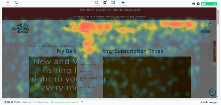
Looking at the click heatmap, a few things jump out:
More interest in buying than selling
Vintage/old lures are preferred over new lures
High usage of brand search filters
High usage of search in general compared to random navigation
If you were the manager of MyBaitShop.com, how would you use this information?
You could update the content to reflect these preferences, such as making vintage lures a content priority to bring in new customers.
Looking at the drop-down menu, you could see what products are preferred by customers.
Not only could you use this information to expand MyBaitShop.com’s inventory of products, but it could also be the base for a new content strategy focused on those clicking behaviors.
Another thing to consider is regional differences.
In this situation, different regions have different varieties of fish which then require different lures. If you filtered data from MyBaitShop.com for specific geographical locations, you could isolate behavior specific to those places.
If northern states prefer a certain fishing lure over southern states, it may be fodder for a better content strategy that could involve campaign-specific landing pages.
Note: These are just examples using MyBaitShop.com. This Shopify store increased conversions by 450% in 103 days by using heatmaps, recordings and polls. Read more.
No. 3. Understanding which content visitors prefer
As we saw with MyBaitShop.com, click heatmaps can open the digital door to where visitors are clicking and what areas of a webpage they may be interacting with more than other areas.
When it comes to understanding which content visitors prefer takes it one step further.
On a blog post, for example, we can evaluate whether long-form content is read by using scroll heatmaps, but there’s so much more to content than just length.
We recently wrote a short post promoting a webinar.
At first, you can see a few areas where people have clicked or tapped within the body of the article and on other current articles, listed to the right.
Looking at the link copy, “Click here to register for the webinar,” the heatmap shows that “register for the webinar” is attracting more engagement than “click here.”
For future webinars, we may want to consider using different CTAs and follow up by comparing heatmap results to see which CTA performed the best.
Click heatmaps can also help bloggers identify which blog posts and headlines drew more attention than others.
Of course, writing great content doesn’t come by chance. Web Canopy Studio has great tips to help make your content, whether it’s for a webpage or a blog, rock your visitors’ socks off.
Making better content
Now that you know how to use heatmaps, how can you use them to make your content better than ever? What can you learn from your audience that will help you write stronger content, position your CTAs better and convert more visitors?
Here are four specific things to watch for as you analyze your data that can really help you up your content game:
No. 1. Look for clusters of clicks on words/images that are not links
When reviewing your heatmaps, specifically the click map, look for groups of clicks in different areas of the page beyond just CTAs and header navigation.
These are signs that people are interested in this content or are confused. It means they are interested in what that means; positively or negatively.
Explore what happens if that click opens a popup with more information or sends them to a descriptive page that walks them through your product or service.
Using heatmaps to show you areas of opportunity will allow you to take a next-level step in site optimization.
No. 2. Tag webpages for deeper analytics insight
Think about your content and the conversion path on your website.
What is the most important conversion a prospect could make? A demo request? Free trial? Contact sales?
For those important conversions, add a behavior tag on Lucky Orange. Behavior tags let you “tag” specific webpages, such as a shopping cart or checkout page, and dive into the heatmaps, recordings and web analytics of that tag.
From heatmaps, you can use behavior tags to look at data just surrounding a specific user behavior or several behavior tags.
For example, you could filter heatmap data using the behavior tag “added to cart” and “thank you for your purchase” to analyze how customers who completed their purchase behaved. You could then compare the heatmap results to visitors who triggered “added to cart” but not “thank you for your purchase,” indicating visitors who abandoned their carts.
Using behavior tags, you can also filter through recordings, which can be accessed from the heatmap or the recordings tab. While heatmap data can indicate the collective behavior of visitors, recordings dive into individual sessions to watch as a visitor moved from homepage to product page to shopping cart to check out.
You can look for things like:
What page did they land on?
What are they clicking?
What are they reading?
You’ll want to look specifically for any roadblocks people have when they go through your site, or if the process could be smoother. See if there are one or two steps every person takes before that conversion.
With this information, brainstorm on what you can do to get more people to do those steps.
No. 3. Look for sharp drop-offs in engagement on the scroll map
When people scroll down your page, they are naturally inclined to do one of two things:
Click into more information if they are interested
Leave the page if they aren’t in the right place
You want to identify areas on your site encouraging that choice, whether that is a positive or negative decision.
If you see a gradual drop off of readers as they scroll down a page, don’t panic. According to Chartbeat, just 50% of readers see 1500 pixels down the page on content pages. On homepages and section fronts, 50% of readers make it to just 1000 pixels.
What we want to look for in this situation are steep drop-offs that signal one of the situations described above.
If, for example, you explore your scroll map and find out that you jump from 80% of the traffic viewing this section to 40% of the traffic viewing the next section, that is a sign that you need to look at what’s happening.
It’s either the content above the drop-off
was SO GOOD that people clicked the CTA right away (which you can confirm by the click map); or
was SO BAD people left the page immediately
Unfortunately, the latter is the more likely the case.
If your scroll maps show a similar drop off, consider removing or revising that second, lower section altogether.
This is important because many times people will keep their most important CTAs at the bottom of the page.
If you put important CTAs below the area where people are leaving the page, you’re excluding the majority of your visitors from even having the opportunity to convert.
What happens if you move your CTA to where most of your traffic can see it?
No. 4. Look for mouseover movements around specific paragraphs or headlines
This is like the secret sauce to identify how people feel about content on the site. You can learn so much by watching where people subconsciously hover their mouse over things they read or highlight important words or phrases that really jump out to them.
As you look at heatmaps for cumulative data visualization, you can see possible words or phrases that are resonating with your audience, which could indicate that your visitors are really interested in a particular type of content.
Recordings, again, really complement heatmaps.
You can watch mouse tracking paths to see which areas of a webpage or article are drawing the most attention.
You can then use that information to elaborate on the topic. Consider building topic clusters around this kind of content or creating videos to walk prospects through the concepts you’re highlighting.
Mouse-over movements are only available for desktop visitors. For mobile visitors, we would suggest looking at recordings for taps and scrolling behavior.
Lucky Orange