What should I look for when using Lucky Orange?
Aug 9, 2023
Published by: Lucky Orange

You made the leap and subscribed to Lucky Orange. Now it's time to look at stuff and do things.
But what stuff should you look at and what things should you do with it?
You're collecting a mountain of data and want to make the most of it. And you want to be sure you're taking the right steps to avoid making decisions based on incomplete research—ones that might lead to a negative impact on your site's performance.
This is a completely normal place to be and one that we're happy to help you navigate. Start by reading through this post which shares several specific ideas you can take into heatmaps and session recordings.
Once you master these two features, then you will want to spend time exploring Lucky Orange Surveys, Announcements and other complementary tools.
What to look for when using Lucky Orange heatmaps
Engagement with call-to-action buttons and other important linked text
Heatmaps are invaluable for understanding user interaction on your site. They visually represent areas with the most user clicks, especially for call-to-action (CTA) buttons and linked text.
Check if users scroll enough to see your CTAs. If the heatmap shows low engagement at the bottom of the page where CTAs are placed, consider moving them higher up.
Evaluate the popularity of CTAs and linked text by looking at the top elements list, shown below. If they aren't among the most-clicked items, reassess their placement, size, color or wording to make them more enticing.

Further reading: 11 Powerful CTA Best Practices for a Higher Conversion Rate
Scroll depth on long versus short content-heavy pages
When using Lucky Orange heatmaps to analyze scroll depth on your content-heavy pages, whether they be long-form blogs or short-form landing pages, there are certain patterns to monitor.
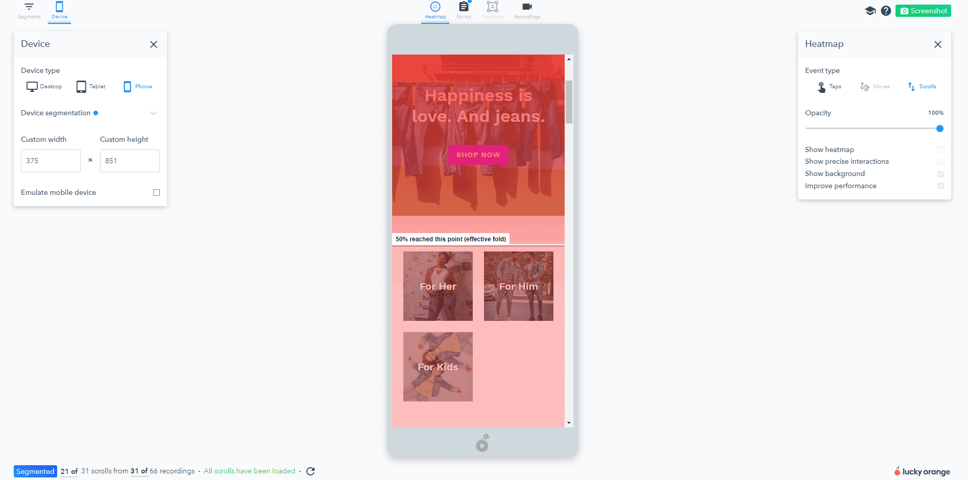
Scroll depth is a measure of how far down a user goes on a page, and with a heatmap, it is visually represented by color intensity. You'll notice a line called the effective fold in each heatmap showing how far down the page 50% of visitors scroll.
On long-form content pages, such as in-depth blog posts or comprehensive product category listings, a common trend seen in heatmaps is that user engagement usually decreases as you move down the page.
This is sometimes referred to as content fatigue - users get overwhelmed by too much information and stop scrolling. Recognizing this pattern in your heatmap can help you identify where to position the most critical information or calls to action to ensure they get seen.
In contrast, on short-form landing pages, where information is typically condensed and presented succinctly, you might observe a more evenly distributed pattern of engagement throughout the page. However, if your heatmap shows that users are not scrolling to the bottom of these pages, you might need to reconsider your content's layout or volume.
By understanding these patterns and making the necessary adjustments, you can improve the user experience on both long-form and short-form pages, ensuring that important information and CTAs are placed where they're most likely to be noticed and interacted with.
Click trends on top navigation and on-page menus
Another key area of focus when using Lucky Orange heatmaps is your site's navigation - the top navigation bar, footer navigation items, and any on-page navigation like product categories.
Navigation elements are essentially the guiding roadmaps for your users, leading them through your site to the information or products they seek.
Analyzing click trends on your top navigation bar can offer insights into which pages or features are attracting the most user interest. Are users frequently clicking on certain tabs and ignoring others? Do some tabs have surprisingly low engagement despite their importance? Heatmaps can help you answer these questions, providing the data necessary to optimize your top navigation bar for better user experience and increased engagement.
Similarly, while not always given as much attention, footer navigation items can also be important touchpoints for user engagement. Use heatmaps to see if users are reaching and interacting with your footer items. If not, you may need to reassess the placement and relevance of these items.
On-page navigation, like product categories, is crucial for e-commerce sites.
Heatmaps can reveal whether users are clicking evenly across categories or favoring certain ones. This can help you understand user preferences and optimize your category navigation for a more intuitive shopping experience.
Remember, the goal isn't just to get users to your site; it's to guide them through their journey once they're there. By leveraging heatmaps to understand user engagement with your navigation elements, you can make the necessary adjustments to increase user satisfaction and conversions.
Further reading: 5 Strategies to Improve Website Navigation
Form field metrics including abandonment, time to complete and field order
Website forms are crucial touchpoints for user interaction on your site. Through Lucky Orange, you can analyze form metrics to identify issues such as field abandonment, time to completion, and fields that cause repeat entries due to their complexity.
Form abandonment is a measure of how many users start filling out a form but do not complete it. This metric is particularly important in understanding user frustration points. If a specific field has a high abandonment rate, it suggests that users find it difficult or confusing.
The time to complete a field is another vital metric. Fields that take a long time to fill out might be perceived as too complex or unclear. This can lead to user frustration, causing them to abandon the form or, in worst-case scenarios, leave your site altogether.
Finally, fields that cause the most repeat entries are also a sign of trouble. Repeat entries often indicate that a field is too complex or that the instructions provided are unclear.
By analyzing these metrics with Lucky Orange, you can identify problematic form fields and make necessary adjustments. This might involve simplifying the wording, providing clearer instructions, or even eliminating unnecessary fields. Remember, the goal is to make the user's experience as seamless and enjoyable as possible, leading to higher form completion rates and improved user satisfaction.
Further reading: How to Reduce Cart Abandonment with Proven Form Analytics
Click trends on common page types
Analyzing click trends on common page types such as product description pages, category pages or blog posts using Lucky Orange heatmaps can yield important insights into how your page layout impacts user engagement.
On product description pages, understanding where visitors are clicking can guide you on how to best structure your page for maximum engagement.
If heatmaps show that visitors are primarily clicking on photos, consider adding more images or making existing ones larger. If they're drawn to customer reviews, you might want to position them more prominently.
Category pages, on the other hand, often contain a variety of products, and heatmap analysis can reveal which ones are grabbing the most attention. This could influence how you arrange your products, prioritizing those that attract more clicks.
For blog posts, heatmaps can show you how far users scroll and where they stop to click. If most activity is concentrated at the top of the post, you may need to consider ways to make your content more engaging to encourage further scrolling and interaction.
By considering these click trends on common page types, you can make informed decisions about your page layout and content, optimizing them to increase user engagement and satisfaction.
Further reading: The Complete Anatomy of High-Converting Product Pages
All of the above analyzed by audience segment
Digging deeper into your heatmap analysis, another highly informative tactic is audience segmentation. This approach allows you to assess the behavior of specific types of users, thereby enabling more personalized optimizations.
Audience segmentation can be achieved in several ways.
One of the most common methods is segmenting by UTM parameters. UTM parameters are tags added to a URL, which track the performance of campaigns and content. By analyzing the heatmap data of users from specific URLs or UTM-tagged sources, you can gain insights into how different marketing campaigns or content types perform in terms of user engagement.
Another useful segmentation is differentiating new visitors from returning ones. The engagement pattern of a user visiting your site for the first time may significantly vary from someone already familiar with your site. A careful study of these differences will assist in creating a more personalized user experience.
Lastly, segmenting users based on their location can provide a wealth of information. Different geographical locations could denote differences in culture, language, and consumer behavior. Analyzing heatmap data by location can help you identify and cater to these differences, ensuring a more targeted and effective user interface.
Each of these segmentation approaches presents an opportunity to delve deeper into your user base's behavior. By studying heatmap data at a segmented level, you can make more informed decisions and provide a more tailored user experience. Remember, understanding your audience is the key to enhancing user satisfaction and ultimately, conversions.
Further reading: Using Optimizable Segments to Improve Your Website Experience
What to look for when watching Lucky Orange session recordings
Trends seen in a heatmap
Lucky Orange's session recordings tool can provide invaluable insights into specific visitor examples of trends noticed during heatmap analysis. This tool captures real-time videos of how visitors interact with your website, offering a granular view of user behavior.
For instance, if your heatmap analysis shows a high concentration of clicks on a specific area of your product page, the session recordings can help you understand the reason behind this trend. You may observe that visitors are clicking on an image expecting it to enlarge or provide additional information. If this feature isn't available, it might be a cue to enhance functionality.
Similarly, if heatmaps indicate a trend of users abandoning your site from a specific page, session recordings can help identify roadblocks. You may find that users are getting confused by complex navigation or a lack of clear call-to-action.
You can also use session recordings to corroborate trends found in form field metrics. If your heatmap analysis shows a high abandonment rate on a form field, the session recordings can offer insights into why users might be struggling with that field.
Together, heatmaps and session recordings help paint an accurate picture of the user experience, allowing you to make well-informed decisions to optimize your site for increased user satisfaction and conversions.
Further reading: How to use Session Recordings to Increase E-commerce Sales
Causes of rage clicks and shaky mouse
Session recordings are an effective tool for diagnosing problematic areas of your website that may be causing user frustration, often manifested as rage clicks or shaky mouse movements.
A rage click occurs when a user repeatedly clicks on an element on your website out of frustration, often because something is not working as expected.
A shaky mouse, on the other hand, is a movement pattern that often signifies confusion or indecision from the user.
Analyzing session recordings allows you to identify the source of such behaviors.
For instance, rage clicks could be triggered by a non-responsive button, a link that's not working, or an element that's not behaving as the user expects. Understanding this can help you rectify the issue, whether that's improving website functionality or clarifying the purpose of specific elements on your site.
Similarly, if you notice a shaky mouse during session playback, this could indicate that your user is unsure of where to go next on your site. This may be due to unclear navigation, overwhelming options, or lack of a clear call-to-action. Identifying these areas can help you streamline your site's navigation, making it more user-friendly and intuitive.
By watching session recordings and noting these specific behaviors, you can gain deep insights into your users' experiences and emotions. This invaluable information can then guide your optimization efforts, helping you to eliminate user frustration and create a smoother, more enjoyable user experience. Remember, a satisfied user is more likely to convert, making this analysis key to your website's success.
Scroll and click behavior when bouncing back and forth between the same pages
Session recordings can provide critical insights into the reasons behind website visitors bouncing back and forth between the same pages. This behavior often indicates confusion, difficulty in finding needed information, or indecision on the part of the user.
For instance, let's say you notice users are constantly navigating between a product page and the FAQ section. This could suggest that the product page may lack essential details, forcing users to seek additional information in the FAQ section. By integrating key details from the FAQ directly into the product page, you can potentially streamline the user journey and reduce unnecessary navigation.
In another example, if users frequently switch between different product pages without making a purchase, it may indicate that they are comparing various options but find it hard to make a decision. Implementing a product comparison feature could significantly enhance user experience here, making it easier for users to compare products side-by-side without having to navigate back and forth.
Lastly, if users are bouncing between their shopping cart and product pages, it might reveal that they're unsure about their selection or the total cost of their order. A solution could be to implement a mini cart that allows users to see their current items and total cost without leaving their current page.
In all these cases, session recordings will offer a first-hand view of user behavior, allowing you to identify potential areas of confusion or difficulty, and take proactive measures to enhance the user journey. This, in turn, can improve overall user satisfaction, reduce bounce rates, and ultimately, increase conversions.
Unlinked elements getting a large amount of attention and clicks
Session recordings can shed light on visitor interactions with misleading elements, i.e., page elements that are not linked to anything but still garner a significant amount of attention and clicks.
This behavior often indicates that users are expecting a response or functionality from the element which is currently not in place.
For instance, if session recordings reveal that visitors are consistently clicking on a particular graphic or piece of text, it may signal that users perceive the element as interactive or informative. This could potentially be a lost opportunity for engagement or conversion.
By analyzing these interactions, you can make informed decisions about potential modifications. For instance, you might decide to add a link or interactive feature to the misleading element, thereby meeting user expectations and enhancing their experience.
Alternatively, if the misleading element is causing confusion and leading users down an unintended path, it might be wise to alter the element's design to make it less suggestive of interactivity.
In this way, session recordings can help you spot and rectify misleading elements, ensuring your website is as intuitive and user-friendly as possible, leading to increased user satisfaction and conversion rates.
Behavior immediately after adding items to cart
Analyzing user behavior immediately after adding items to a shopping cart can provide valuable insights into your conversion funnel. With session recordings, you can directly observe the actions taken by both visitors who convert and those who do not.
For visitors who successfully convert, their actions highlight the smooth aspects of your checkout process that encourage completion.
For instance, they may seamlessly navigate from the cart to the checkout page, indicating that your call-to-action and navigation are clear and effective. Or perhaps they might review their selected items in the cart and then swiftly proceed to checkout, signifying that your cart design is intuitive and user-friendly.
On the other hand, examining the actions of visitors who do not convert after adding items to the cart can help you identify potential roadblocks in your checkout process. These visitors might exhibit behaviors like lingering on the cart page, revisiting product pages, or navigating away from the site altogether. Such patterns could indicate confusion, uncertainty, or unexpected costs, potentially signaling areas of your site that need improvement.
Through these insights, session recordings can help you to refine your checkout process, decrease cart abandonment rates, and ultimately enhance your website's conversion rate.
What to do with the insights you discover in Lucky Orange
Create an A/B testing hypothesis
Using the insights gleaned from heatmaps and session recordings, you can develop a strong A/B testing hypothesis to further optimize your website. For instance, if the data shows that users are spending a significant amount of time on an element that isn't linked to anything, you might hypothesize that adding a link or a CTA to that element will increase user engagement and conversion rate.
To formulate your hypothesis, start with a clear, specific statement about what changes you believe will lead to improvements. Your hypothesis could be something like this: "We believe that adding a call-to-action to the 'XYZ' element, which currently gets a lot of attention but is not interactive, will increase user engagement and lead to higher conversion rates."
As you develop numerous test ideas, it's crucial to prioritize them effectively. Consider factors such as potential impact on key metrics, the ease of implementation, and crucially, the insights derived from your user behavior analysis. Prioritize tests that address key pain points or opportunities highlighted in your session recordings and heatmaps. This way, your testing efforts will be data-driven, aligned with user behavior, and more likely to yield significant improvements.
Remember, A/B testing is an ongoing process. Regularly leveraging the insights from your user behavior analysis tools will keep your tests relevant and impactful, driving continuous optimization and growth.
Free tool: Website testing idea log & prioritization rubric
Share notes with relevant team members
Sharing notes with relevant team members after studying visitor behavior through session recordings and heatmaps has manifold benefits.
First, it fosters cross-functional alignment, ensuring that all stakeholders - be it design, product management, marketing, or customer service - have a unified understanding of user behavior and challenges. This shared knowledge base can help teams collaborate more effectively, align their efforts towards common goals, and make more informed, user-centric decisions.
Second, sharing these insights can spark creative solutions. Different team members bring diverse perspectives and expertise to the table. Sharing user behavior data with them can catalyze brainstorming and problem-solving, leading to innovative solutions that a single team or individual might not have conceived.
Third, it reinforces a culture of continuous learning and improvement within the organization. It underlines the value of data-driven decision making and encourages teams to consistently leverage insights from user behavior analysis in their work. This can lead to continual optimization of the website, creating a more user-friendly, intuitive, and high-converting digital experience.
Lastly, sharing these insights with customer-facing teams such as sales and customer service can enhance their understanding of user needs and pain points. This can empower them to serve customers more efficiently and empathetically, thereby improving customer satisfaction and loyalty.
Skip testing and make a change
Sometimes, after studying visitor behavior, it might be apparent that a change is required with no need for A/B testing. This could be due to an obvious issue in the user experience or when the page does not get enough traffic to run a meaningful A/B test.
For example, if session recordings reveal that users are repeatedly clicking a non-interactive element expecting a response, it's clear that making the element interactive can enhance the user experience. Instead of waiting for the outcomes of A/B testing, you could confidently make this change immediately based on the data.
Similarly, if a page isn't attracting enough traffic, running an A/B test might not yield statistically significant results. In such cases, if heatmaps or recordings suggest a potential improvement, it can be beneficial to implement the change directly, monitor user responses, and adjust accordingly.
Taking prompt action based on clear insights can fast-track website improvements, deliver a better user experience, and potentially drive increased engagement and conversions.
However, it's important to continue tracking user behavior after the change to ensure it's delivering the expected improvements.
Save a segment to revisit and validate over time
Saving a segment of visitors in Lucky Orange can be highly beneficial if you plan to revisit and study the same group over time.
This feature allows you to identify, isolate, and analyze specific visitor behaviors, providing a wealth of insights into user interactions and engagement patterns. By consistently studying the same segment, you can track changes in behavior, assess the impact of any website modifications, and effectively measure progress over time.
Saved Segments show up in the dropdown in Visitors. You can save a combination of filters as a segment directly in the filtering drawer on the right side of the page or directly in the Saved Segments dropdown, shown below.

For instance, if you make changes to your website aimed at improving user experience for a particular segment, you can monitor this group's behavior before and after the changes. This enables you to validate the effectiveness of your modifications in real-time and adjust your strategy based on tangible data.
Furthermore, by saving visitor segments, you also eliminate the need to manually recreate or define the same group each time you need to analyze their behavior, thus saving time and ensuring consistency in your data.
This consistent, data-driven approach can significantly enhance your website optimization efforts, leading to improved user experience and potentially higher conversion rates.
Run a survey to gather real visitor thoughts and feedback
Running a survey is an effective way of gathering direct feedback from your visitors, enabling you to better understand their motivations, fears, and hopeful outcomes.
Surveys can provide valuable insights that may not be apparent from session recordings or heatmaps. For example, a user might abandon their cart because of unexpectedly high shipping costs, something you might not glean from behavior analysis alone.
A well-crafted survey can validate the assumptions you're making based on user behavior data.
For instance, if you assume that users are getting confused by a complex navigational structure, a simple question asking them about their experience with site navigation can confirm or refute this hypothesis.
By asking open-ended questions, surveys can also bring to light user needs and preferences you might not have considered. Users might present new ideas for features or services, giving you fresh avenues for site improvement and innovation.
However, it's crucial to design your survey carefully. Keep it short, simple, and user-friendly to encourage completion. Also, ensure your questions are clear, unbiased, and designed to elicit the most informative responses.
Remember, while surveys are powerful tools for gathering user feedback, they are most effective when used in conjunction with other methods like session recordings, heatmaps, and A/B tests.
Combining these approaches allows for a more comprehensive understanding of user behavior, leading to a more effective website optimization strategy.


