Blog
Conversion Rate Optimization
The Complete Guide To Using Website Heatmaps
Master website heatmap analysis with this comprehensive guide to identifying user engagement patterns and optimizing for better conversion performance.
Lucky Orange

Heatmaps are an integral part of the website optimization process. By providing a visual representation of website visitor behavior, it’s possible to find pain points in the visitor's journey and make meaningful improvements to increase conversions.
In this article, we'll discuss what heatmaps are and how to use themc for website performance optimization. We'll also explore the next steps you should take once you've taken advantage of insights from heatmaps.
What is a heatmap?
Heatmaps are data visualization tools that can illustrate both qualitative and quantitative data.
By using a range of colors, they typically show the concentration or value of data through the warmth of the colors used. This is in contrast to Google Analytics tools which provide strictly quantitative data.
The term “heatmap” refers to the use of color, resembling a map of heat distribution to indicate areas of higher activity. Website heatmaps are used in a variety of fields, recognizably in meteorology, where heatmaps are used to show patterns in temperature or precipitation.
They are also used for visual representation in a range of other industries including science, business and weather (does this look familiar ⬇️?).
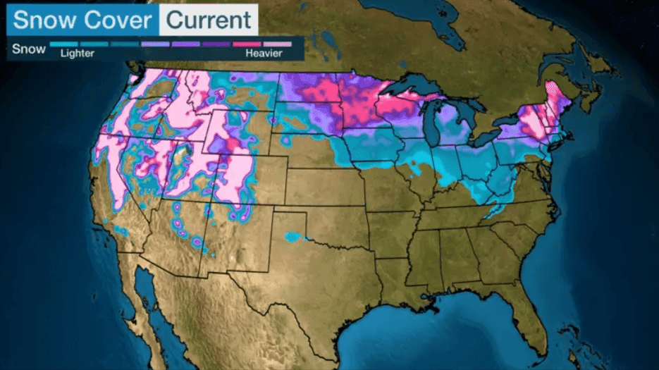
Image from Weather.com
In the example above, you can see the differences in snow cover between states and understand trends in the winter storm because the heatmap represents snow cover across regions of the country. The warmer colors on the heatmap above indicate higher levels of snow and precipitation.
In this case, the heatmap allows you to quickly understand weather trends happening around the country—without the need for deep, individual study of each state or region.
By using heatmap data, it's possible to identify patterns that might not be as present in other data visualization methods.
Beyond weather data, heatmaps can also be applied to website optimization as visualization digital analytics tools.
Website heatmaps, for example, track clicks to show which areas of a page website visitors are gravitating towards, what elements are receiving the most clicks, or where point points are occurring.
How does heatmap software work for website optimization?
Website heatmaps visually show how visitors interact with a web page, offering insight into user engagement and behavior.
Warm colors highlight areas with high levels of clicks, taps, or scrolls—signaling what’s resonating. Cooler areas suggest where attention drops off and improvements may be needed.
This type of analysis helps website owners understand navigation patterns and uncover opportunities to enhance the user experience.
By identifying where people interact—or where they drop off—businesses can make informed changes, like adjusting call-to-action placements, improving navigation, or refining content.
Heatmaps benefit businesses of all sizes. Marketers, sales teams, and UX designers can all use them to better understand how users interact with a site.
Ultimately, heatmaps reveal what works for your audience—helping you design with real human behavior in mind.
Three different types of website heatmaps
There are three different types of website heatmaps in Lucky Orange, Scroll, Moves and Clicks. Each of these heatmaps surface a different type of visitor behavior that can be used to gain deep insights.
Scroll heatmaps
Scroll heatmaps show how far down the page your website users scroll before leaving.
The scroll depth color gets lighter as visitors drop off from the page and let you identify which content isn’t getting much attention. The deeper the color, the more engagement that section is receiving.
In Lucky Orange, users can drag their cursor down the heatmap tool to see the actual percentage of users scrolling through to that point on the page.
Lucky Orange visitor scroll maps also show the effective fold, the point of the page where 50% of your visitors leave the page. In the example below, the effective fold is the white line. It’s always important to make sure your most important content is above that line to maximize potential conversions.
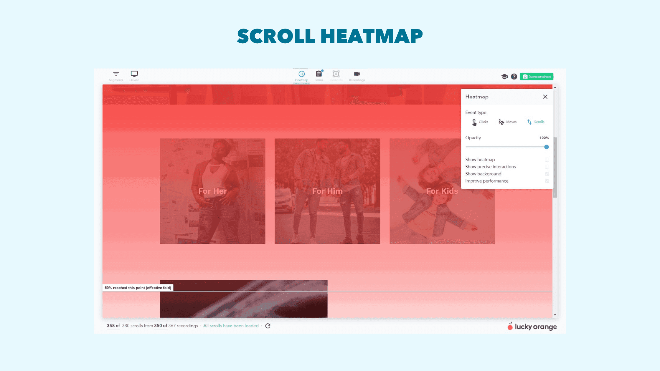
A scroll heatmap tool is a great starting point for website optimization because it can help you answer questions like why visitors aren’t clicking on a landing page CTA button further down the page or if visitors are reading an important piece of content.
Click heatmaps
Click Heatmaps show you where visitors click their mouse on website pages.
This type of collected data is especially helpful when analyzing the success of clickable elements like CTA buttons.
For example, if you discover that a particular CTA button isn't getting the clicks you had hoped for, you can experiment with different button placements or messaging as part of your conversion rate optimization strategy.
With Lucky Orange heatmaps, you can also filter your view to see how a key audience segment performs on its own—such as first-time visitors.
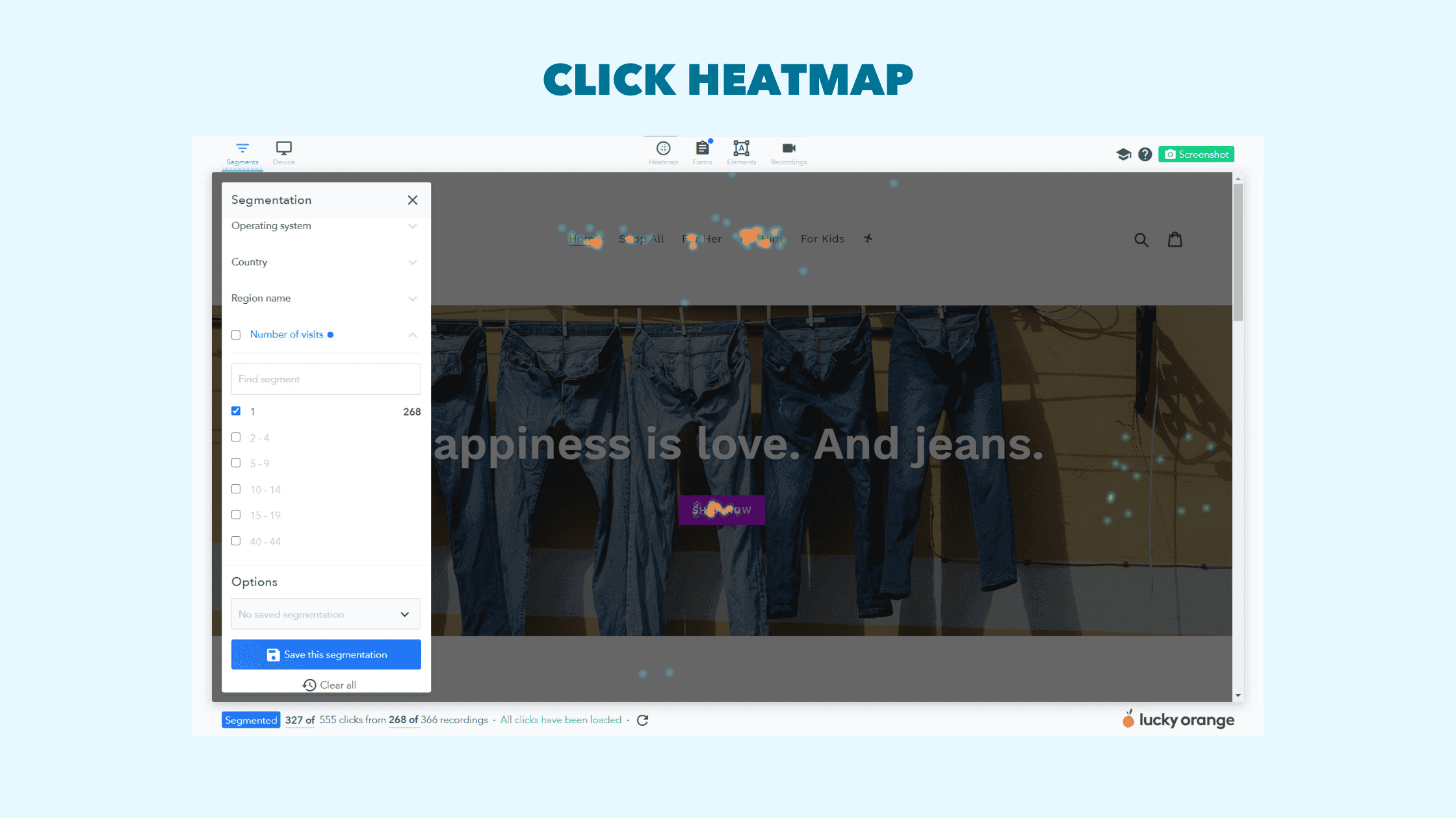
Using Click and Scroll website heatmaps together can provide deeper insight into why certain business-critical pages aren’t causing conversions. If you notice that certain CTA’s aren’t getting clicks, following it up with a scroll map can reveal if your visitors are seeing it or not and can help narrow down a potential solution.
Moves heatmap
Moves Heatmaps show you where a visitor's mouse is while they navigate the page. The mouse movement can show you which elements of the page your visitors are drawn to and identify any trends in user behavior.
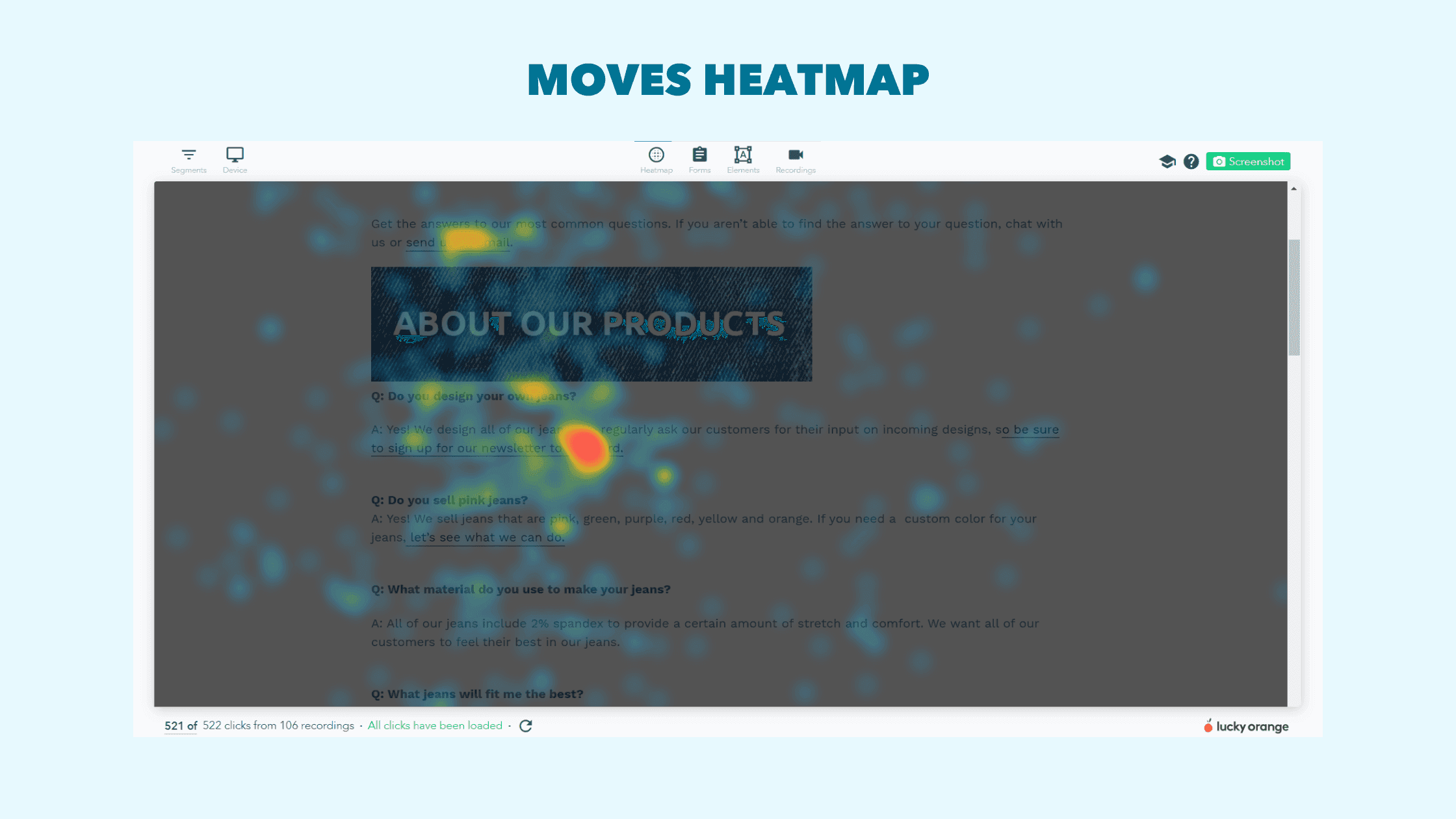
Often, a reader uses their mouse to line up with where they are reading or use it to follow along with the images or page elements they are looking at. For these reasons, it’s possible to draw parallels between moves heatmaps and where your visitors are looking.
Use this type of heatmap tool to identify which content your visitors are reading and if there are patterns in behavior worth noting.
For example, if while using a Moves Heatmap on a landing page I notice that all of our visitors are hovering their mouse over a certain phrase or section, I can assume that they are looking for more information or are especially interested in that page element.
How to read a website heatmap tool
Heatmaps are a powerful tool for website optimization but are only truly effective if you know how to use them. Luckily, we have you covered.
Here are three quick heatmap techniques you can use to identify opportunities to optimize your website.
1) Are your visitors seeing your content?
Scroll maps help you identify the effective fold—the point where most visitors stop scrolling. To capture attention quickly, your most compelling content should appear above this fold.
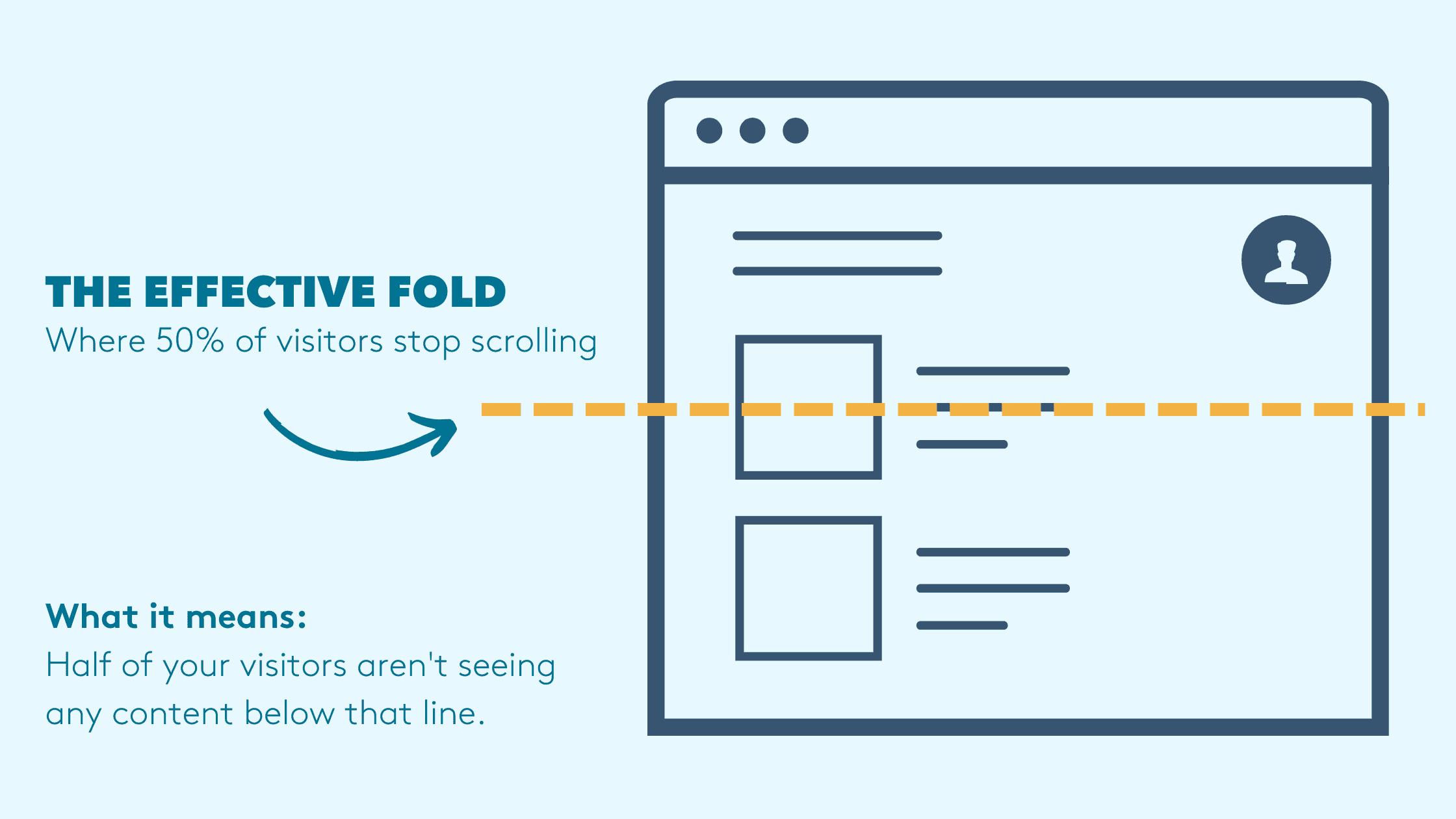
If scroll maps show key information below that point, simply moving it up can have an immediate impact. For instance, a CTA placed too low may go unseen, causing visitors to drop off before converting. Relocating it higher ensures more people actually see and can act on it.
While we often assume certain elements belong in specific spots, data driven decisions about layout are best. Even small adjustments can significantly boost conversions.
Take contact information, for example. It’s usually placed at the bottom—but on a service-based site, that section may be critical. Bringing it above the fold can make it easier for visitors to reach out, improving conversion rates by aligning design with user priorities.
2) Are your visitors getting confused?
Your website should offer a smooth, intuitive experience that guides visitors toward conversion. Every scroll and click should move them closer to taking action.
If certain elements create friction or distract from your goals, you could be losing sales.
Heatmaps are a powerful way to spot these issues. Click heatmaps can reveal when visitors are clicking on non-clickable elements—a clear sign of confusion. You can also use click or move heatmaps to see where visitors focus their attention. If they’re engaging with content that doesn’t support conversion, they’re likely getting sidetracked.
Removing distractions and clarifying the path forward can quickly improve your site’s user experience and boost results.
3) Is your website built for mobile?
Mobile users account for a growing share of e-commerce sales—so if your site isn’t mobile-friendly, you’re likely losing conversions.
With Lucky Orange heatmaps, you can filter by device type to compare behavior between desktop and mobile visitors. Mobile heatmaps help ensure no key elements are hidden or broken due to layout or formatting issues.
Use them to check the mobile effective fold, evaluate if CTAs are visible, and identify distractions or gaps in engagement. Pay special attention to dynamic elements like carousels or pull-down menus, which can behave differently on mobile.
While heatmaps are powerful on their own, pairing them with other CRO tools delivers even better results.
How to use heatmaps with other analytics tools
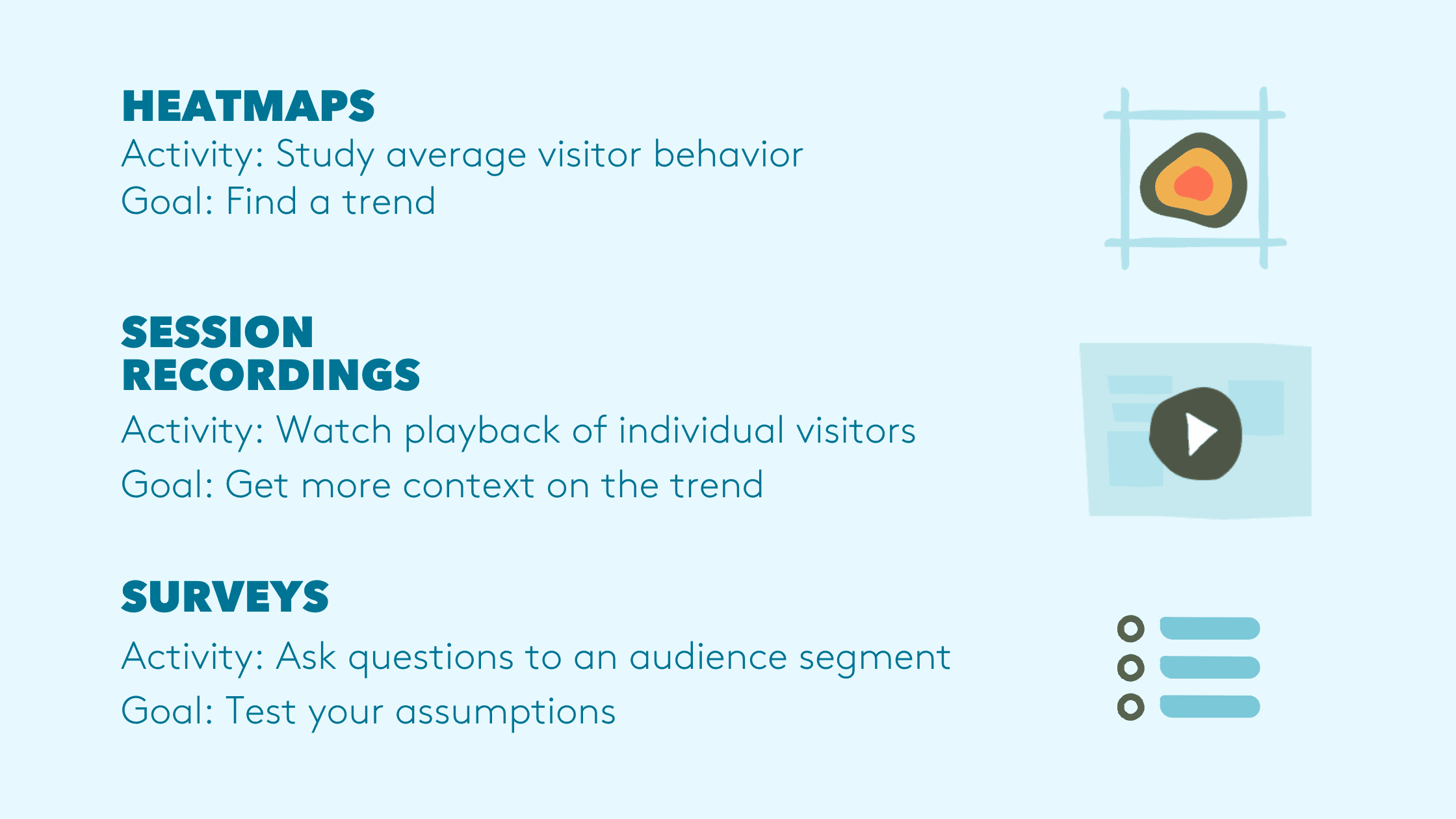
Website heatmaps are great on their own but make an even greater impact when used together with other tools like recordings and surveys.
Using a website heatmap tool alongside recordings
Heatmaps show overall user behavior, while recordings let you watch individual user journeys in real time. Used together, they provide a powerful way to uncover user experience issues and understand why they happen.
In Lucky Orange, you can easily switch between heatmaps and recordings to connect broad trends with specific visitor actions.
Start with heatmaps to spot problem areas—like weak CTAs or low scroll depth—then view recordings to understand why those issues occur.
You can also go the other way: if you spot confusion or friction in a session recording, jump to the heatmap tool to see if the issue is common or isolated.
This combination helps you move from insight to action—faster and with greater confidence.
Using a website heatmap tool with customer feedback tools (like chat and surveys)
Customer feedback provides some of the best insight into website visitors' behavior. That is why Surveys are included in Lucky Orange’s suite of website optimization tools.
With Surveys, it’s possible to ask your visitors where they are having trouble navigating your site, if they found what they were looking for and even if there are other items they’d like to see you sell. The big question in website optimization is always if there’s something causing pain points in your visitor's journey, and with the addition of surveys it’s as easy as just asking them.
Combining the power of customer feedback tools with heatmaps and session recordings is by far the best website optimization process.
We like to think of heatmaps, recordings and surveys as a trio of tools to use together to discover valuable insights that can lead to an improved website experience and a higher conversion rate.
Just like in the last section, it’s always a good idea to start with heatmap reporting to identify where visitors interact with elements that become roadblocks or are missing important information.
Then using session recordings, zero in on what is causing this confusion or disruption in your visitor's journey so you know what to fix.
Idea: Use a survey to ask people which payment method(s) they prefer ⬆️.
While you could stop the process here, there is still a question of if your optimization hypothesis is correct.
Instead of making an educated guess on what you assume is the correct fix, follow up these first two steps with a survey asking your visitors if your hypothesis is right.
Adding this third step will ensure you’re not wasting your time with website page changes that won’t yield results and will guide you in the most effective direction.
In practice, this process could look like this:
I’m unhappy with my conversion rate from visitors that visit a product page for hats. To discover what’s causing a roadblock for my visitors I open up a heatmap for that page and discover that instead of clicking on the CTA “buy now”, visitors are scrolling down the page and are completely missing the next step in the conversion funnel.
To learn why my visitors aren’t clicking on my CTA, I open up a session recording of visitors to that page. I learn that instead of clicking “buy now” visitors are navigating to a shipping page that takes them out of the checkout page flow and is getting in the way of conversion.
Just to be sure, I create a survey to ask visitors on that page if they found the information they were looking for. Just as I suspected, visitors responded that they couldn’t find shipping details.
With my hypothesis supported by customer feedback, I add a drop-down table with shipping information above the CTA to create a better user experience for my visitors. As a result, conversion increase because customers can find the information they need immediately without having to navigate away from the conversion opportunity.
What to do when you see something interesting on a heatmap
Using website heatmap data and other tools is important for uncovering insights that can lead to optimization. That said, the real impact on your site comes from the changes you make based on those insights. So the question becomes, how do you know what changes to make based on your visitor data?
The answer varies depending on the types of pain points you discover and what your goal is. Making the leap from discovery to change can be tough especially when the answer isn’t clear. That’s why it’s important to view website optimization as an ongoing process of improvement to your site instead of a one-time project or fix.
Using customer feedback through Surveys and Chat is a great way to minimize risk and inform your strategies if you're stuck. For example, if you notice that your CTA is getting ignored on business cricital pages but can’t figure out what change would fix the problem, chatting with visitors about their experience or adding a Survey to ask what visitors are looking for will tell you how to improve their experience.
A/B testing is also a great way to ensure that the changes you think need to be made actually increase conversions instead of having a negative effect. You can also double-check your website fixes by viewing a website heatmap and session recordings of how visitors are navigating the new page. Keep an eye on how your visitors react and even use a survey to compare if their experience changed.
Spending as little time as an hour a week tracking your visitor's behavior and making small adjustments to your site can make a significant difference in your user experience and conversion rate optimization.
Heatmap Fast Facts
Are heatmaps useful on Shopify, Bigcommerce or HubSpot websites?
Lucky Orange heatmaps are compatible with all common website builders like Shopify, BigCommerce, Hubspot, Square and more. We offer one-click installation through many app stores.
Will Lucky Orange heatmaps increase page load time?
Our code loads asynchronously, meaning it doesn’t load on your site until the essential elements such as your product pictures, navigation and CTAs have loaded and are fully functional. Learn more in the Lucky Orange Help Center.
How do heatmaps work if I'm A/B testing a page?
You can easily compare page variations with Lucky Orange heatmaps. Simply choose the web page in question, the time frame for your control page and your test variation, download a screenshot for each and compare. This gives you a visual representation of each page variation, seeing where visitors click or using scroll maps to see the effective fold.
Can I share a heatmap with other team members?
Yes. You can download a screenshot of the web pages you're studying with heatmaps. This way you can analyze user behavior as a team.
What are precise clicks on a website heatmap tool?
By toggling precise clicks, you'll see heatmap data with every single click included. This shows all collected data instead of a typical heatmap pattern
How do I create heatmaps for funnel analysis?
Simply launch a website heatmap for each of the business critical pages in your conversion funnel. Then compare the same segment for each page to identify trends in their unique behavior.
Lucky Orange