Blog
Conversion Rate Optimization
6 Tips to optimizing your e-commerce checkout page
Reduce cart abandonment with six proven strategies to optimize your ecommerce checkout page, streamline the purchase process, and boost conversion rates.
Lucky Orange

Did you know that e-commerce carts have an average 69.57% abandonment rate? That means around 7 out of every 10 people who get to your checkout page leave without making a purchase. No matter how good their experience leading up to this, something must be going wrong - so just how can you optimize the final step in a consumer’s journey to deliver a great customer experience (and more sales)?
Businesses spend so much time on other aspects of the customer-centric experience—from their contact center solutions to their landing pages and search engine results—but often neglect the checkout page. Get ahead of the competition by reducing your cart abandonment with these top tips.
Reduce additional fees
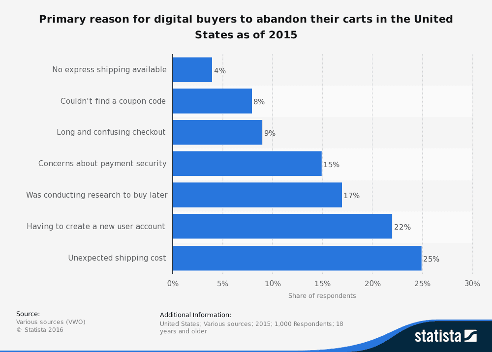
The checkout page is a vital part of your conversion funnel, yet nearly half of the abandonments happen due to something you can easily fix. It’s time to reassess your taxes and shipping fees.
Be clear on taxes
If you don’t already include the tax on the product page, start. Even if you display it on the product page separately as well as in total, it’s worth being upfront about these charges to avoid surprising the customer at checkout. While American customers are used to tax after purchase, it’s better to be clear on your rates, especially if you’re offering international sales.
Even showing an estimate near the initial price would help reduce this shock for customers, and encourage them to complete the purchase. In the UK, many sites aimed at businesses sell products at two rates - including and excluding VAT - and show both prices. This is a good way to be clear about costs upfront.
This is especially important for subscription plans or products with extras. If you’re a SaaS marketing agency, you might offer a base product with opt-in extras, and your website should be able to estimate taxes for each version.
Provide shipping options
Offering free shipping is the best solution here, but it’s not necessarily possible for all businesses, especially smaller ones. It’s worth assessing if it’s something you can provide - even if it’s only over a certain price or you bump the cost of your products slightly to adjust.
However, even without free shipping, you can make customers’ lives easier. Rather than having a flat rate shipping fee, have two or three options (any more and your customers will get decision fatigue and leave anyway). Ideally, you want a cheap option that takes longer, a quicker yet more expensive choice, and potentially an even more costly tracked version.
Have your checkout page default to the middle choice. By providing a cheap option, customers are more likely to complete their purchase as they can reduce the shipping costs - but they can choose to pay more for speed.
Don’t force them to register
After the extra fees, over a quarter of all cart abandonment is caused by the website wanting customers to create an account. If you use a customer engagement platform, you will obviously want to gather as much data as you can - and encouraging registration is good for this. However, you don’t want that to come at the expense of sales!
Guest checkout
Offering ‘guest checkout’ next to the option to register/sign in is great for website visitors who don’t want to sign up. Whether they’re security conscious, a first-time buyer, or have another reason for not wanting to sign up, this will cover it. Rather than seeing ‘register’ and leaving the landing page, they can instead select ‘guest checkout’ and only provide the details required for purchase.
Remember: you can always push for them to register after the sale has been made. Create a custom thank-you page for after the purchase, or use an onboarding email. As well as giving them their order number and detailing where order details will be sent, you can give them the chance to create an account to keep track of their orders.
Single sign-on
As well as creating a dedicated account on your site, you can offer the chance to use a single sign-in.
This is a great way to capture the interest of customers who don’t want to create an account out of disinterest. By offering the chance to use a pre-existing account, you still get the data as if they’d registered, but they don’t need to remember a new account’s details.
Make the process shorter
The longer the checkout process, the more likely someone is to leave. It’s frustrating to have spent a long time comparing products and adding them to your basket, only to discover you have to spend even longer to actually buy them. When you create digital catalogs, you want it to be as intuitive as possible - and the checkout should be the same.
Single page checkout
If it’s possible to display everything on a single page, it’s worth doing. By having just one page to fill in before pressing a (very clearly marked) purchase button, you reduce their frustration over what could be a lengthy process.
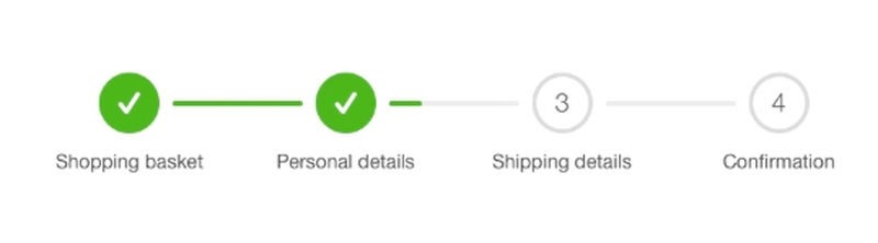
Have a progress bar
If you can’t fit it all on one page, show a progress bar so that your customers know there’s not much more left. Try to reduce it as much as possible - the example below is a helpful one, as it has just three sections and one of them is ‘confirmation’.
Any time you implement a web form, it’s worth doing this.
Conversion Rate Optimization for mobile
Whilst laptops and desktops used to be the main source of online sales, more customers are turning towards mobile devices. Given the amount of mobile marketing, this looks set to increase steadily.
If your checkout page isn’t optimized for mobile, people will abandon their carts and they’re unlikely to use the site again. By designing a mobile version (or app), you can ensure they stay. More importantly, they’ll remember that they had an easy time ordering from you - and are likely to order again.
Offer more payment methods
Even physical shops offer multiple payment options - usually cash, debit and credit card. By restricting your options, you’re restricting which customers can buy from you. While you can’t easily take cash payments, there are many more options available.
One major player is PayPal. For many customers, paying through PayPal means they don’t have to go and find their card in their handbag or wallet. Reducing the need for them to physically walk away from the checkout page is a surefire way to improve their experience! Similar platforms like Amazon or Google Pay are available, too.
For B2B companies, you may find many departments prefer the old-fashioned way of invoicing. If you can accommodate that, you’ll draw customers in who might otherwise have avoided you. You can even offer over-the-phone payment with a single click to connect to your VoIP services.
Simplify everything
Just like with something like SEO or social media—clear strategy and objectives matter. Make the checkout page clean, clear, and easy to fill in. No distractions, no pop-ups (unless it’s an exit one!), and no banner ads to other sites. Some things you can do to optimize your e-commerce checkout page include:
Allow customers to select their billing address as their shipping address, rather than typing it in twice
Display the form categories above where they type, rather than replacing it with their own text
If you’re going to upsell, make it non-intrusive and directly related to their purchases
Remove visual clutter - keep your brand image, but slimmed down as much as you can
If it doesn’t go through, make it easy for the customer to see what’s missing
While things like video can improve customer experience, avoid using them on the checkout page. You might want to highlight a tutorial related to what they’ve bought, or show off a new product. Waiting until the purchase is complete means they’re more likely to look upon it as a positive addition, not a distraction.
By following these six top tips, your customers will have a much simpler - and more pleasant - checkout experience, and you’ll see less cart abandonment. If you want to drill down even further, why not consider using heatmaps to see exactly what your customers are doing before they leave?
Lucky Orange