Blog
Conversion Rate Optimization
Boost Sales with Effective Website Announcements
Discover 5 Ways To Use Website Announcements To Grow with Lucky Orange. Boost engagement, reduce cart abandonment, and enhance user experience with effective strategies.
Lucky Orange

You've worked hard to drive people to your store, but traffic is only the first step. Have you ever visited a physical shop with no signs, prices, or clerks to help? That silent frustration mirrors what visitors feel on a website that doesn't clearly show them what to do next.
Fixing this doesn't require a developer. Think of an announcement bar as a bright, friendly sign at the top of your page. A well-placed web announcement acts as a digital greeter, pointing shoppers toward your best deals or helping them navigate away from confusing sections before they leave entirely. If you're looking for new website announcement examples, explore 5 Ways To Use Website Announcements To Grow | Lucky Orange for practical inspiration.
Research shows that confused shoppers rarely stick around long enough to buy. By providing clear guidance, you increase your "conversion"—the specific moment a visitor takes a desired action, like purchasing a product or joining an email list. Following announcement bar best practices bridges the critical gap between a browsing visitor and a loyal customer.
Today, you can quickly turn those hard-earned clicks into real revenue. These practical announcement strategies reveal how to boost engagement immediately without writing a single line of code. Whether you're announcing a new website or optimizing existing pages, the same principles apply.
Ditch the Hidden Shipping Fees: Boost Sales by 15% with Free Shipping Banners
Many online shoppers fill their carts, only to leave when a surprise $10 delivery fee appears at checkout. That sudden exit is called cart abandonment, and unexpected costs are the main reason it happens. Shoppers shouldn't have to guess your shipping rates while browsing your store.
Fixing this is incredibly simple. By placing a permanent message at the top of your site, you broadcast your delivery rules instantly. This onsite messaging works beautifully when you set a shipping threshold—a specific amount a customer must spend to get free delivery.
Unlike aggressive alerts, announcement banners win here because they quietly follow the user without blocking their screen. Try these proven templates for an effective e-commerce promotional strategy:
"🚚 Free shipping on all orders over $50!"
"Almost there: Free Delivery unlocks at $75."
"Treat yourself! Free Shipping on orders $100+."
Solving this shipping mystery gives visitors the confidence to shop. For those who aren't ready to pull out their credit card today, you can easily turn casual browsers into loyal subscribers without annoying pop-ups.
Turn Casual Browsers into Loyal Subscribers: Scaling Your Email List Without Annoying Pop-ups
Not every visitor is ready to buy immediately, but you shouldn't let them walk away empty-handed. Since your email list is a highly valuable business asset, collecting visitors' contact info is essential.
Instead of blocking a shopper's screen with a frustrating popup, savvy owners increase newsletter signups with header banners. These slim messages sit quietly at the top of your site, offering a polite but visible prompt. The secret to making them work is a strong CTA (Call-To-Action), which is simply the specific button you want them to click, like "Claim 10% Off."
People protect their inboxes today, so simply asking them to "subscribe" rarely works. Offering an immediate reward, such as a welcome discount, is crucial. By improving lead generation with call-to-actions that promise upfront value, you successfully turn hesitant browsers into an audience you can reach anytime.
Once you build an audience of subscribers, you can seamlessly direct them toward your biggest hits. This gentle approach also works as an announcement for new website visitors who are still exploring.
Announce Your Biggest Hits: Driving Traffic to New Products and Content Launches
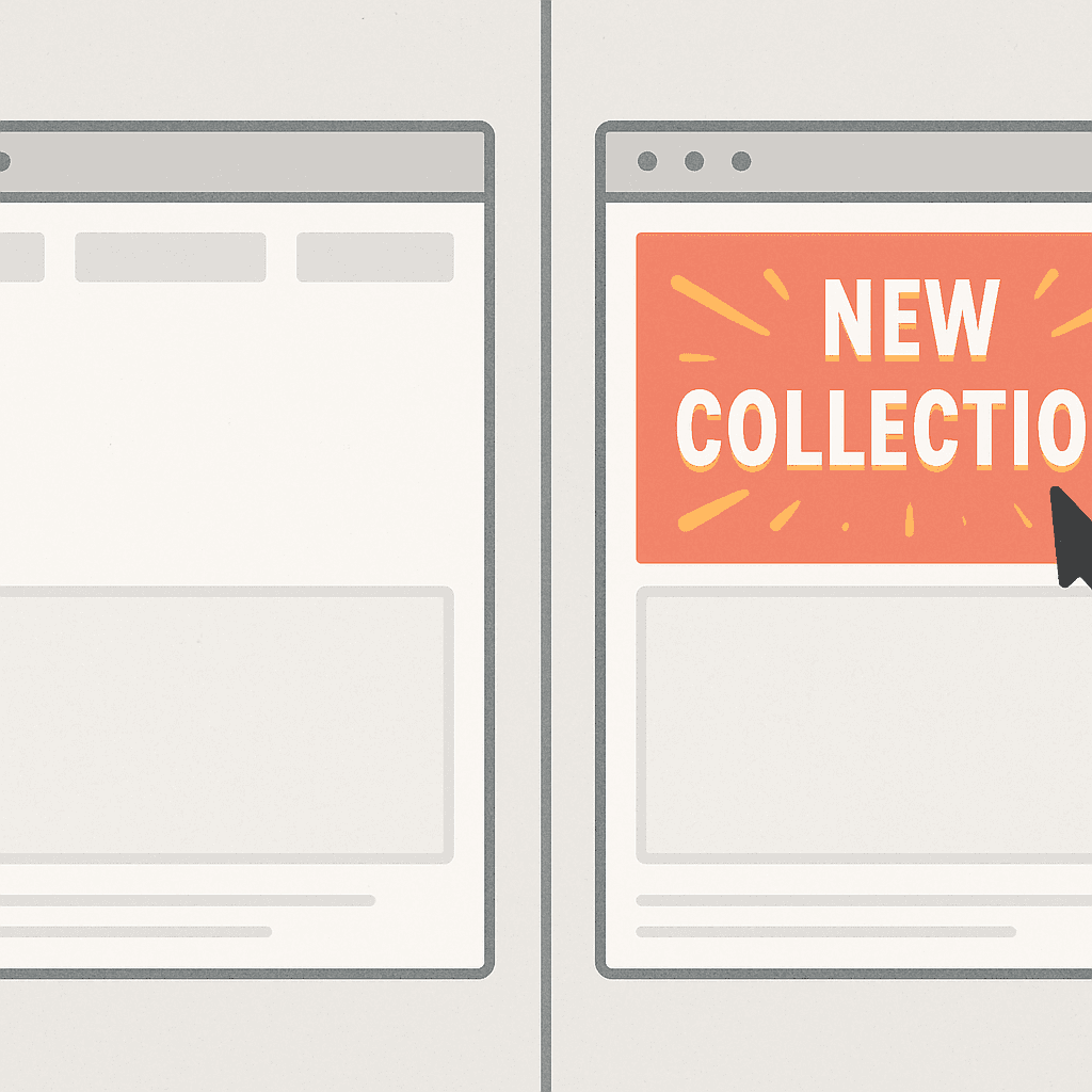
Creating a fantastic product is only half the battle; you must actively guide visitors toward it. When announcing a new item, think of your homepage as a busy store. Without clear signage, shoppers miss new arrivals. An announcement bar handles this traffic direction, smoothly funneling browsers directly to high-value pages. The same pattern powers a website launch announcement; a concise web launch announcement guides visitors to the right place fast.
Visual hierarchy—arranging elements so the most critical message grabs attention first—is the secret to making these banners work. Human brains are hardwired to notice "New," especially when combined with color psychology. Top announcement examples utilize highly contrasting colors. If your website is mostly blue, a vibrant yellow banner instantly signals something fresh just dropped.
To guarantee your release gets noticed, follow this launch checklist:
Contrasting Colors: Pick a background entirely different from your normal branding so it pops.
Strategic Links: Make the entire banner clickable so visitors don't have to hunt for a button.
Smart Timing: Remove the banner after two weeks so the "new" factor doesn't feel stale.
Directing early traffic to your latest hits builds essential sales momentum. For shoppers who add those exciting items to their basket but hesitate, real-time alerts can step in to save the sale.
Save the Sale Before They Leave: Reducing Cart Abandonment with Real-Time Alerts
You've likely watched visitors add items to their cart only to vanish, treating your store like a window-shopping trip. This hesitation is natural, but you can gently nudge undecided shoppers toward the checkout line using well-timed website notifications.
Creating a sense of scarcity is an effective way to encourage a decision without sounding pushy. Think of a "Flash Sale" banner as a friendly reminder, notifying customers about limited-time offers like "Only 3 left!" or "Free shipping ends at midnight." When people realize a great deal won't last forever, they stop procrastinating and start purchasing.
Timing this urgency perfectly requires a simple but powerful tool called an exit-intent trigger. Using real-time user behavior analysis, your site watches when a shopper's mouse moves toward the "close" button. Popping up a "Wait, take 10% off your cart!" message right as they try to leave gives you one final chance to save the sale.
Stopping shoppers from abandoning their carts protects your hard-earned revenue. After converting these hesitant browsers into buyers, personalized messaging keeps them coming back.
Treat Regulars Like VIPs: Using Personalized Announcements to Increase Return Sales
Imagine walking into your favorite coffee shop only for the barista to read you the menu like a complete stranger. Frustrating, right? Treating loyal online buyers exactly like newcomers misses a massive opportunity to build lasting relationships.
The secret to fixing this is segmentation—simply showing different digital signs to different groups of people. By integrating website announcements with conversion rate optimization, you can greet familiar faces with tailored deals. In fact, an exclusive "Welcome Back" discount is three times more effective at driving repeat sales than throwing a generic promotion at everyone.
Setting up personalized alerts for returning visitors is surprisingly easy using these three basic targets:
First-time visitor: Welcome them with a small discount in exchange for an email signup.
Returning visitor: Show a friendly "Welcome Back" banner with a VIP promo code.
Customer from a specific city: Highlight localized perks, like "Free local delivery in Chicago!"
Before launching dozens of these helpful popups, remember that too many messages can quickly overwhelm your shoppers. To optimize the user experience, you must master the golden rules of announcement bars and dodge common UX pitfalls.
The Golden Rules of Announcement Bars: Avoiding 'Banner Blindness' and UX Pitfalls
Most internet users instinctively ignore brightly colored banners at the top of websites. This habit is "banner blindness," where visitors subconsciously tune out anything resembling an ad. Designing high-converting notification bars means realizing that shouting louder doesn't work; you must be genuinely helpful instead.
Balancing visual impact with a smooth user experience (UX)—making your site easy and pleasant to navigate—is crucial here. Effective strategies rely on the "Contrast Rule." If your website is mostly blue, make the bar a soft yellow so it catches the eye naturally. Pair this color pop with the "One-Sentence Rule," keeping messages incredibly brief, like "Free shipping on orders over $50."

When considering the best announcement types, never forget your mobile shoppers. A banner that looks perfect on a desktop might unexpectedly cover half a smartphone screen, frustrating buyers and blocking them from clicking anything. Mobile-friendly alerts must sit neatly at the edge, delivering value without hiding your actual store.
Once your messaging is visually appealing and structurally sound, it's time to put it into action.
Your 24-Hour Action Plan: How to Launch Your First Announcement and Measure Success
You don't need a massive website redesign to capture more sales. You now have the power to guide visitors exactly where they need to go using simple, strategically placed messages. Whether it's a new website launch announcement or a limited-time promo, the workflow is the same.
Transition from reading to growing by following this simple checklist over the next 24 hours:
Choose one clear goal.
Write short, punchy text.
Pick a color that stands out.
Launch your new announcement.
Check your heatmaps.
Once your message is live, measuring success becomes effortless. Use heatmaps to actually watch visitors click your banner, proving the immediate ROI of your efforts without needing to decode complex data.
Every visitor is looking for guidance, and you now know exactly how to provide it. Take just ten minutes today to put these practical announcement strategies into place, and see the immediate difference a simple digital greeting makes.
Q&A
Question: What is a website announcement bar, and why use it instead of pop-ups?
Short answer: An announcement bar is a slim, always-visible message at the top of your site that acts like a friendly in-store sign. It guides visitors to take meaningful actions—shop a deal, discover a new product, or join your email list—without blocking their view or interrupting their browsing. Unlike pop-ups, it quietly follows the user, reduces confusion, and improves conversions without needing any code to set up. It also supports personalization (for example, a “Welcome Back” VIP offer for returning shoppers), which can outperform generic promos by a wide margin.
Question: How can free-shipping banners reduce cart abandonment, and what should they say?
Short answer: Hidden fees drive cart abandonment. A permanent, top-of-page banner that clearly states your shipping policy removes the “surprise” at checkout and builds confidence to complete the purchase. Set a threshold and state it upfront. Proven copy includes:
“🚚 Free shipping on all orders over $50!”
“Almost there: Free Delivery unlocks at $75.”
“Treat yourself! Free Shipping on orders $100+.”
The article highlights that using free-shipping banners can boost sales by around 15%, because shoppers no longer have to guess what delivery will cost.
Question: What’s the best way to grow my email list without annoying pop-ups?
Short answer: Use a discreet header banner with a strong, value-forward CTA instead of a screen-blocking popup. People guard their inboxes, so “Subscribe” alone isn’t compelling—offer an immediate reward like a welcome discount and make the action crystal clear (e.g., “Claim 10% Off”). This turns hesitant browsers into subscribers you can reach anytime, without degrading the user experience.
Question: How should I announce new products or a website launch so people actually notice?
Short answer: Use visual hierarchy and color psychology to make the message unmistakable. Practical checklist:
Contrasting colors: Choose a banner color that sharply contrasts with your brand palette so “New” stands out.
Strategic links: Make the entire banner clickable so visitors don’t have to hunt for a button.
Smart timing: Remove the banner after about two weeks so the “new” signal doesn’t go stale.
This turns your homepage into a guided path to high-value pages—perfect for new product drops or a site launch announcement.
Question: How do I avoid “banner blindness” and mobile UX issues—and launch fast while measuring success?
Short answer: Be helpful, concise, and considerate on every device. Follow the golden rules:
Contrast Rule: Use a color that naturally pops against your site.
One-Sentence Rule: Keep copy brief (e.g., “Free shipping on orders over $50”).
Mobile-first: Ensure the bar is slim, readable, and doesn’t cover key content or controls on small screens.
Don’t overload: Too many messages overwhelm users; show the right message to the right segment.
To launch in 24 hours, follow this workflow: choose one clear goal, write short punchy text, pick a standout color, publish, then check heatmaps. Heatmaps let you see clicks on the banner in real time, proving ROI without complex analytics.
Lucky Orange