Blog
Conversion Rate Optimization
Upload and Analyze Website Heatmaps with an AI Heatmap Tool
Use AI heatmaps to analyze user behavior, uncover conversion insights, and make smarter design and content decisions.
Lucky Orange

Website heatmaps---and increasingly, AI heatmaps---are super useful for marketers, UX designers, and web developers who want to improve their sites.
But let's face it---manually figuring out what your heatmaps are telling you can only get you so far. That's where artificial intelligence (AI), heatmap AI, and chat tools come in. They make it easier and faster to analyze the data, giving you smart insights to boost your site's performance---no matter your goals.
Summary
This guide shows how to combine heatmaps with AI to quickly turn visual behavior data into actionable UX and conversion improvements.
It covers AI’s benefits (pattern detection, predictive insights, and segmentation), explains heatmap types, and provides a workflow: generate and filter heatmaps (e.g., in Lucky Orange), add GA4 metrics, upload to an AI tool, and use a structured prompt. You’ll learn to interpret results, prioritize with an impact/effort matrix, and apply concrete recommendations and predictive visuals. The outcome is faster, clearer decisions that improve engagement, user flow, and conversions across devices and audiences.
The Role of AI in Analyzing Heatmaps
AI heatmap analysis can save hours of manual work, while uncovering patterns and insights that might go unnoticed to even the most experienced CRO researcher. It also supports AI heat mapping before and after launch.
Key Benefits of AI Analysis:
Pattern Recognition: AI detects user behavior trends, like recurring bottlenecks or popular pathways, that might not be obvious on visual inspection.
Predictive Ideas: AI can forecast user behavior based on historical data, helping you implement proactive optimizations.
Personalization and segmentation: LLM tools allow segmentation to offer insights for specific user groups, improving targeted marketing strategies.
By using AI on your team, you essentially add a layer of intelligence to otherwise static heatmap tool visualizations. An AI heatmap tool helps connect visual patterns to actionable steps.
What is a Dynamic Heatmap?
If you've never played with website heatmaps before, they're simply a visual representation of viewer attention on a web page.
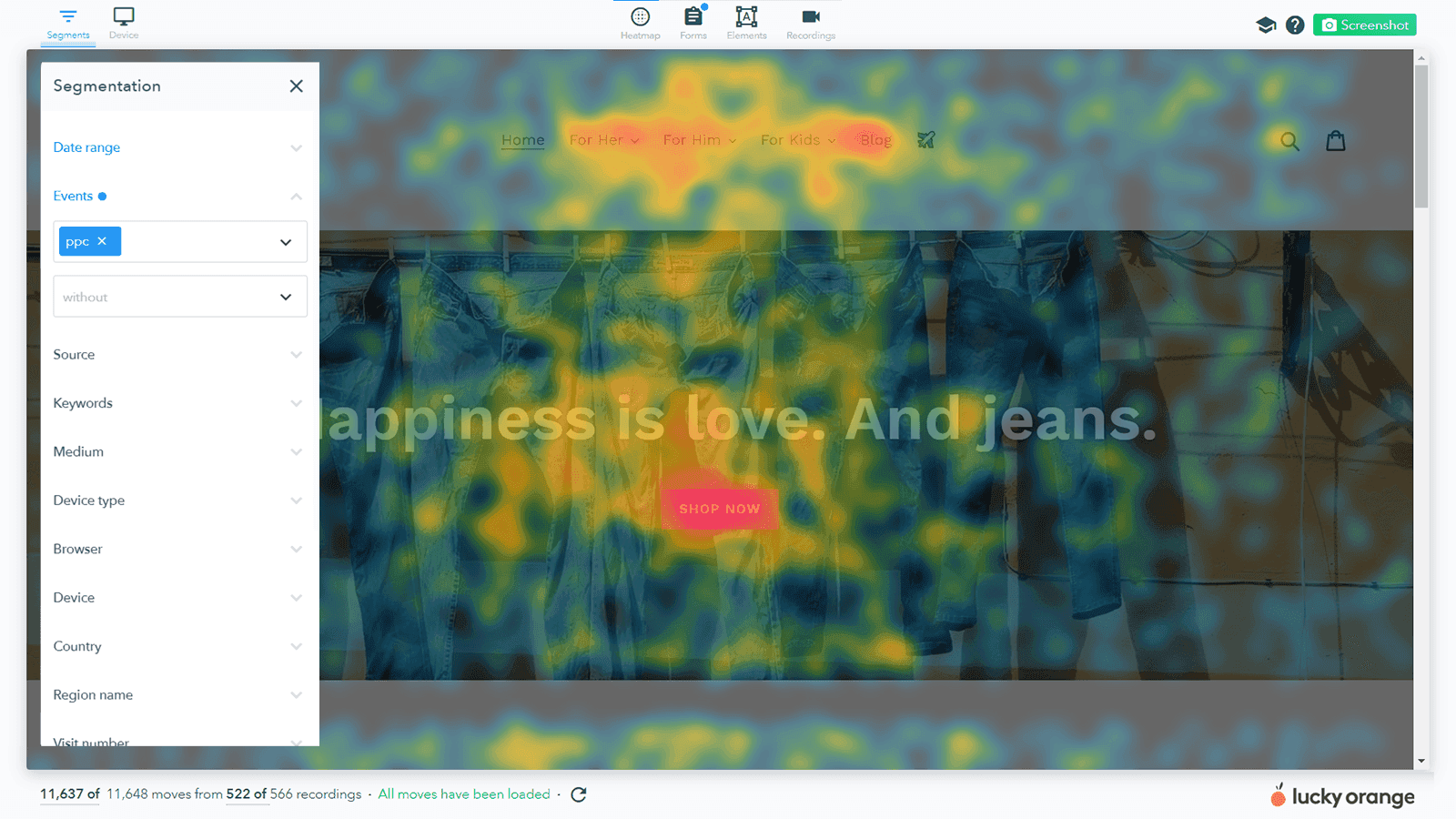
Click heatmaps (also known as attention heatmaps) show user engagement by displaying clicks, taps and scrolls, highlighting which elements captured the most viewer attention.
Move heatmaps show where users paused or hovered their mouse on the page, often correlating with eye tracking studies to indicate where they focused their attention rather than just clicking.
By using color-coded overlays, heatmaps highlight areas of high and low engagement, providing a clear picture of how people navigate and engage with your site. Before launch, an AI heatmap generator can predict where attention may concentrate, and an AI heatmap can help validate real-user behavior after you collect traffic.
If you've never played with website heatmaps before, they're simply a visual representation of viewer attention on a web page.
Click heatmaps (also known as attention heatmaps) show user engagement by displaying clicks, taps and scrolls, highlighting which elements captured the most viewer attention.
Move heatmaps show where users paused or hovered their mouse on the page, often correlating with eye tracking studies to indicate where they focused their attention rather than just clicking.
By using color-coded overlays, heatmaps highlight areas of high and low engagement, providing a clear picture of how people navigate and engage with your site.
How Visual Representation via Heatmap Powers Optimization
This heatmap analysis (sometimes written as heatmap analyse in UK English) is useful whether you're managing a Shopify store, running a corporate website or optimizing a personal blog, and it helps answer key questions like:
Are users clicking on Call-to-Actions (CTAs)?
Are visitors reaching important conversion points like a product page or a cart?
Where do users lose interest?
Are my dynamic page elements rendering properly?
Heatmaps visually highlight visitor behavior through "hot" and "cold" spots. The brighter the color, the more attention that element receives.
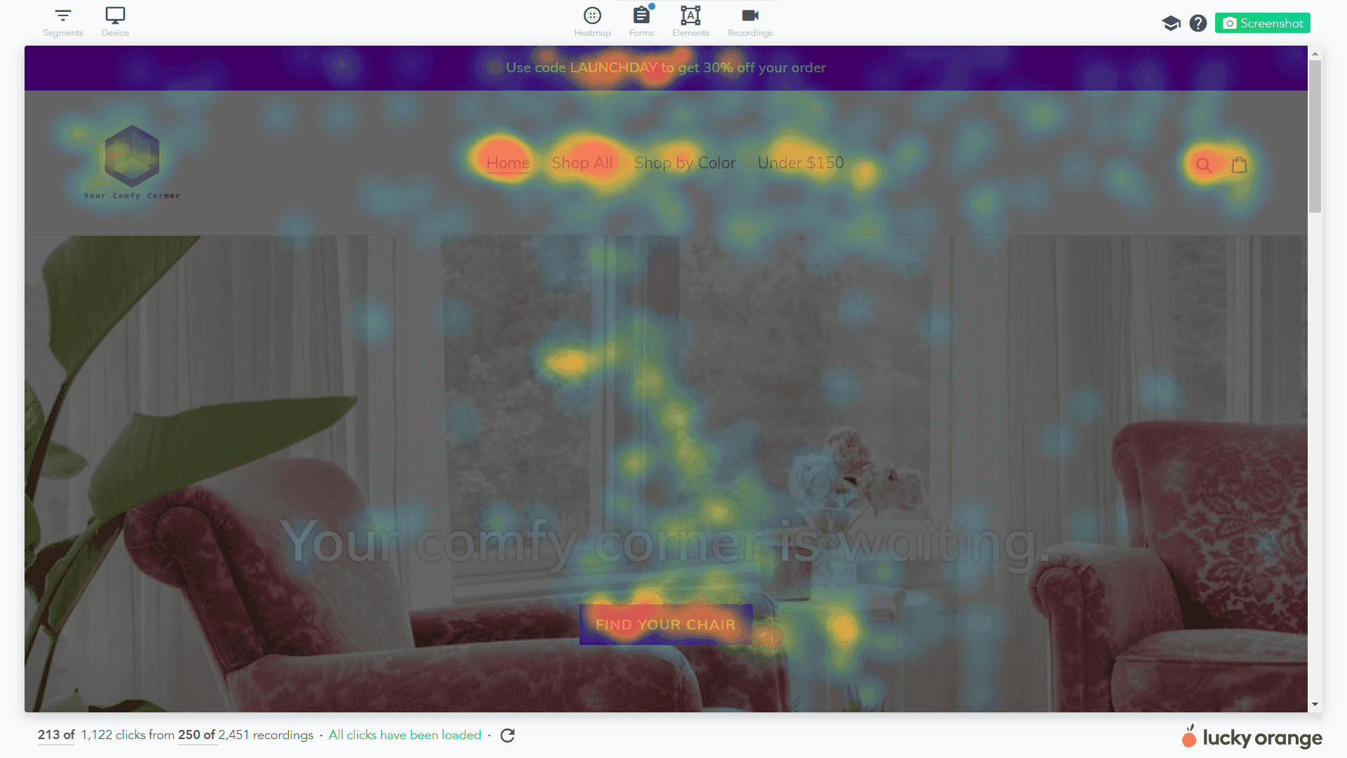
For example, a glowing red area might indicate a busy click zone, while darker blue areas could suggest neglect. Understanding this data allows you to improve user flow, optimize conversions, and design better UX. You can also use AI heat mapping suggestions to prioritize tests.
However, the real challenge lies in interpreting these heatmaps efficiently and accurately---and that's where AI can help.
How to Analyze User Behavior With AI & Heatmap Tools
Generate and customize your heat maps
Before jumping into AI heatmap analysis, you need to generate and save a heatmap as an image for easy uploading. If you use Lucky Orange, the process of both generating and saving a heatmap can be completed for any of your website's URLs in less than a minute. If you want a quick early read before traffic builds, an AI heatmap generator can complement Lucky Orange by predicting likely hotspots.
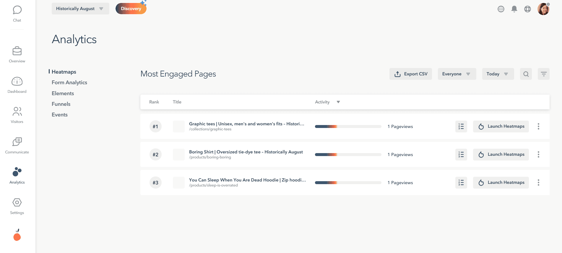
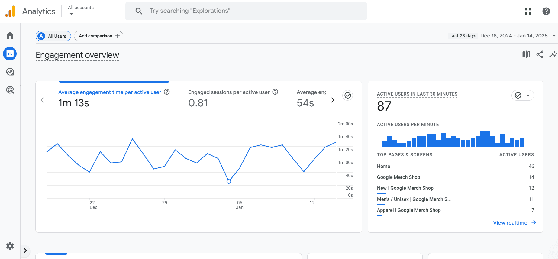
Go to Analytics > Heatmaps, then click the "Launch Heatmap" button for the page you're analyzing to generate a detailed, visual analysis of user interactions with important elements on a page.
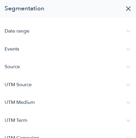
Once you're inside the heatmap tool, you can also quickly apply filters like date range, traffic source, UTM parameters or location to focus on the most relevant audience for your research goal.
When you're satisfied with the data displayed on your heatmap, simply use the Screenshot button in the upper-right hand corner to create a static image for sharing or further analysis.
Add in Google Analytics data before going to your AI tool
While you can upload the heatmap alone for AI feedback, adding quantitative data to the picture will help the LLM tool reply in a more complete way about how people interact with the page. Many Lucky Orange customers pair our visual analytics with data from Google Analytics (including directly through our GA4 Lucky Orange integration).
Recommended metrics for powerful insights
Conversion rate
Time on page
Bounce rate
Referring sources
Browser and device types
Below, we'll provide a complete prompt to use when querying LLMs that references these GA4 metrics.
Upload into your preferred AI chat tool
To start AI heatmap analysis, upload your heatmap screenshot as an image file (usually JPG or PNG work well) into your preferred AI heatmap tool or chat interface.
Two extra tips:
Certain AI solutions may limit you to uploading one heatmap tool image at a time, meaning multiple images must be uploaded individually. However, when using AI, you can refer to previously uploaded images to enhance your analysis. If you're using this process to compare heatmaps from different pages or different versions of the same page but with an A/B test, you may need to upload images separately.
If you're working with multiple images, group related heatmaps together. For instance, upload all mobile heatmaps for a single webpage as a set to ensure cohesive analysis.
Just uploading your heatmap into AI isn't enough. The key lies in asking the AI the right questions. The better your prompt, the better the insights you'll receive.
Below is a prompt you can play with in your own research, but the top tips for AI conversion optimization in general are:
Start with specificity: Instead of asking, "what does this heatmap show?" Focus on specific elements of the page or behaviors you've already noticed like scroll depth or click concentration.
Leverage hypotheses: Provide scenarios to help lead the AI to actionable answers with your full real-world context. "I think visitors are missing this section because of X. What can I do to influence more engagement?"
Ask for secondary follow-ups: Once you get a noteworthy response, go deeper by asking about performance with specific parts of your audience (device type, location, UTM parameter, returning vs new visitor).
Here's a comprehensive prompt you can (and should) steal for your analysis:
Note: Provide this entire prompt to your LLM tool. You'll need to fill in the dots with an uploaded heatmap and GA data either in spreadsheet format or directly where each metric is mentioned.
"You are a website optimization and conversion rate expert with deep knowledge of UX/UI principles, behavioral analytics, and data-driven decision-making. Your goal is to analyze the provided heatmap (in PDF format) alongside Google Analytics data, including but not limited to:
Conversion Rate (CR): How well is the page driving desired actions?
Bounce Rate (BR): Are visitors leaving without interacting?
Time on Page: Are users engaged with the content?
Click Distribution: Where are users focusing their attention?
Scroll Depth: How far down the page are visitors scrolling?
Exit Rate: Which elements might be causing drop-offs?
Traffic Source Analysis: Are different channels interacting with the page differently?
Step 1: Evaluate Key Heatmap & Analytics Insights
Analyze the heatmap and data using the following categories:
How can I increase Engagement & Interaction?
High-Activity Areas: Where are users clicking the most, and do these align with the intended conversion paths?
Ignored Elements: Are key elements (CTAs, value propositions) being overlooked?
Scrolling Behavior: Are users reaching critical content sections, or are they dropping off too soon?
Interaction Flow: Are users navigating intuitively, or is there confusion in their journey?
How can I improve my conversion elements?
CTA Effectiveness: Are users engaging with calls-to-action? Assess messaging clarity, visibility, and placement.
Form Performance: Are form fields being completed, or do they contribute to drop-offs?
Content Engagement: Are users interacting with key messaging, testimonials, and trust signals?
Give me a predictive heatmap to help get higher engagement.
Visual Attention Distribution: Is the page layout guiding users towards important content?
Navigation Efficiency: Are users finding what they need quickly and intuitively?
Distraction Factors: Are there any elements causing friction or confusion (e.g., cluttered sections, non-clickable items)?
Step 2: Identify Patterns and Areas for Improvement
Provide insights based on behavioral patterns observed in the heatmap and analytics, highlighting:
Successful Elements: What's working well and should be further optimized?
Friction Points: What areas are causing frustration or abandonment?
Missed Opportunities: Where could design or content changes improve user engagement?
Step 3: Prioritization with a 2x2 Matrix
Categorize recommendations based on:
Impact (High/Low): The potential effect on conversions and engagement.
Effort (Easy/Hard): How complex the implementation is.
For example:
High Impact, Easy to Implement: Improving CTA placement and readability.
Low Impact, Hard to Implement: Redesigning complex sections or restructuring navigation.
Step 4: Actionable Recommendations
For each identified issue, provide 2-3 specific, actionable recommendations, such as:
CTA Optimization: "Increase button contrast and test action-oriented language like 'Get Started Today' instead of 'Submit'."
Content Reordering: "Move testimonials higher to increase trust before the CTA."
Mobile Adjustments: "Optimize for mobile by reducing image sizes and ensuring touch-friendly buttons."
Step 5: Visual Summary Charts
Provide a visual summary of findings using:
Color-Coded Alignment Chart
Green: Fully optimized
Yellow: Needs improvement
Red: Requires immediate attention
Click Heatmap Insights Table
Columns: Section | Interaction Level | Suggested Action
Deliverable:
A concise, compelling report summarizing the key findings, prioritized recommendations, and visual aids to support decision-making and encourage actionable next steps."
Increase Conversions by Combining a Heatmap Tool with AI
AI heatmap analysis makes optimization easier by combining the best of GA4 metrics with Lucky Orange visualizations in one handy conversation. When helpful, you can also reference AI heatmaps generated before launch to compare against real-user behavior.
This approach takes out the guesswork, so you can make better decisions on what really works for your visitors. Whether you want to improve engagement, increase conversions, or make your user experience better, AI insights give you the information you need to hit your goals. Stay ahead of the competition and take control of your website's performance by making the most of these tools.
Your visitors are showing you what they need---AI helps you see it clearly.
Q&A
Why use AI with website heatmaps instead of relying only on visual inspection?
AI speeds up analysis and uncovers patterns you might miss. It detects behavior trends (like recurring bottlenecks or popular paths), offers predictive ideas based on historical data, and supports segmentation so you can see how different audiences behave. In short, it turns static heatmap visuals into clear, actionable steps for UX and conversion wins.
What types of heatmaps should I generate, and when does an AI heatmap generator help?
Short answer: Start with click (attention) heatmaps to see where users click/tap/scroll, and move heatmaps to understand hover and focus areas that often mirror eye tracking. Before launch, use an AI heatmap generator to predict attention hotspots; after traffic accrues, validate and refine with real-user heatmaps to confirm (or challenge) those predictions.
Question: What’s the recommended workflow to analyze heatmaps with AI?
Short answer: Generate your heatmap (e.g., Lucky Orange > Analytics > Heatmaps > Launch Heatmap), apply filters (date range, source, UTM, location), then save a screenshot. Add key GA4 metrics, upload the image (JPG/PNG) to your AI tool, and use the structured prompt provided to evaluate engagement, conversion elements, and predictive attention. Finally, prioritize recommendations with an Impact/Effort 2x2 and implement actionable fixes (e.g., clearer CTAs, content reordering, mobile touch targets), using AI follow-ups to segment by device, traffic source, or visitor type.
Question: Which GA4 metrics should I include, and how do they improve AI insights?
Short answer: Include conversion rate, time on page, bounce rate, referring sources, and browser/device types to ground the visuals in quantitative context. For deeper diagnosis, add click distribution, scroll depth, exit rate, and traffic source analysis so the AI can connect attention patterns to drop-offs, engagement depth, and channel differences.
Question: Can I compare multiple heatmaps (e.g., mobile vs. desktop or A/B variants) in an AI tool?
Short answer: Yes—upload images individually if your AI tool limits one-at-a-time, then reference previously uploaded images in your prompts. Group related sets (e.g., all mobile versions for a page) to keep analysis cohesive, and ask targeted follow-ups to highlight differences by device, variant, or audience segment.
Lucky Orange