Blog
Conversion Rate Optimization
Analyzing Content Performance With Dynamic Heatmaps
Unlock powerful content insights with dynamic heatmaps to understand user engagement, optimize page elements, and create more effective website content.
Lucky Orange

It’s a constant question for anyone who creates content: is anyone reading what I’m writing? This step-by-step guide can help you answer questions such as “Is my content marketing effective?” and “Why content marketing fails.”
Let’s get started with the first question, “Is my content marketing effective?” There are two parts to figuring out whether your content marketing is effective - conversions and reader engagement. The goal of most content marketing programs is to spur action like signing up for an email list, creating an account, purchasing a product or requesting a demo.
It’s fairly straightforward to figure out if your content is succeeding in terms of conversions. Simply take your conversion metric and see what the conversion rate is for that piece of content. A conversion rate is the total number of people who viewed your content divided by the number of people who converted.
But how can you tell if your content is effective if you don’t have a direct conversion opportunity tied to it? This might be the case if you have content on a page that is educational in nature but not tied to a conversion, like help documentation, shipping and return policies or blog posts.
Or you might be creating content to support a lengthy sales cycle where it takes multiple interactions throughout the buyer journey before a visitor converts. So how can you gauge the effectiveness of your content when you can’t tie it to a conversion?
On-page content metrics
Reader engagement is a great way to get a sense of how your content is performing. You may have used metrics in the past like time on page to determine this. The downside of measuring reader engagement by time on page is that you don’t actually know what the reader was doing while they were on the page. Maybe they opened a tab on their browser but then switched to a different tab or walked away from their laptop or phone to do something else.
Access dynamic heatmaps for your site with a free 7-day trial of Lucky Orange.
A high time on page might seem to indicate an engaged reader, but in scenarios like the ones above, the reader might not be engaged at all. That’s where a Lucky Orange tool - dynamic heatmaps - can help you learn more about reader engagement.
The following steps will take you through how you can evaluate your content using heatmaps to determine the level of reader engagement.
1. Choose pieces of content you want to evaluate.
We recommend evaluating both long- and short-form content to see if your audience prefers one type over the other. Pick content that has similar traffic if possible so you have an apples-to-apples comparison.
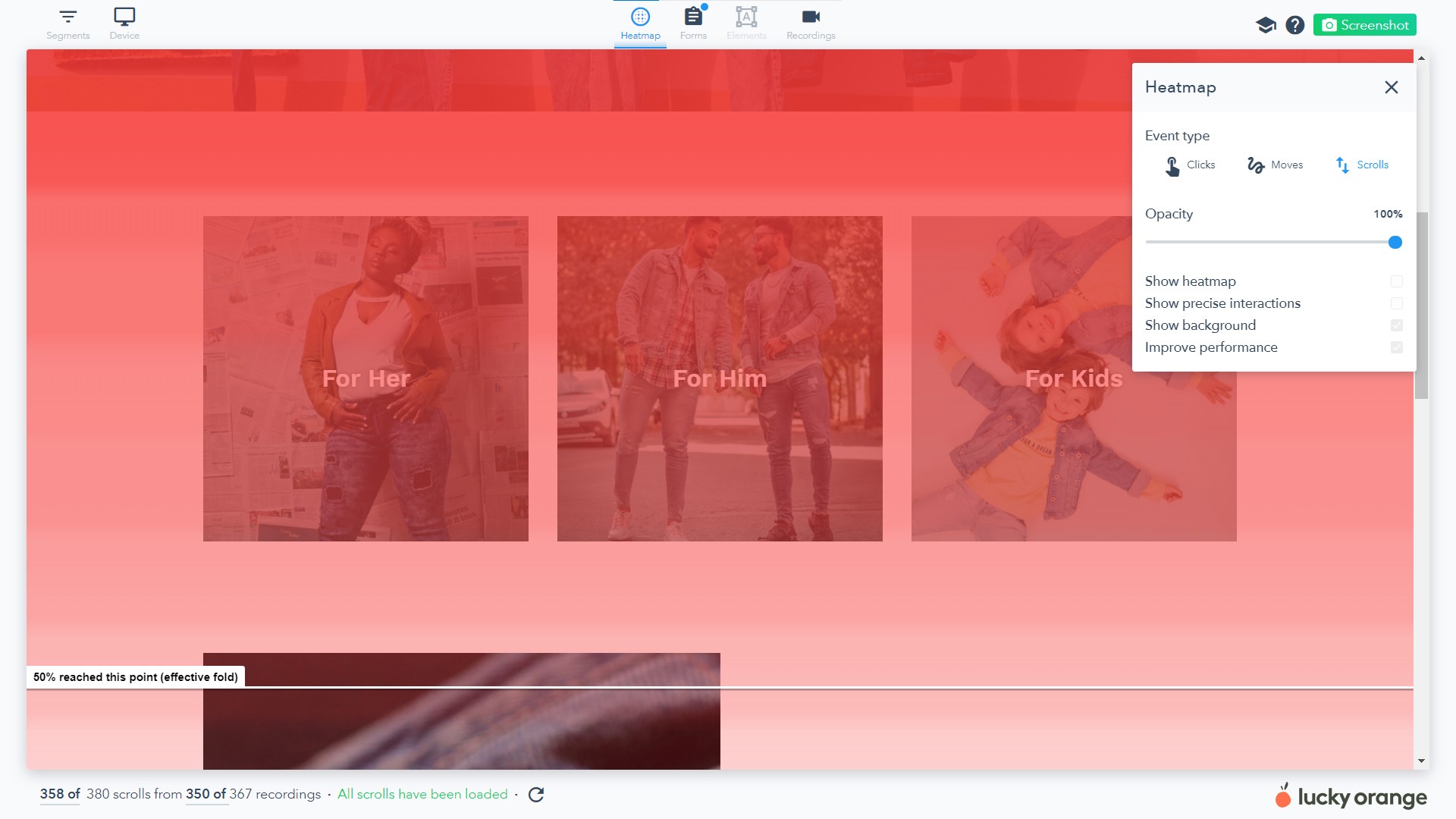
2. Generate a scroll heatmap of your short-form content.
A scroll heatmap shows you an aggregate view of people who came to a specific web page and how far down on average the majority of people scrolled before leaving the page.
3. Scroll down the heatmap until you find the effective fold.
You’ll notice as you scroll down the page, the scroll depth color changes from darker red to lighter red and eventually to white. Similar to other types of heatmaps, the more red in the overlay, the more engagement there is with the page. If you’re not seeing much red but seeing more pinks and white, the content isn’t getting much engagement.
You’ll notice a white line when you reach the effective fold. This is the point where 50% of readers left the page.
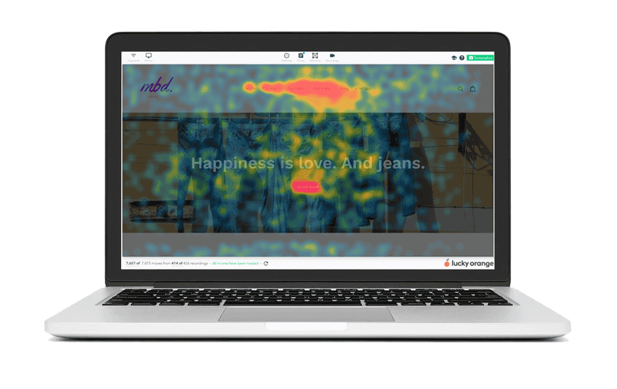
4. Switch to a click heatmap to see how many users are engaged with your calls to action (CTAs) and links.
The areas where you see more of the larger red overlays indicate elements that receive more engagement. If you’re seeing lots of cooler blue and green overlays, that indicates lower engagement with those elements or parts of the site.
Shape up your content with our free content strategy map.
5. Repeat these steps with long-form content.
Scroll heatmaps are one of our favorite tools because it helps you answer that nagging question, “Are people even reading my content?” If you’ve ever been trying to hit a specific word count for a blog post based on the advice of some expert, scroll heatmaps can tell you if that effort was even worth it by showing you if people read to the end of your lengthy content.
6. Look for differences between long-form and short-form content performance.
Here are a few things to look for:
Make note of which type of content had an effective fold that was further down the page. A deeper effective fold indicates more reader engagement.
See which piece had more engagement with your CTAs, and where that engagement happened. Did more readers engage with your CTAs early on, but fail to engage later? That could be a good sign if the user ultimately ended up converting on your first CTA.
Taking your analysis a step further
Another helpful layer of analysis to perform on your content is to see if there are differences in conversions and engagements in traffic coming from desktop compared to traffic from mobile or tablet. In Lucky Orange, you can segment your heatmaps to see traffic specific to those types of devices.
Why does it matter if readers on mobile devices show less engagement than readers on desktop devices? If your primary source of traffic to your website comes from mobile users, you might want to consider optimizing for this audience instead.
Rinse and repeat
Repeat the process of comparing long- and short-form content several times. This helps prevent you from making assumptions on just one piece of content that either performed very well or very poorly.
Once you’ve completed your analysis and know which type of content your visitors engage with most, focus on that type of content going forward.
Lucky Orange