How to Create a Successful Mobile Website for your Business
Aug 7, 2023
Published by: Kennedy Kaufman

Creating a successful mobile-optimized website involves more than just shrinking your desktop site to fit a smaller screen. This blog will take you on a hands-on journey, guiding you through the practical steps required to help build a mobile website that truly works for your business.
We're not just talking about the basics here.
Together we'll delve deeper into the nuances of mobile web design and functionality, helping you understand how to make smart choices that will benefit your bottom line.
Read with us as we unpack the process of building a mobile website that truly delivers success.
1. Understand and adopt responsive design
Responsive design is the backbone of a successful mobile website. It ensures that your website automatically adjusts and looks great on screens of all sizes, from the largest desktop monitor to the smallest smartphone.
But what does it mean to have a responsive design, and how can businesses achieve it?
Let's look at a company that has excelled in creating responsive designs.
Nixon, a mens watch company, is an example of an e-commerce site that understands the art of responsive design. Their website seamlessly adapts to different screen sizes, rearranging content and navigation menus to guarantee an optimal user experience no matter the device.
Here are some examples from Nixon's mobile site where you can notice examples of some responsive design best practices:
- Downsizing product images without losing image quality
- Adjusting menu bars to match visitor expectations and standards
- Adjusting filtering buttons and banners to avoid covering other key elements
- Building pages to encourage scrolling behavior, with properly-sized images and clickable elements

So, what makes this design good?
A few key elements stand out. Firstly, it maintains consistency. The brand identity remains clear and recognizable across all devices. Secondly, it prioritizes user experience. Navigation is intuitive, and important information or actions (like a 'Buy Now' button) are easily accessible.
Making sure the most important buttons are easily clickable by customers on every device. Lastly, continuous improvement and fast load times, even after launch, continue testing and improving your mobile website, but also load quickly.
Now, how can your business create a similar responsive design?
Start with a mobile-first approach. Design your website for small screens first, then scale up for larger ones.
This ensures your site will function well on mobile devices where screen real estate is limited. Use flexible grids to arrange your content, which allows it to resize dynamically based on screen size. These grids adapt dynamically based on the screen size they're viewed on. For example, a three-column layout on a desktop might rearrange to a single-column layout on a mobile device, ensuring legibility and usability remain high regardless of the viewing environment.
Also, make sure your text is readable without zooming, and clickable elements are spaced out enough to prevent accidental clicks.
Accidental clicks can significantly affect conversion rates. This negative user experience can result in users quickly bouncing back from the landing page without engaging with the content or completing the intended action.
2. Focus on quality with your landing pages
Landing pages play a pivotal role in mobile website design, acting as the first point of interaction between your business and potential customers.
They are specially designed to convert mobile device users, serving as a destination for users arriving from various channels such as ad campaigns, online referrals, marketing campaigns and search results.
The quality of your landing page can significantly impact your ad rank position, quality score, and overall conversion rate.
A high-quality landing page experience can lead to an increase in conversions and lead generation, ultimately attracting new customers through effective digital advertising campaigns
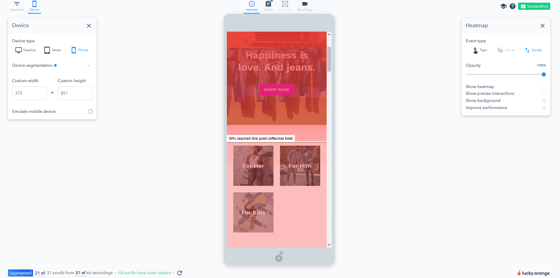
One of the most critical elements of your landing page is thecall-to-action (CTA). The CTA encourages conversion and needs to stand out, typically by using a color that contrasts with other elements on the page.
It's helpful to use scroll heatmaps to ensure that your CTA is placed in an area that garners maximum visibility. For example, if the heatmap shows that a majority of users do not scroll beyond the halfway point of your page, you might consider positioning your CTA higher up on the page to increase its exposure.
Looking for an easy-to-use landing page builder?
One tool that can help create such impactful and effective landing pages is GemPages.
GemPages is a smart storefront customization solution for Shopify eCommerce, with less code. Its diverse pre-designed templates, extensive collection of elements and more help merchants build, customize and optimize pages for multiple eCommerce purposes with ease.
GemPages places a strong emphasis on responsive web design, ensuring your website looks superb and functions seamlessly on both desktop and mobile interfaces. Its versatility shines through its compatibility with any Shopify theme, allowing you to maintain your brand's consistency across all platforms.
In the upcoming Editor v7, GemPages will introduce its first-ever AI feature: Image-to-Layout. The feature helps to generate layouts from a reference image or URL instantly.

Don't undervalue page load time and image optimization
The reason is simple… efficiency. Mobile users are often on the go and expect websites to load quickly and efficiently. If a site takes too long to load, or if the images don't display correctly, users are likely to abandon the site and look elsewhere admittedly.
Take Pinterest, for example. The company understood the importance of image optimization and implemented a system that adjusts the quality and size of images based on the user's device and network conditions.
Another company that has leveraged image optimization is Amazon. They use a technique called "lazy loading," where images only load when they come into the user's view. This practice significantly speeds up the initial page load time, allowing users to start interacting with the site more quickly.
So how can you optimize your images and improve page load times?
Start by compressing your images before uploading them to your site. Tools like JPEG Optimizer, Compress Now, or Tiny PNG can help reduce file size without sacrificing quality. Implement lazy loading, so only necessary images load initially.
Also reducing redirects because each time a page redirects to another page, your visitor faces additional waiting time for the request-response cycle to complete.
So, try to keep them to a minimum. Finally, consider using a Content Delivery Network (CDN) to deliver images faster to users around the world.
Mobile image optimization techniques
Stay mindful of how images and other page elements stack or align with each other when on mobile.
This is particularly important because the layout that works best for a desktop display might not translate as effectively on a smaller, mobile screen.
Consider a scenario where you have an image placed to the left of a product description in your desktop layout. On a larger screen, this arrangement allows users to simultaneously view the image and read the description. However, on a mobile device, due to the limited screen width, this side-by-side layout will likely need to change to a vertical one.
Here’s a great example of image optimization done with a responsive design by Lean Labs. Notice how their website images adapt well to any screen size or layout.

In many cases, you'll need to decide whether the image should appear above or below the product description on the mobile version.
If the image is compelling and helps instantly communicate what the product is, you might want it to appear first (above the product description). On the other hand, if the written information is more critical in understanding the product, then the text might take precedence, pushing the image below it.
This same principle applies to other visual elements on your website, like image carousels or video blocks.
A useful tool to consider is watching visitor session recordings. By watching these recordings, you can determine whether people are clicking through the images or if you should consider using an automatic carousel instead.
For instance, if you have an image carousel that showcases different features of a product on your desktop site, how would that translate to mobile? Should the image carousel shrink to fit the mobile screen, or should the images stack vertically for easy scrolling?
Remember, the goal is to create a mobile interface that delivers a user-friendly, intuitive experience, where visuals supplement the text rather than overwhelming or confusing the viewer.
4. Concise content wins
Having a mobile-friendly website goes beyond just design. Every website needs good content to keep visitors engaged. But mobile content is different from the rest.
Crafting mobile-friendly content can help your business stand out from competitors and deliver a better user experience. This involves creating adaptive content that is concise, easily readable, and tailored to the needs and preferences of mobile users.
Consider collapsible content that can be opened to make mobile usability better.
Imagine there's a secondary product description info that matters "less” or people engage with less (from what you see in a heatmap), then that's collapsed into a block that someone could open up if they are interested to read more.
But how do you create a content-friendly atmosphere?
Companies like Square Online and WordPress offer great mobile themes that can be customized to your content to suit your business needs. Start small and build up content as you go. Making sure to craft clear compelling headlines.
With mobile content, you want to touch all the important information but make sure there's not too much “fluff." Remember, less is often more. Always make sure you test out your mobile website's content by trying it out on your own devices. Decipher if the content is too long or doesn’t fit correctly on your page.
Make sure to consider which information people need to know to make a purchase.
If they're shopping for something common like a sweater, they probably want to know the materials and construction process. But if it's something less common like a unique toy, you'll prioritize describing what it does.
5. Push for continuous improvement
Lastly, the journey to creating a successful mobile website for your business involves a push for ongoing, incremental improvement.
We've explored the importance of responsive design, image optimization, and concise content. But understanding these concepts is just the first part of the process. The real challenge lies in implementing and evaluating these strategies effectively and consistently. Making sure you track and test these strategies for the future of your business.
The good news is that you don't have to do this alone.
Lucky Orange can be your ally in your mobile optimization endeavor. Our software has features that allow you to watch session recordings to see if visitors are clicking through the images or not.
This is helpful to see what works for your mobile website, where it may not work on your desktop website. Since mobile is so different from searching on a computer, it's crucial you continuously update and improve your site from every device interface. Ultimately, the success of your mobile website is determined by the user experience it offers.
Conclusion
In conclusion, creating a successful mobile website is not a one-time task but rather a continuous process that involves several crucial steps.
We've explored the importance of responsive design, landing pages, image optimization, concise content, and the necessity of quick page load times. These elements are all essential in providing an outstanding user experience, keeping visitors engaged, and ultimately converting them into customers.
The journey to creating a successful mobile website might seem daunting, but with careful planning and execution, it's entirely achievable. Start implementing these strategies today and watch your business grow.
After all, a better mobile experience means happier customers and happier customers mean a more successful business. So here's to your success in the mobile-first world.


