Blog
Conversion Rate Optimization
How to Stop Misinterpreting Your Website Heatmaps
Heatmap data is accurate. Your interpretation might not be. Here’s how to read click maps, scroll maps, and rage click data correctly — and avoid the mistakes that lead to bad CRO decisions.

Lucky Orange
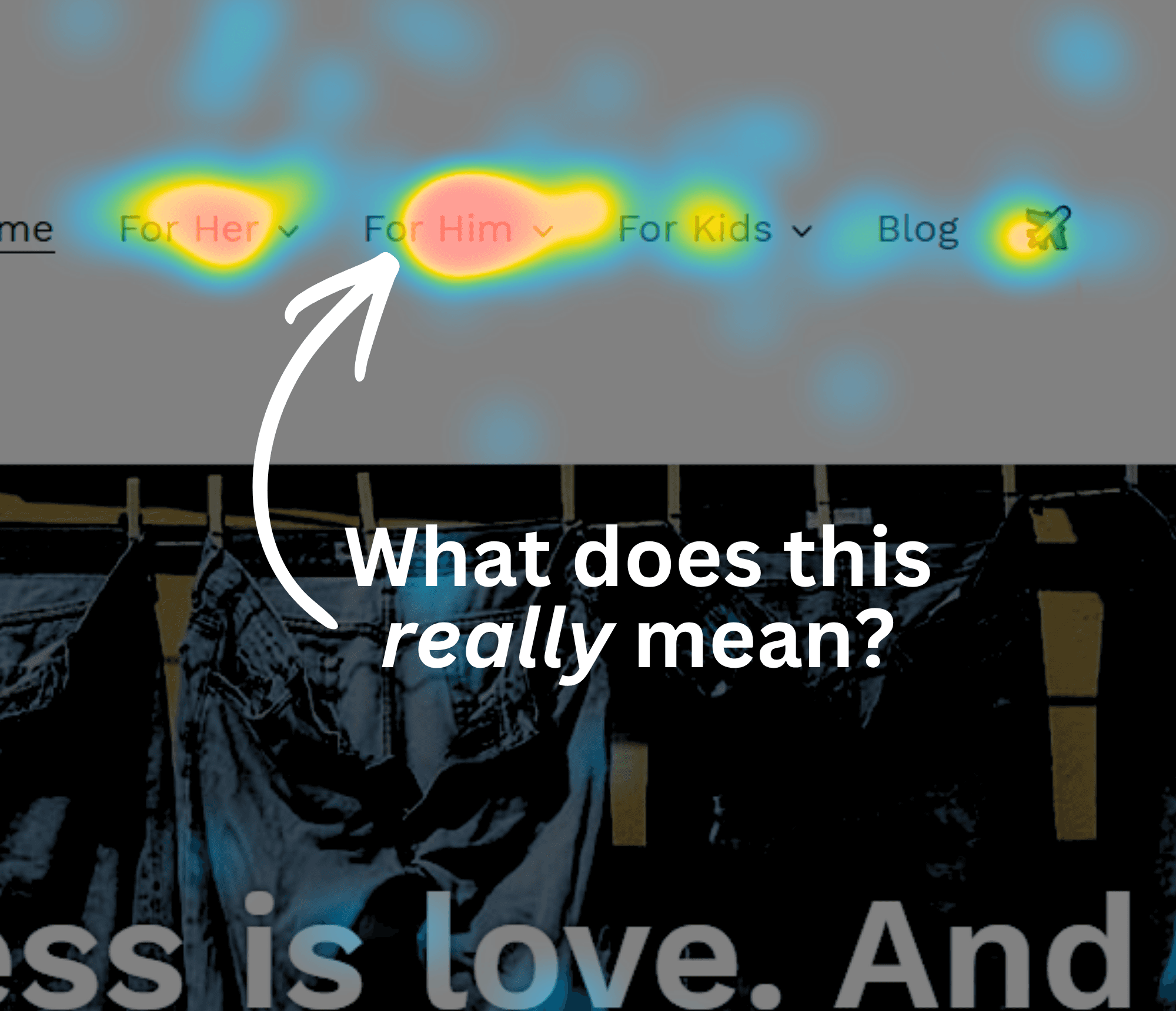
Your heatmap isn’t lying to you.
That’s the first thing to understand. The clicks are real. The scroll patterns are real. The rage clicks, the cold zones, the sudden drop-off at 40% scroll depth — all of it happened.
The problem isn’t the data. It’s the layer of interpretation you’re applying on top of it.
Heatmaps are descriptive, not explanatory. They show you what happened on your page. They don’t tell you why. Every misread in this post — and these are the ones we see most often — comes from treating a behavioral signal as a self-explanatory answer. It isn’t. It’s a starting point.
If you already have a heatmap tool running and you’re second-guessing what you’re looking at, you’re in the right place. This post is about reading the data correctly, not replacing it with something else.
The root problem: heatmaps show behavior, not intent
A user clicked your product image. A user stopped scrolling at the 60% mark. A user clicked the same element three times in rapid succession.
Those are facts. What they mean — curiosity, frustration, confusion, a slow-loading element, a misplaced CTA — is not in the heatmap. It requires a second layer of analysis to determine.
This isn’t a flaw in the tool. It’s just the nature of behavioral data. Heatmaps show you where to look. They’re excellent at that. The mistake is expecting them to also explain what you find.
Every misinterpretation below is a version of the same error: treating a “what” as a “why.”
The most common heatmap misinterpretations — and how to correct them
1. High scroll depth doesn’t mean engagement
What you see: 70% of visitors scroll past the fold. 40% reach the bottom of the page.
The assumption: People are reading. The content is landing.
What it might actually mean: Deep scrolling often signals that a visitor couldn’t find what they were looking for and kept looking. It can indicate confusion as easily as interest. Scroll depth tells you where people stopped — it doesn’t tell you whether they were engaged or just hunting.
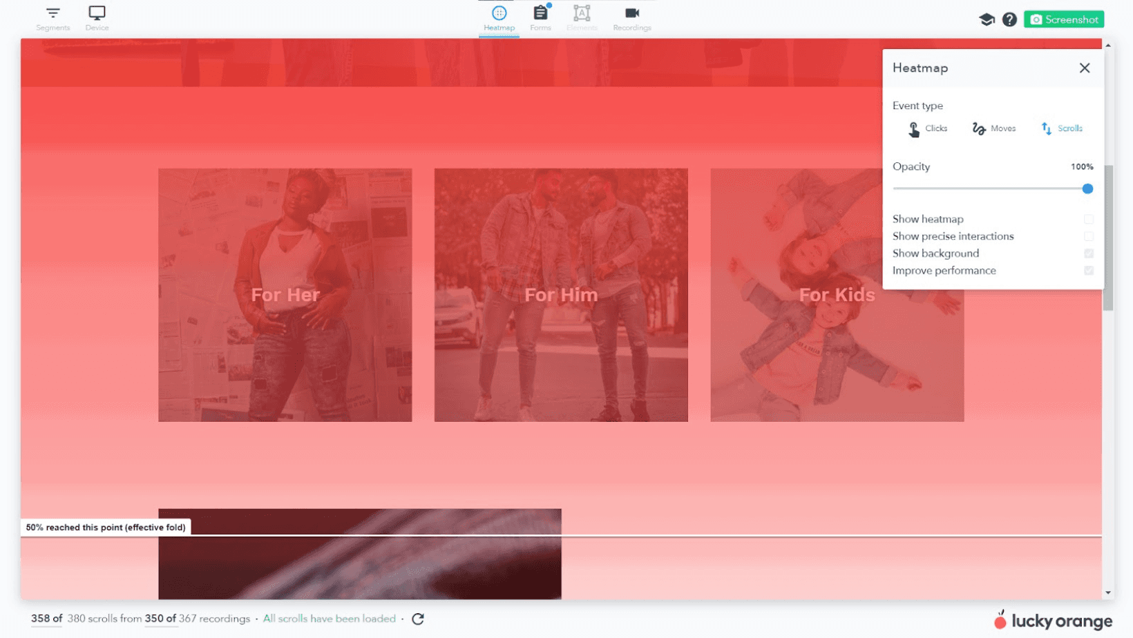
How to read it correctly: Cross-reference scroll depth with time-on-page and exit rate. A page with high scroll depth and a high exit rate is a flag, not a win. Visitors who scroll to the bottom and leave without converting were probably looking for something specific and didn’t find it.
Where this still has a ceiling: Even combining scroll + time + exit rate won’t tell you what the visitor was trying to find. That’s where session recordings close the gap. Watch the scroll behavior on sessions that exited after deep scrolling — the pattern usually makes it obvious whether they were reading or scanning.
2. Rage clicks aren’t always broken elements
What you see: A cluster of rapid, repeated clicks on one element.
The assumption: Something’s broken. Fix it immediately.
What it might actually mean: Depends entirely on what the element is. Rage clicks on a non-interactive element — a static image, a heading, decorative text — mean the visitor expected it to be clickable and it isn’t. That’s a UX clarity problem, not a technical one. Rage clicks on an actual button or CTA are different: the element is supposed to be interactive, which means the issue is more likely a slow load, a broken state on a specific device, or a click target that’s too small.
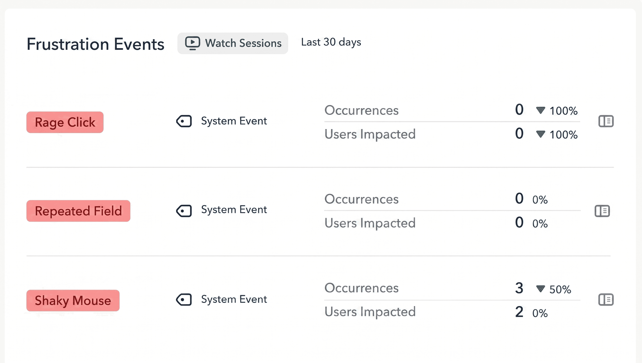
How to read it correctly: Filter rage click data by element type first. Non-interactive element with rage clicks = visitors are confused about what’s clickable. Interactive element with rage clicks = performance or responsiveness issue. These require completely different fixes, so conflating them leads to wasted work.
Where this still has a ceiling: Device type matters enormously here. A rage click pattern concentrated on mobile but absent on desktop is a different problem than a universal one. Always segment rage click data by device before drawing conclusions or writing a ticket.
3. A cold zone doesn’t mean cut it
What you see: Low click or scroll activity in a section of the page. Nobody seems to engage with it.
The assumption: This content isn’t working. Remove it or move it higher.
What it might actually mean: Cold zones are a symptom, not a verdict. A section nobody interacts with might be cold because most visitors aren’t reaching it — something upstream is breaking the scroll or pulling attention elsewhere. Cutting the cold section doesn’t solve that problem. It just removes content that might have been working fine for the visitors who did get there.
How to read it correctly: Before acting on a cold zone, look at the scroll map. If the majority of your traffic isn’t scrolling deep enough to reach the section, the question isn’t “why don’t they engage with this content” — it’s “why aren’t they scrolling this far.” Fix the upstream problem first. Then reassess whether the cold zone is actually cold.
4. Click maps pick up a lot of noise — especially on mobile
What you see: High click activity on a static image, a section header, or a block of body text.
The assumption: Users are interested in this element. Double down on it.
What it might actually mean: People click on non-linked elements constantly — especially on mobile, where accidental taps are common and users have been trained by apps to expect most things to be interactive. A hot zone on a static image doesn’t mean the image is compelling. It might mean visitors expected it to enlarge, link somewhere, or trigger a preview and were confused when it didn’t.
How to read it correctly: Always filter click maps by device type before making a decision. Mobile and desktop click patterns on the same page are often dramatically different. An aggregated view combines those patterns into a single heatmap that may not accurately represent either. A click cluster that looks significant in aggregate sometimes disappears entirely when you isolate mobile traffic — and vice versa.
Heatmaps show you the pattern. Session recordings show you why it’s happening. Lucky Orange gives you both in the same platform — so you’re not switching between tools to connect the dots. See your site the way your visitors do. → Start your free trial |
5. Aggregate heatmaps can bury the real story
What you see: A single heatmap view across all your traffic.
The assumption: This is how your users behave.
What it might actually mean: “All traffic” is not a user segment. It’s an average of completely different behavioral patterns layered on top of each other. Organic visitors, paid traffic, and returning users often interact with the same page in measurably different ways. An aggregate heatmap is the mean of all those patterns — which can accurately represent none of them.
How to read it correctly: Segment before you interpret. At minimum: device type, traffic source, and new versus returning visitors. The differences are often significant enough to produce opposite conclusions from the same underlying data. A CTA that looks well-clicked in aggregate might be completely ignored by paid traffic and over-indexed by returning users who already know where it is.
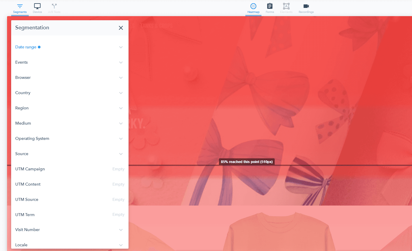
Where this still has a ceiling: Even with intentional segmentation, you’re still choosing which segments to examine. The behavioral differences hiding in segments you don’t think to check are often the most actionable. This is where AI-assisted analysis changes the math — Lucky Orange’s Discovery AI surfaces behavioral patterns across segments you didn’t know to examine, without requiring you to know the right question in advance. It finds what you’d have missed.
6. Before/after comparisons need controlled conditions
What you see: Two heatmaps — one before a redesign, one after. The after looks different.
The assumption: The redesign changed how users behave.
What it might actually mean: If your traffic mix shifted between the two snapshots — different paid spend, a seasonal change, a new referral source, a campaign that went live — you’re comparing two different audiences, not a behavioral change from the same audience. The heatmaps look different because the people are different, not because your redesign worked or didn’t.
How to read it correctly: Before running a before/after comparison, check that traffic volume, source mix, and device split are similar across both periods. If they’re not, the comparison is noise. This is also why running proper A/B tests beats sequential comparisons for most redesign decisions — you control for the traffic variable by design.
The right workflow: heatmaps as the start of the investigation, not the end
Every heatmap insight is a hypothesis, not a conclusion. The data points you toward something worth investigating. What you do next determines whether you make a smart change or an expensive mistake.
Here’s the workflow that closes the gap between “something looks off” and “I know exactly what to fix”:
Step 1 — Spot the anomaly. High rage clicks. An unexpected cold zone. A click cluster on a non-interactive element. A scroll drop-off that doesn’t match where you’d expect visitors to lose interest. Something looks off.
Step 2 — Validate with session recordings. Watch the sessions that match the pattern. In most cases, the behavior becomes immediately obvious when you see it played back. You’ll either confirm the hypothesis — yes, visitors are confused by that element — or rule it out. Either outcome is useful.
Step 3 — Isolate the segment. Filter to the specific device type, traffic source, or behavioral cohort where the pattern is strongest. That’s your test group. Acting on aggregate behavior when the problem only exists in one segment means you’re optimizing for people who don’t actually have the problem.
Step 4 — Act on a specific hypothesis. “Mobile visitors on paid traffic are clicking the product image expecting it to enlarge, but it doesn’t” is a testable hypothesis. “The page seems confusing” is not. The more specific the hypothesis, the more meaningful the result when you test it.
For teams who want to compress Step 2 and 3 — Discovery AI does the segmentation work automatically, surfacing which patterns are worth investigating without requiring you to know where to look first. It’s not a replacement for heatmaps. It’s the layer that tells you which heatmap to open.
What heatmaps are genuinely great at
This post has covered a lot of ways heatmap data gets misread. That doesn’t mean heatmaps are unreliable — it means they’re powerful tools with a specific job, and using them well requires understanding what that job actually is.
Heatmaps do a few things better than any other format:
Visual pattern recognition at a glance. No other data format makes above-the-fold engagement this legible. You can look at a click map for ten seconds and immediately know where visitor attention is concentrated and where it isn’t. That’s genuinely hard to replicate with tables or charts.
Surfacing friction in forms and multi-step flows. When a form field shows low engagement or a checkout step shows rage clicks, heatmaps catch it fast. You don’t need to run a full funnel analysis to notice that nobody’s touching your promo code field.
Comparing page variants quickly. Running two versions of a landing page and want a fast read on where attention lands? Heatmaps give you a directional answer before a full A/B test reaches statistical significance.
Making stakeholder communication fast. A heatmap is one of the most persuasive artifacts you can put in a presentation. Showing a stakeholder that 70% of visitors never reach the CTA is more convincing than any conversion rate table. The visual does the work.
The key is knowing when you’re using heatmaps for what they’re built for — pattern identification and hypothesis generation — versus expecting them to do the analytical work that belongs to a different layer of your stack.
Frequently Asked Questions about Heatmaps
What’s the difference between a click map and a scroll map?
A click map shows where users click or tap on a page. A scroll map shows how far down the page users scroll before leaving. They answer different questions: click maps reveal what users interact with, scroll maps reveal how much of the page they actually see. Used together, they give a more complete picture of on-page engagement than either does alone.
Why does my heatmap look different on mobile vs. desktop?
User behavior varies significantly by device. Mobile users tap differently than desktop users click, scroll patterns differ based on screen size and thumb reach, and the same page can render in ways that meaningfully change the user experience across devices. Viewing an aggregate heatmap without filtering by device is one of the most reliable sources of misinterpretation — you end up making decisions for an audience that doesn’t actually exist.
How many sessions do I need for a heatmap to be statistically reliable?
As a practical benchmark, 500–1,000 sessions gives you a meaningful pattern for most pages. High-traffic pages can reach that quickly; lower-traffic pages may need two to four weeks of data before patterns stabilize. Drawing conclusions from 50–100 sessions is where most premature optimization decisions happen. If a pattern shows up clearly at low session counts, treat it as a strong signal worth investigating — not a confirmed finding worth acting on immediately.
Can heatmaps tell me why users are leaving a page?
Not directly. Heatmaps show you where users stopped engaging — the last element they clicked, where they stopped scrolling, what they interacted with before exiting. The “why” requires a second layer: session recordings to watch the actual behavior, or on-site surveys to ask visitors directly. Heatmaps narrow down where to look. They don’t explain what you find there.
What’s the best way to act on heatmap data?
Treat every heatmap insight as a hypothesis, not a conclusion. Identify the pattern, validate it with session recordings, isolate the segment where it’s strongest, and make one specific targeted change. Avoid broad page decisions based on aggregate heatmap data alone — the cost of acting on a misread is real, both in development time and in the conversion rate drop that follows if you move the wrong element.
Heatmaps find the pattern. Recordings explain it. Discovery AI finds the ones you missed. Lucky Orange puts all three in one place — so the next step after spotting something is one click away, not another tool. → Try Lucky Orange free for 7 days |
Lucky Orange